matt harvey art
Portrait paintings, art demonstrations, figurative painting, landscapes
Short clip of my latest painting
Posted on May 12, 2024
I love drawing and painting the human figure. I see these paintings as sculptures though really, they are prequels to carvings.
I am wary of interpretation with these paintings. For me, in and of themselves they show the beautiful symmetry of the human form as it reflects the macrocosmic universe.
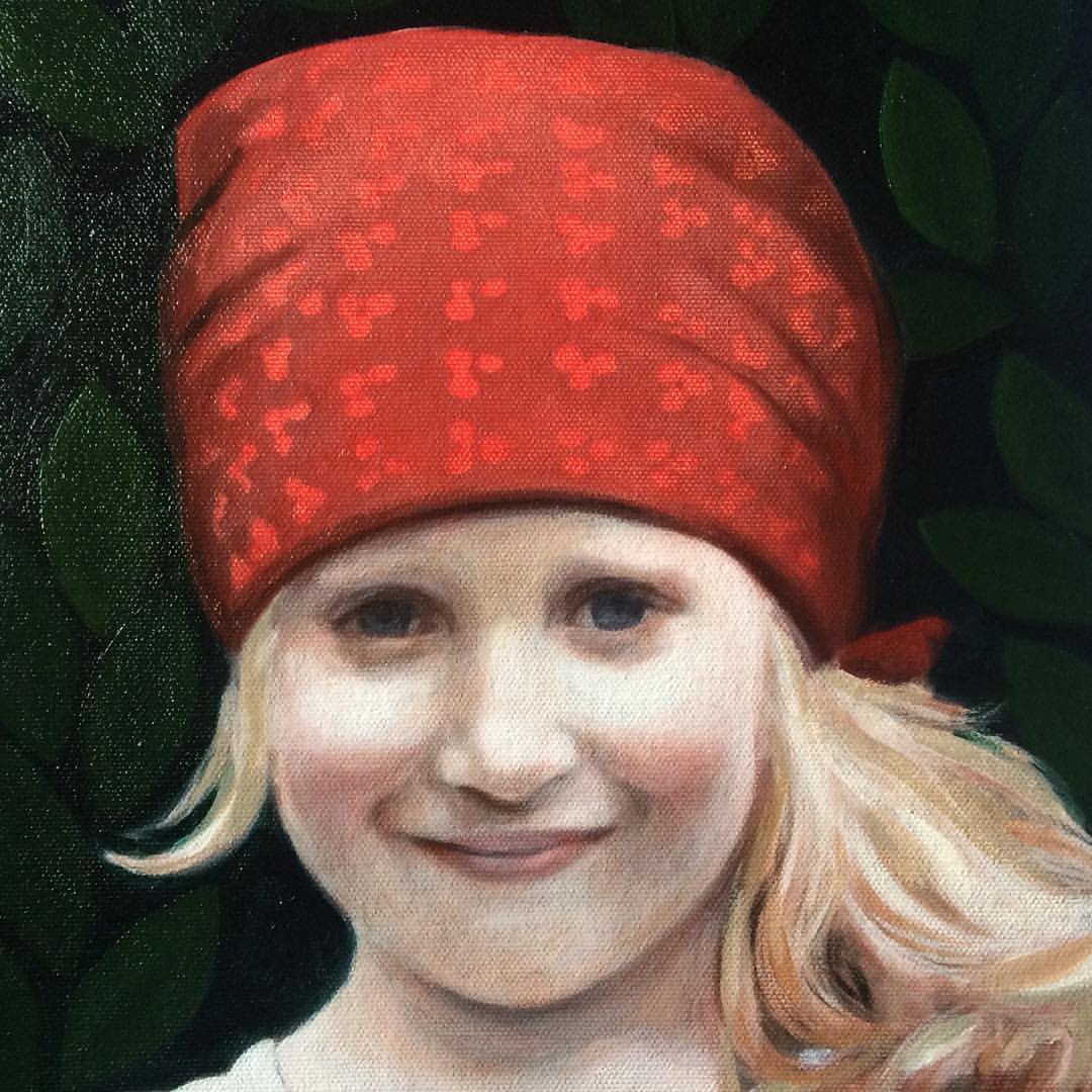
Portraits in a landscape
Posted on December 12, 2019

Rockpooling, acrylic and oil on canvas
I can’t take too much credit for the composition of this one which was originally photographed on the Cornish coast, one of my favourite places! I like the dribble of seawater coming off the net on the left. Its a good dribble. This was another painting that I began in acrylics and finished in oil paint, and its a method I am going to return to. My dilemma is that there is nothing more pleasurable than pushing oil paint around a painting surface and acrylics lack this quality as they dry so quickly. I learned how to paint using oil paints and still feel acrylics are not the most natural method for me. They are dry before you know it and I have always found this difficult to manage. But then building them up slowly in layers has other advantages. When I was younger I wanted to draw like Giacometti and used biros and gouache paint to build up meshes of lines and daubs, and that is echoed in how I have been glazing acrylic paint when I use it. Because I don’t want to commit too much as the paint won’t let me manipulate it before it dries, I use thin layers of acrylic to slowly render the form.
I have mentioned I find this similar to carving. Inverted carving, as it is adding and not taking away. But each line or glaze of paint serves to refine and tighten the drawing, but unlike carving the mistakes add to the whole effect and in the end strengthen the drawing. When I carve stone every ‘mark’ with the chisel has to count. Every cut moves the sculpture closer to completion.
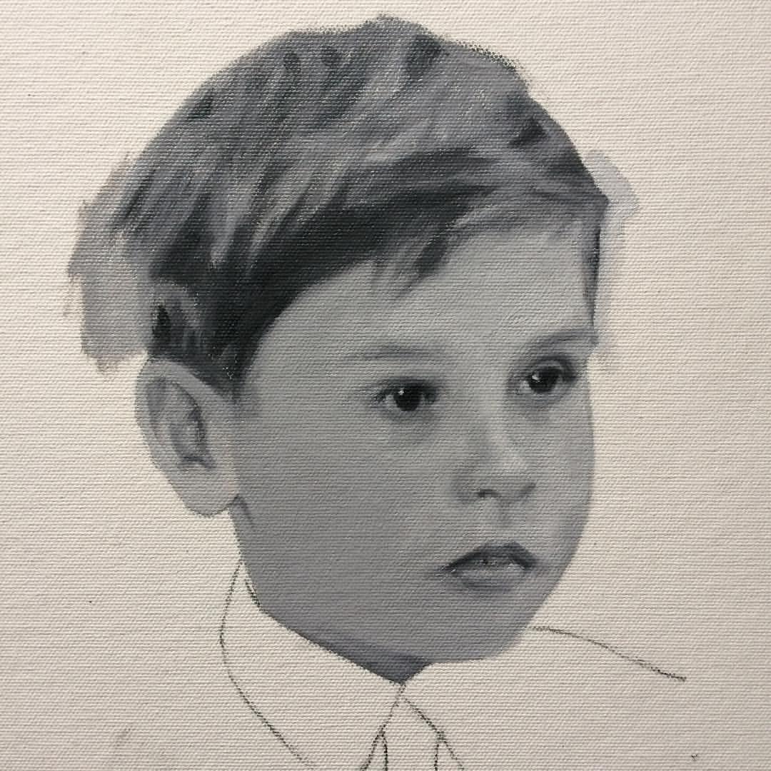
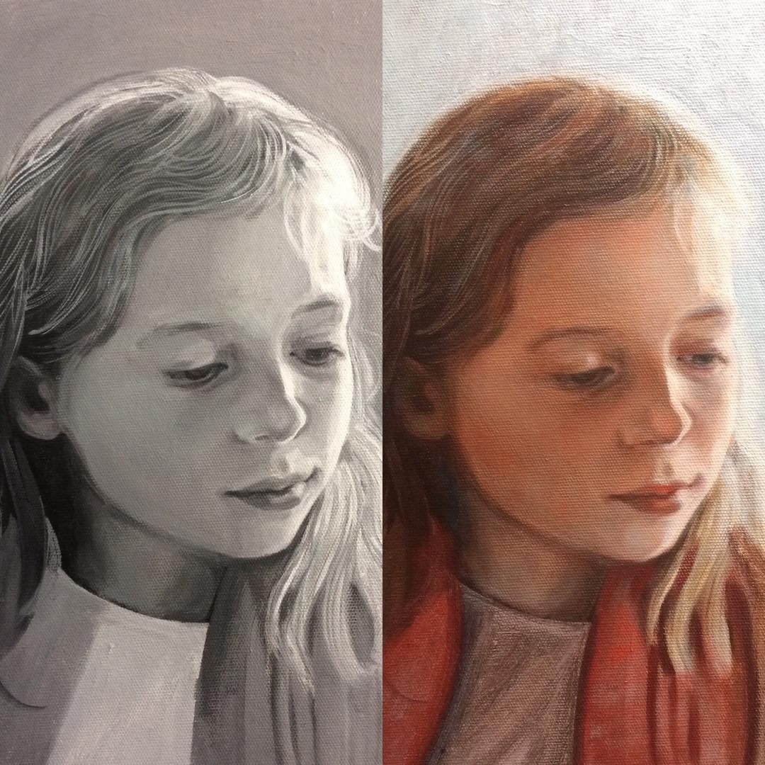
Portrait painting showing grisaille underpainting
Posted on May 29, 2018
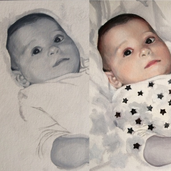
Detail of a portrait in oil on canvas, showing the grisaille underpainting before and after
This is a detail of a painting that I have shown before of the effect of glazing over a grisaille underpainting in a short time. You can see the first glaze which took around an hour to paint, and the effects are dramatic. It is something I wish I had filmed at the time along with the other short film I made of glazing the arm, my first video!
It also shows a detail of some decorative motifs I was experimenting with which in the end I discarded. Just the sleeve of his pyjamas had some tiny star decorations on, and I enlarged these stars to create a free floating design that ran across the painting. Its certainly good to have a record of this, even though it was scrapped. I’m still interested in the idea of playing games with the picture plane. Of course the realism of the portrait is an illusion, and it felt like a good idea to juxtapose that with something that flaunted the illusion.
The portrait is of my son and it was my wife who decided she didn’t like this design! Its something else I would like to investigate more in the future though.
The palette I used here for the glaze was fairly limited: Titanium White, Indian Yellow, Vermillion, Alizarin Crimson, and Sap Green.
It shows what can be achieved with glazing just a few colours over the Black and White underpainting, but strictly speaking Ivory Black is on the palette too, it was just painted beforehand and already dried as the grisaille. You don’t need umbers or ochres for the hair necessarily, and just a mix of reds and the Sap Green will do, as it did for the shadow tones. Like in a Zorn palette the Ivory Black mixed with white gives a cool bluish hue to the skin tones where it shows through.
I used a hogs hair brush to start and then blended colours using both that and then a sable brush to finish. There was an additional glaze to this but in the main I was happy with this first glaze, and it demonstrates the efficiency of the grisaille technique. Get the drawing right first, and the correct value tones, and then the glazing can achieve very quick results. Even though its quick to paint, every glaze is painted very slowly, very carefully, never committing too much paint.
Here is the final painting which is still not completely resolved. I think I preferred the earlier version and its just been left which is sometimes the only way I finish paintings. I may go back to it one day, but can’t now though because its being exhibited. Paintings though pass into one another in a linked chain of learning where all past failures and successes are handed down and carried through to future works. The point is to keep moving forward!
Portrait of Hideo, oil on canvas
Portrait painting commission – grisaille layer waiting for the first glaze
Posted on November 2, 2017
This is the first stage, the grisaille. I will be posting a video of the first glaze in a few days. The sitter is the sister of the earlier portrait posted. I will be able to continue modelling the forms as I glaze. I have talked about this elsewhere but the drawing never stops while glazing is taking place, each glaze revealing new areas to develop in the painting. The grisaille is not perfectly formed but is enough to form an anchor for the rest of the painting. Hue or colour is in itself drawing and form and all the imperfections and flat areas are transformed with the glazes.
There are many different ways to make a grisaille underpainting; with black and white as here, or you can make a ‘verdaccio’ which is monotone green and white, or burnt umber and whites. In the future I would like to do some paintings with very limited palettes, like the Zorn palette which has Yellow Ochre, Black, red and white. Or like the one I used at school, Burnt Sienna, Cobalt Blue and White. Just thinking about it is so nostalgic and I fondly remember swimming in warm and cool tones back then.
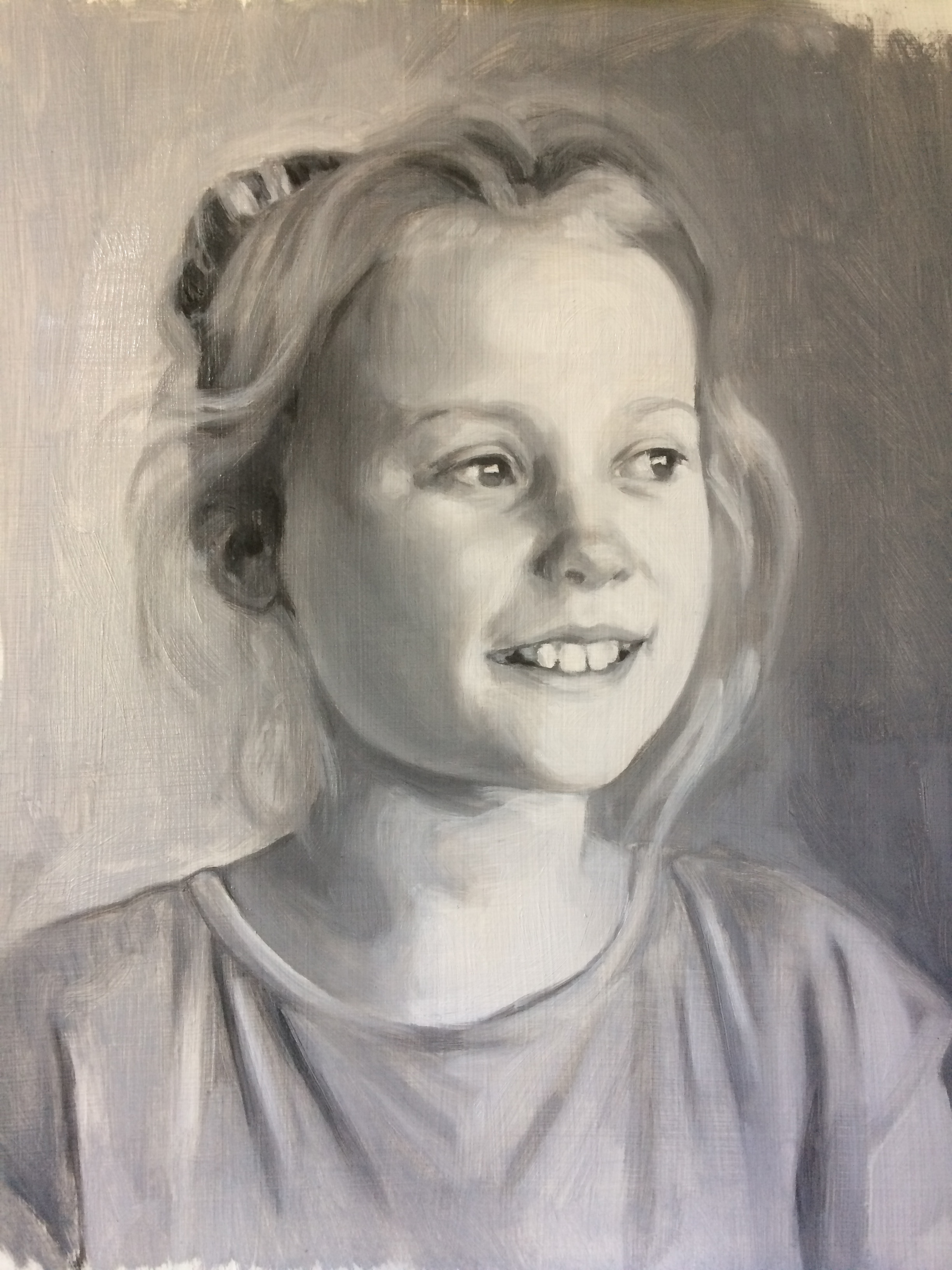
Portrait of Ruby, grisaille painted in oils, Titanium White and Ivory Black
Oil painting demonstration: Glazing over grisaille – Portrait of Amy
Posted on October 23, 2017
This is Amy’s portrait, glazed in oil paints. I filmed myself doing this and it will shortly be on my youtube channel. Its still in the early stages, and when this layer is dry I’ll go over it again, up to 3 or 4 times. I don’t know if I’m going to film those other stages – they might be a bit boring as its just a lot of tinkering. In the early stages its quite dramatic how a few glazes of colour changes the grisaille into a very nearly finished portrait. Stay tuned!
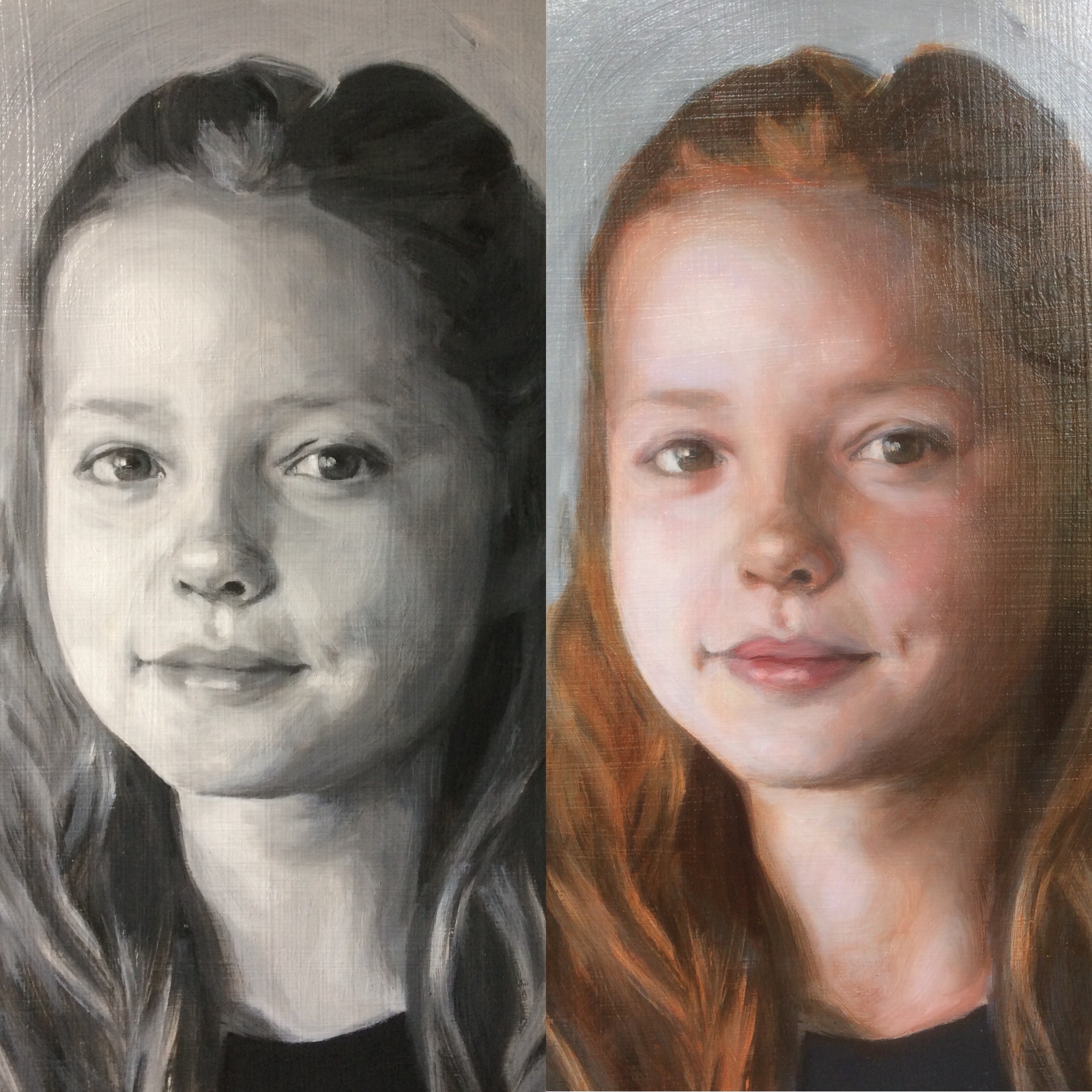
Before and after glazing over grisaille. The first oil glaze took roughly an hour to complete. The grisaille underpainting was painted using Titanium White and Ivory Black oil paints, and the glazes are mixed from Alizarin Crimson, Raw Sienna, Cadmium Red, Titanium White, Ultramarine Blue and Sap Green, to name a few
Titian’s Ecce Homo – underpainting and glazing
Posted on August 7, 2017
This beautiful painting by Titian from the Prado Museum is the reason I wanted to try and learn the technique of painting with a grey layer, or underpainting in grisaille, a technique that Titian pioneered.
The flesh appears both taught, as if it was carved out of marble, and fluid at the same time. Titian painted this in Rome, and you can clearly see the influence of Michelangelo in the rendering of the forms and their monumentality. Another interesting fact is that he painted it on Slate. You can see the colour layers as applied over the grisaille and they seem to dance and flicker on the picture plane. It is as if Jesus Christ is illuminated from the inside, and the strokes of glaze glow like flames burning in a furnace. The cloth Christ is wrapped in has an extraordinary quality which maybe I could get to the bottom of by copying.
I don’t paint portraits with this kind of chiaroscuro and extreme passages of light to dark, but maybe I should. Chiaroscuro as seen here feels like it belongs in a different age, but it would be interesting to see if you could do it today, and make it something worth looking at, without pastiche.
These paintings of Christ on his way to the crucifixion were meant as devotional images, painted in such ways to elicit empathy from the viewer. You can feel the depth of Titian’s religious faith in this painting. There is more information on the Museo Del Prado’s website about it.
It feels a bit shallow chatting about it in this way, or that I’ve somehow understood it when I don’t think I have at all. Perhaps the only way to come to terms with it is to try and copy the painting, but the subject is so raw that personally I don’t think I can. I am able to admire this painting, but not as a devotional object and certainly only in a small way appreciate it in the way Titian intended. But as much as being a devotional object it is also celebrated because of the skill and grace he displayed in handling the paint after all. I do believe though that it was his religious faith that gave rise to his superlative technique here.
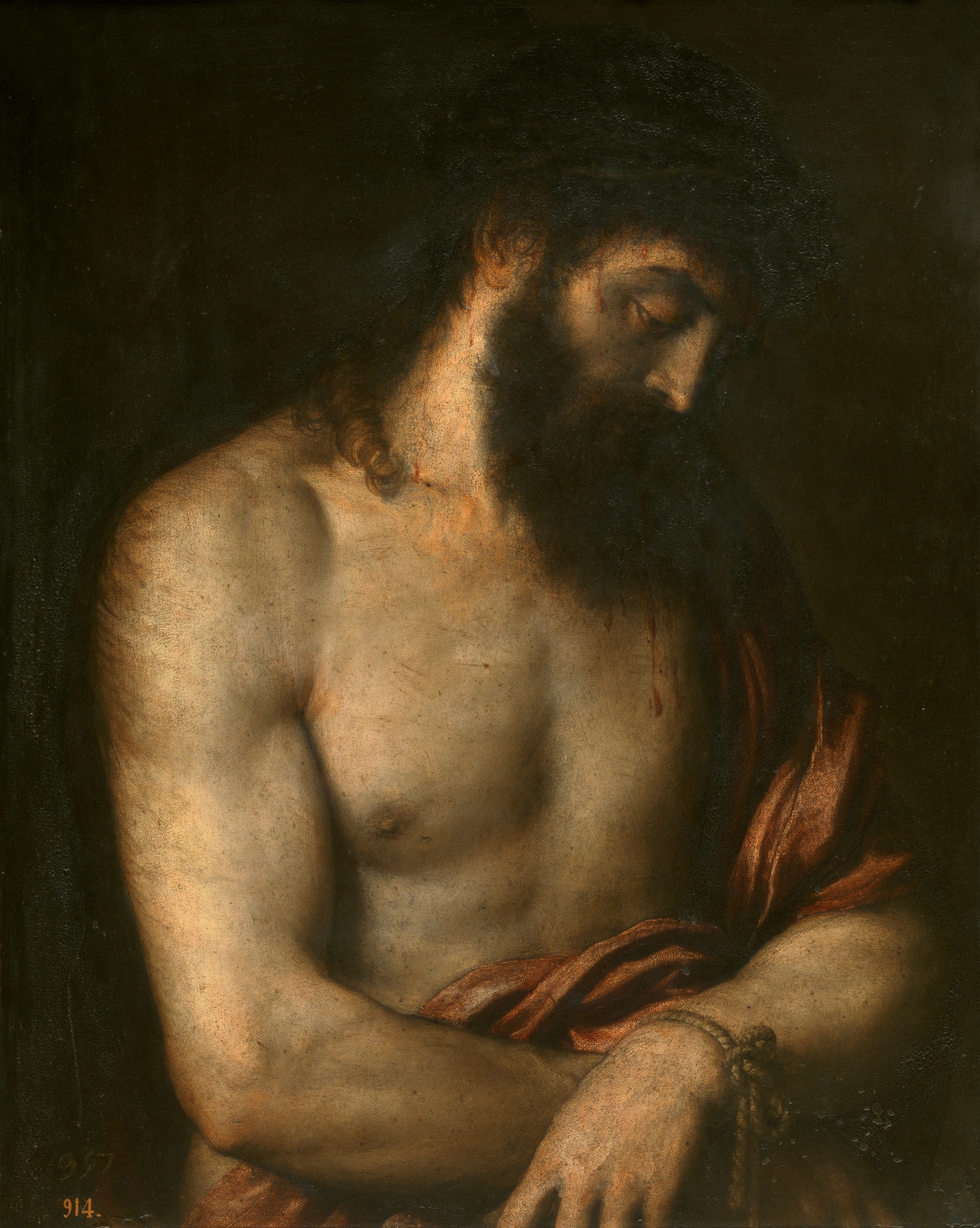
Underpainting using Titanium White and Ivory Black oil paint on canvas
Posted on August 1, 2017
Tommy, grisaille portrait painting, oil on canvas. Painted with Titanium White and Ivory Black. This is a typical grisaille underpainting before the colour glazes of oil paint
Tommy- underpainting in progress. Underpainting is a technique used since the renaissance. It usually refers to a monochrome foundation or base layer, and layers of paint are applied on top. This one is a grisaille or grey, but there are various different kinds, and not always of the monochromatic variety. Titian used coloured underpainting. The idea is that it supports further layers of paint, as a foundation supports a house. For me it is purely a pragmatic solution where I can be confident that the drawing is correct and can continue applying further colour layers without having to backtrack and amend the drawing as I go. If I’m painting a portrait to commission I like to work as efficiently as possible, and in the past I have found myself in tricky situations where I have had to keep going over the drawing because its not right, and this can be very time consuming. As I have said elsewhere, you can throw a lot of good painting after bad if the drawing isn’t right first.
The other type of underpainting I have used is called ‘verdaccio’, which is a green version, and usually made by mixing black, yellow and white although I think a nice version would be with Michael Harding’s Sap Green and Titanium White only. I never used black as my art teacher at school was a hardcore impressionist with a love of purple who could not abide it. Honestly it took me 20 or more years to get over that – just couldn’t use the stuff.
Anyway there were a lot of impressionists or those painting at the same time who loved a good bit of black, think Manet and Degas. But we were taught to mix optical blacks with reds and greens or browns an blues and these are very beautiful, and deeper than your average black in a tube. When I learned how to mix oil paint for skin tones from Louis Smith using reds and greens, that struck a chord with my earlier learning and its stayed with me as the basis of all the glazes I’ve found the most useful when painting portraits.
In every portrait painting I paint using the grisaille method, I use the same mix of Alizarin Crimson, Cadmium Red and Sap Green to start off (has to be a warm Sap Green – Michael Harding does a beautiful but cooler version which is different to the one I need). I have a Winton Sap Green that is good for now. Maybe a little Raw Umber as well.. All the other glazes I mix hover around this mix on the palette, depending on the person I am painting of course.
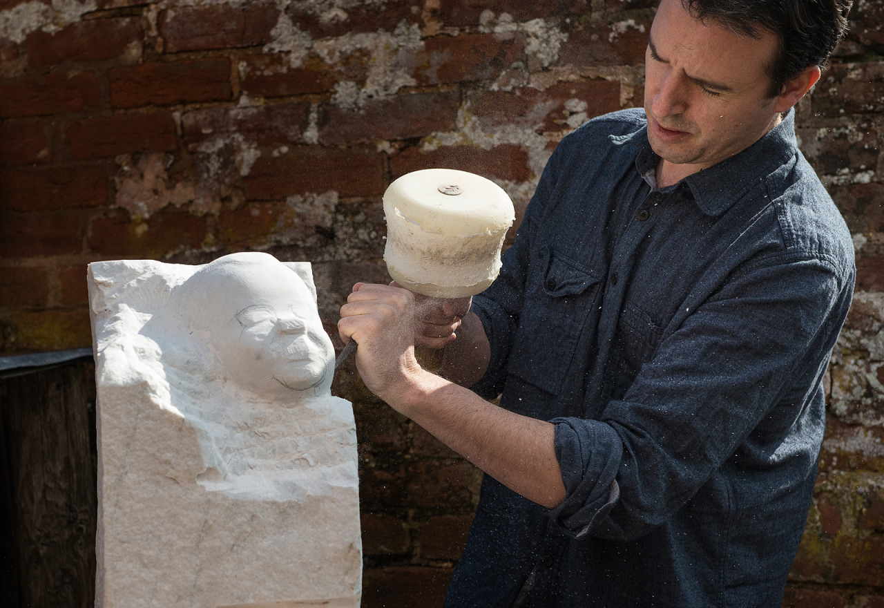
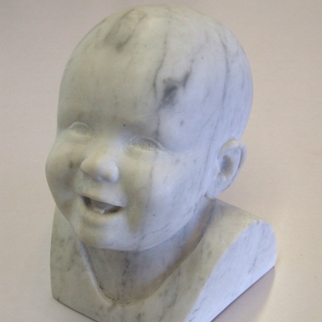
Portrait sculpture, Direct marble carving
Posted on March 1, 2017
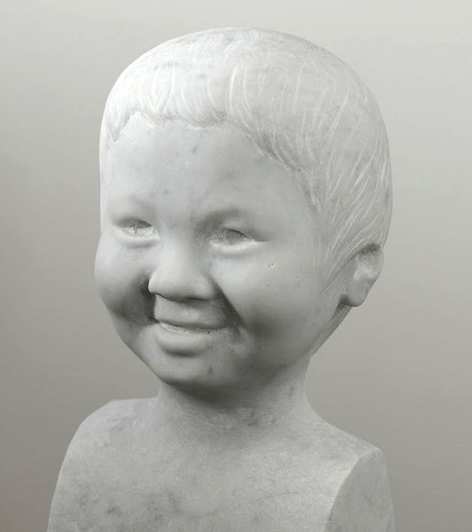
For this piece I made a clay model which was in turn worked up from photos, and then using the clay model as a reference I carved directly into the marble. I didn’t use a pointing machine or anything, but I do use callipers to measure distances between say eyes to bottom of nose, width of mouth etc. I hew off large areas first, for example the width of the head down to the shoulders can all come off at right angles, then the distance between the projection of the nose and the rest of the face, then down to the cheeks. You can see an example of this in the photo below of another portrait sculpture where the tip of the nose is still square. This is a method I picked up when working as a stone mason in the Wells Cathedral yard, where I worked while taking a year out of art school. #art #devonartistnetwork #carraramarble #carrara #stonecarving #sculpture #portrait #portraitart #portraitsculpture #elbowgrease
Devon open studios
Posted on February 28, 2017
I’ this portrait for promotional material for Devon open studios in September 2017 #portrait #portraitpainting #contemporaryrealism #art #oilpainting #devonartistnetwork #devonopenstudios (at Kenton, Devon)
Portrait painting in stages
Posted on January 12, 2017
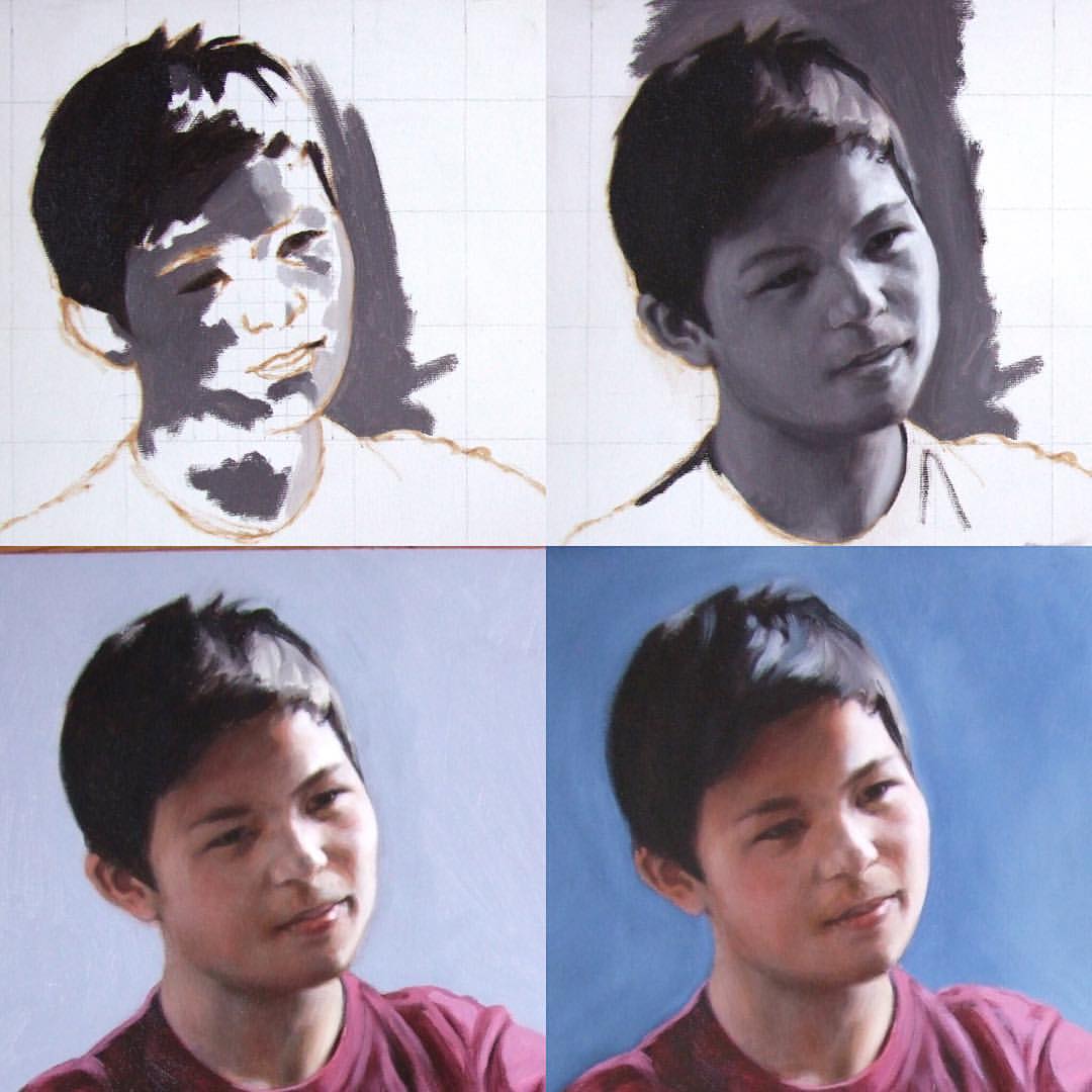
This is an early example and one of my first efforts at glazing over a grisaille underpainting, a portrait I painted of Dai, in stages. You can see the grid system I used to copy the original photograph reference. I don’t have a strict methodology of working from darkest darks to lightest lights that you can sometimes read about on academic portrait painting sites, and work intuitively. The painting doesn’t use so many glazes, maybe 3 or 4, but at the time I felt it had a nice quality and I left it. #contemporaryart #realism #underpainting #art #portrait #grisaille #underpainting #portraitpainting
First glaze
Posted on November 24, 2016
First glaze done. Took about 90 minutes. I’ll adjust the colours and drawing as I go on #portrait #art #painting #oilpainting #glaze #grisaille #underpainting #contemporaryart #realism
Grisaille underpainting
Posted on November 15, 2016
Grisaille underpainting finished for another portrait. Ready for a glaze very soon. #devon #portraitpainting #glazing #underpainting #contemporaryart #art #portrait #oilpainting #oiloncanvas #painting
Posted on November 14, 2016
//www.instagram.com/p/BMzGPrlD5C6/embed/
Glazing over the grisaille. I’m sure you’ll appreciate the flashy production values. Full video at mattharveyart.com #grisaille #portrait #art #oilpainting #contemporaryart #underpainting #glazing #portraitpainting #devon
Colour glazing – 3rd glaze over the underpainting
Posted on November 10, 2016
The third glaze has been painted with veils of oil paint over the grey or grisaille underpainting. I did some experimenting with the background here, but ended up painting it out in further glazes.
3rd glaze done. Still a few more needed #underpainting #grisaille #portrait #portraitpainting #oiloncanvas #art #painting #fineart #devon #glaze #contemporaryart #contemporaryrealism #oilpainting
Posted on November 9, 2016
Would be nice to do another version of this one day – carved directly in Carrara marble using photos as a reference #carrara #marble #directcarving #contemporaryart #sculpture #portrait #stonecarving #babygirl #elbowgrease #portraitsculpture #marblesculpture #stonesculpture #devon
