matt harvey art
Portrait paintings, art demonstrations, figurative painting, landscapes
Oil painting demonstration: Glazing over grisaille – Portrait of Amy
Posted on October 23, 2017
This is Amy’s portrait, glazed in oil paints. I filmed myself doing this and it will shortly be on my youtube channel. Its still in the early stages, and when this layer is dry I’ll go over it again, up to 3 or 4 times. I don’t know if I’m going to film those other stages – they might be a bit boring as its just a lot of tinkering. In the early stages its quite dramatic how a few glazes of colour changes the grisaille into a very nearly finished portrait. Stay tuned!
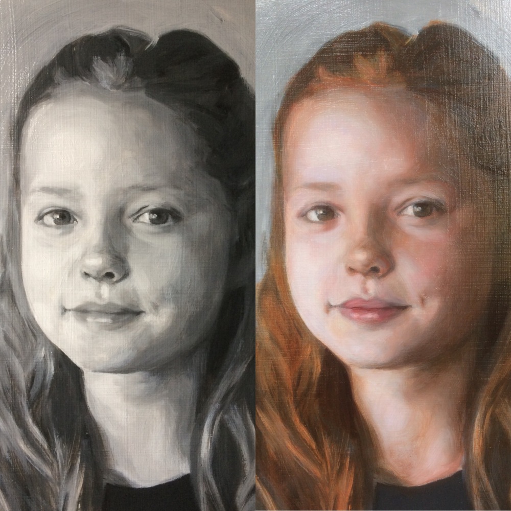
Before and after glazing over grisaille. The first oil glaze took roughly an hour to complete. The grisaille underpainting was painted using Titanium White and Ivory Black oil paints, and the glazes are mixed from Alizarin Crimson, Raw Sienna, Cadmium Red, Titanium White, Ultramarine Blue and Sap Green, to name a few
Drawing practice
Posted on July 21, 2017
The most intense ‘drawing’ experience I have had is when I am carving directly into marble. This piece was done from photos with some simple measurements I took with a set of callipers as a guide (not easy with a baby – generally done while she was asleep!) With marble carving any wrong move would ruin the whole thing and a months work, making it pretty stressful but a great discipline. Because of that pressure I think I improved my ‘looking’. For me drawing is about making a mark, and then checking it, and checking again, and deeply looking at the subject. I even feel that the depth of the looking etches the subjectivity of the artist on the media they are working, be it drawing, painting or sculpture. I don’t know what that subjectivity is but its an emotion, and its possible to embody that emotion in a work of art. Making a sculpture in the round is like doing hundreds of drawings simultaneously. Without drawing, or when the drawing is lacking, the painting’s ruined.


In my experience CUTTING CORNERS with drawing is the biggest waste of time and I have probably wasted YEARS of my life throwing good after bad in paintings, going over and over attempting corrections when all the effort could have been saved with earlier checks. Its the ultimate false economy..
‘Drawing includes three and a half quarters of the content of painting… Drawing contains everything, except the hue’. (Jean-Auguste-Dominique Ingres) from Art Quotes
Portrait of Florence, oil on canvas
Posted on May 27, 2017


For this portrait as usual I used a canvas on board, and cropped it slightly to fit the subject. I started with a grisaille underpainting using Raw Umber and Titanium White and a little medium. I’m hovering between a straightforward Ivory Black and White underpainting, and other versions, mainly Raw or Burnt Umber and White. Burnt umber has a little more warmth. I’ve looked around online and you can see people painting with blacks which are made up of reds mixed with greens, e.g. Alizarin Crimson and Viridan Green, or again different blues and browns. At school I was taught by my militant impressionist teacher Mr. Baines that using black was sinful and one should only EVER mix blacks optically, and his chosen mix was Burnt Sienna and Cobalt Blue. You can mix a nice black from these two, but I went off Burnt Sienna a while ago (I’m sure I’ll come back to it – at the moment it just has a bit too much character, like someone talking very loudly at a party, so you can here them wherever you’re standing!). I think you can achieve a deeper black mixed from Burnt Umber and Ultramarine or Cobalt Blue.
Having said all that, in the name of efficiency I have stripped back all of my processes to avoid unnecessary headaches so I generally I use Ivory Black and Titanium White! I have also learned from Louis Smith that a little Alizarin Crimson mixed in with Ivory Black gives it more depth, so I also do this on occasion.
The thing is that I can achieve this depth at a later stage by glazing darker colours over the underpainting so again the Alizarin Crimson gets ditched when I want to simplify the process. I’m possibly lazy, but if you are working on something over a few sessions and have to mix the colours each time inconsistencies can creep in and so thats just another layer of process that can be removed.
You can see an example of the depth achieved through glazing in the image below where the grisaille is actually quite bland in comparison. Dark glazes in and around the eyes give huge depth (generally I won’t use black at this stage and mainly use Alizarin and Sap Green or Cadmium Red and Viridian, or blues or browns or whatever..). This is the first glaze and already it has transformed the tonal range of the portrait.

Portrait of Bea, final glaze
Posted on March 3, 2017
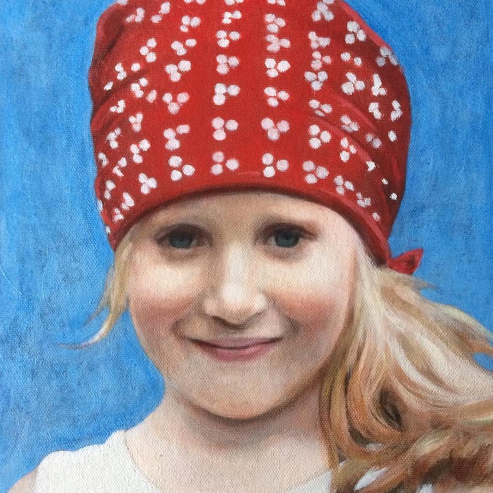
Portrait of Bea. After feeling around what might work for the background I settled on this regal blue, and I gave the painting a few glazes of Michael Harding’s Ultramarine, which is both warm and sharp, and has a depth while also firmly hovering on the picture plane. Ultramarine blue was discovered around 1820. Before that the only available version of this blue was the extremely expensive Lapis Lazuli, from Afghanistan. Duccio and a whole lot of 14th century artists would have loved to use it to save some cash #oiloncanvas #oilpainting #portrait #portraitpainting #art #contemporaryart #figurativeart #bandana
Devon open studios
Posted on February 28, 2017
I’ this portrait for promotional material for Devon open studios in September 2017 #portrait #portraitpainting #contemporaryrealism #art #oilpainting #devonartistnetwork #devonopenstudios (at Kenton, Devon)
