matt harvey art
Portrait paintings, art demonstrations, figurative painting, landscapes
Portrait of a young girl after Rubens, 1st glaze
Posted on February 21, 2019
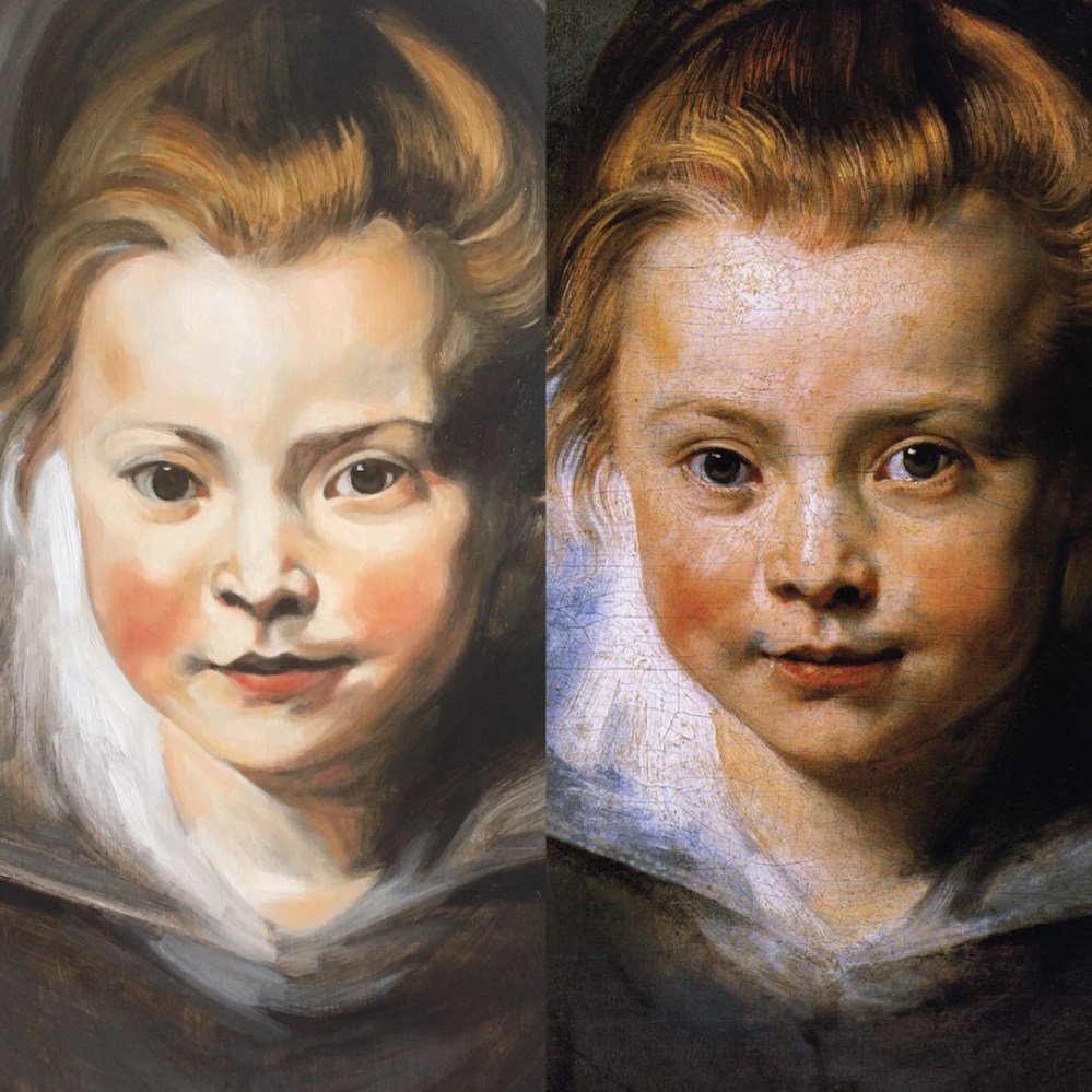
Portrait of a young girl after Rubens 1st glaze from patreon.com/mattharveyart
Here is an image of the 1st glaze as I finished filming. The real time video will be on Patreon but there is a taster on youtube. One amazing thing I discovered doing this glaze was that I only used 3 colours; Titanium White, Vermilion and Yellow Ochre. I feel now that I may have been a bit stubborn in my pursuit of authenticity in the process here. Looking at the original I am sure that these are the only colours Rubens used, although the fact remains that there are deeper shadows in the original. Usually I would have painted the shadows in first and worked the highlights into them, and I am sure I would have got closer to it if I had. I have read that Rubens used Burnt Umber and Alizarin Crimson as well as Ultramarine Blue, and all these would have helped create shadows in the first glaze. I will correct it in the 2nd glaze but honestly I would have liked to get closer to the original painting. Comparing them here I can see that Rubens’ colours were a lot darker, or richer. I don’t know for sure if he used further glazes, and my initial guess is he finished it in the 1st. Having said that though, when you look at it the paint looks as if it has been built up in layers, but its hard to tell. I might try and do it again from a print of my underpainting.
I say I think he finished it in one go after underpainting because his paintings generally have that effortless spontaneity in the brushwork and the handling of paint. He worked quickly, and relished the magical effects of glazing over grisaille underpainting and the efficiency of this process. His large studio and many commissions encouraged this way of working – prizing brevity and clarity and the swashbuckling technique that is so characteristic of Baroque painting.
The shadows are simply the underpainting showing through and possibly the underpainting was in quite high contrast, or certainly more than you would usually expect. Look at the cool areas around her mouth. These are created only by the raw umber underpainting showing through the glaze above. But then maybe the shadow under her right eye is made with a cheeky bit of Burnt Umber and Vermilion? Its fun to try and find out. Fun and agonising at the same time. When teams lose a rugby match the captain always says something like ‘It’s really hurting! The lads just wish they could go out there and play them again now!’ Painting always feels like that. Especially when you’re waiting for the thing to dry so you can just get out there again and make it right.
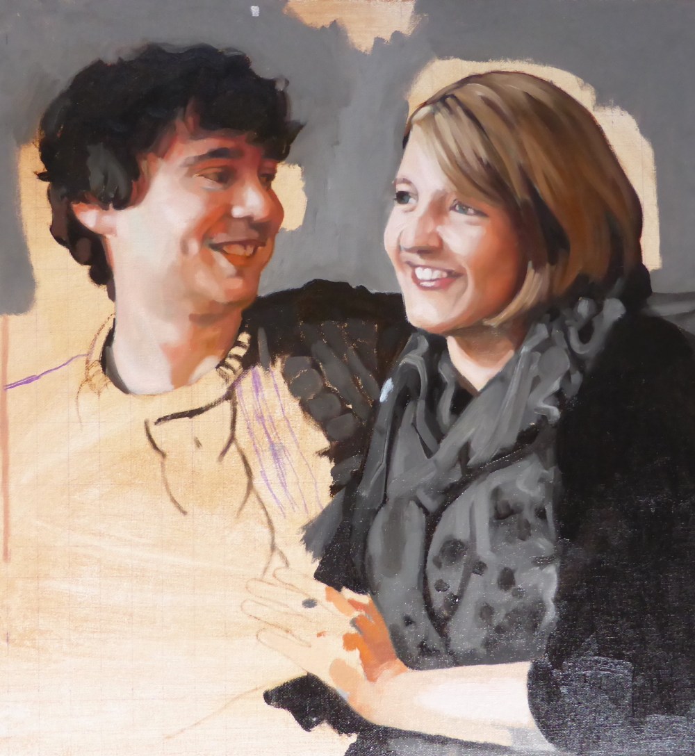
Anna and Simon portrait
Posted on September 21, 2017
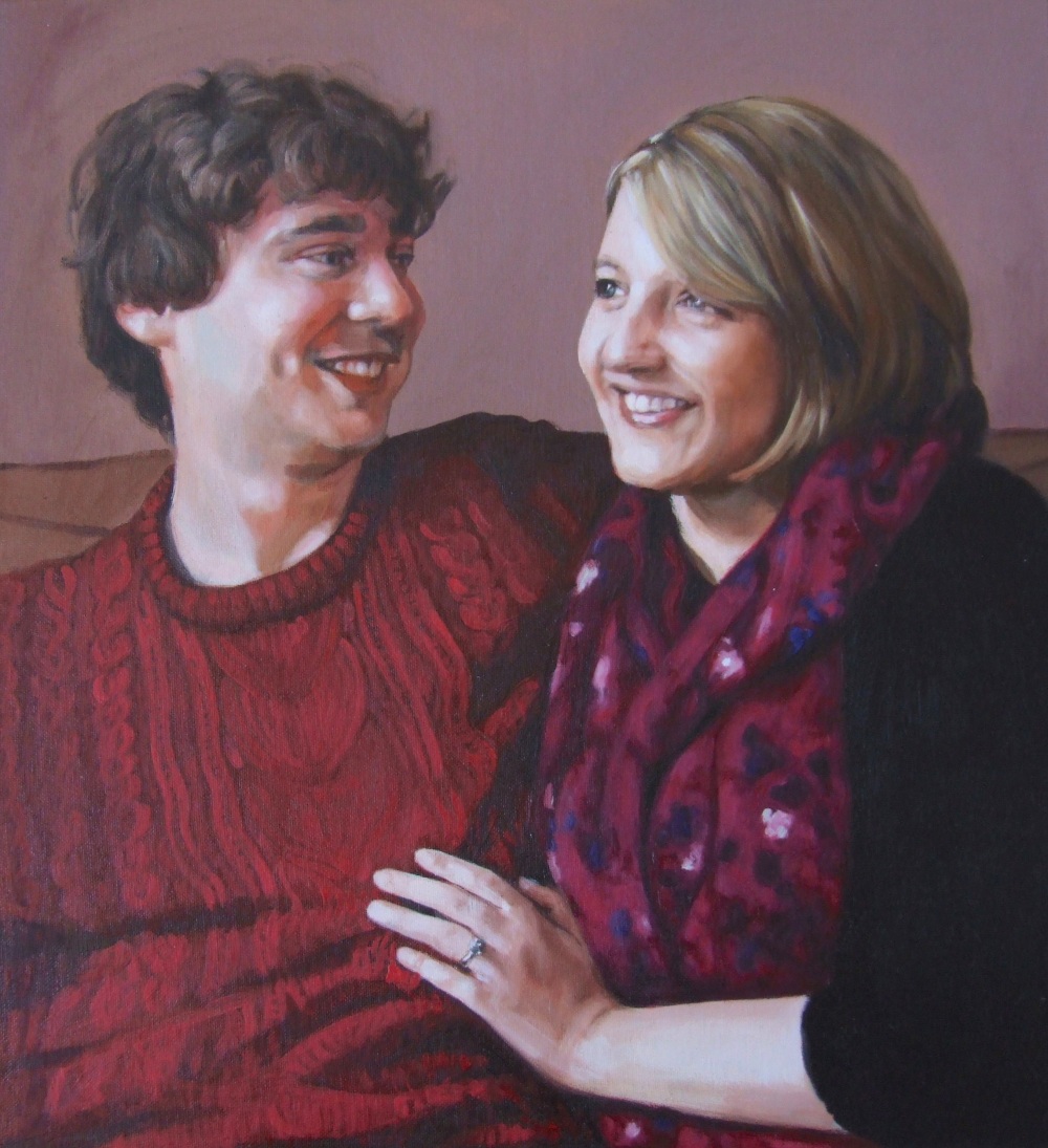
Anna and Simon final version
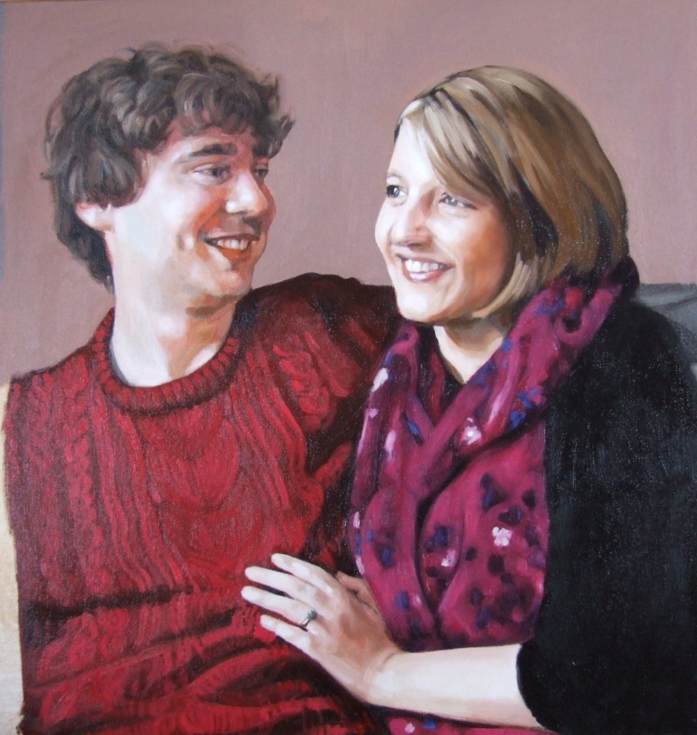
Anna and Simon progress 3 – refining details and adding glazes for depth. I was trying to be economical about the details of Simon’s jumper
Anna and Simon progress 2 – here I have blocked in all the areas of colour, like a ‘dead layer’
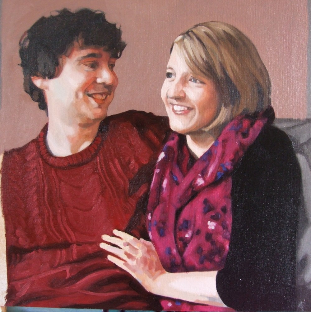
Anna and Simon progress 1- at this stage I abandoned the grisaille and worked colours straight onto the canvas
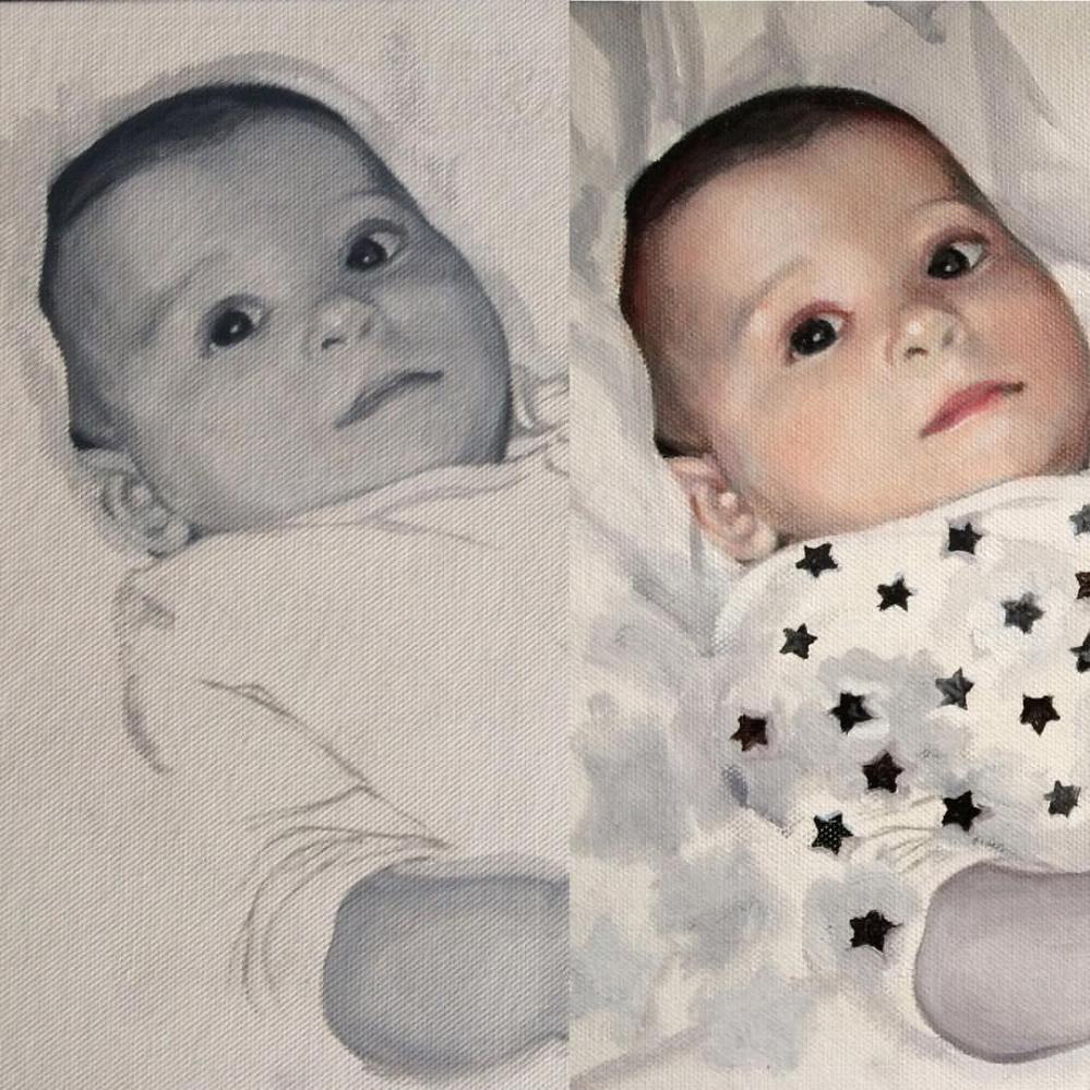
Here is a double portrait I worked on from a photo, to give an example of the process. I originally painted Anna in a grisaille, and went over the face in colour, having changed tack and wanting concentrate on a single opaque colour layer. It was worked into over a few sessions with additional glazes of colour.
In contrast I painted Simon’s face in colour directly onto primed canvas. I painted a ‘ground’ (or colour stain) on the canvas first, using a couple of coats of acrylic Burnt Umber. You can also see where I drew the grid. I had to leave some of the background unpainted so I could still follow the gridlines! It was one of those rare occasions where I was able to get the drawing right on the first attempt.
When the drawing doesn’t work I can spend many hours going back over the painting, needlessly, because if the drawing was all correct in the first place it wouldn’t have been a problem. Many bad experiences trying to fix paintings like this led me to use the grisaille method, because that is a great way of ensuring the drawing is right before attempting colour.
When I say drawing I’m talking about drawing with the paint. I’ve written about this before, especially here regarding the utmost importance of getting the drawing right first. Drawing is all of painting – figurative painting that is. That’s why even though I trained as a sculptor I could try painting portraits, because I had done a lot of drawing already. Working to commission means I need to make sure there’s no wasted effort.
Portrait of Tom
Posted on September 19, 2017
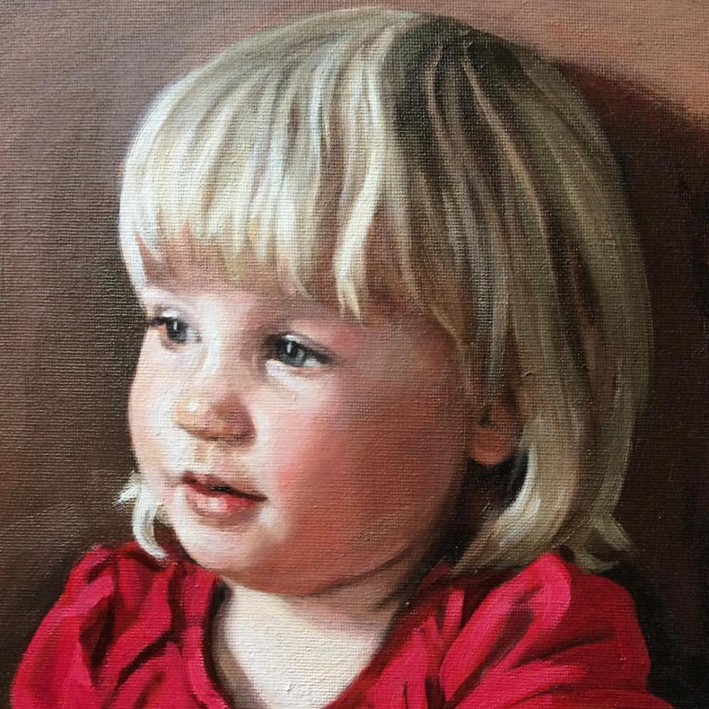
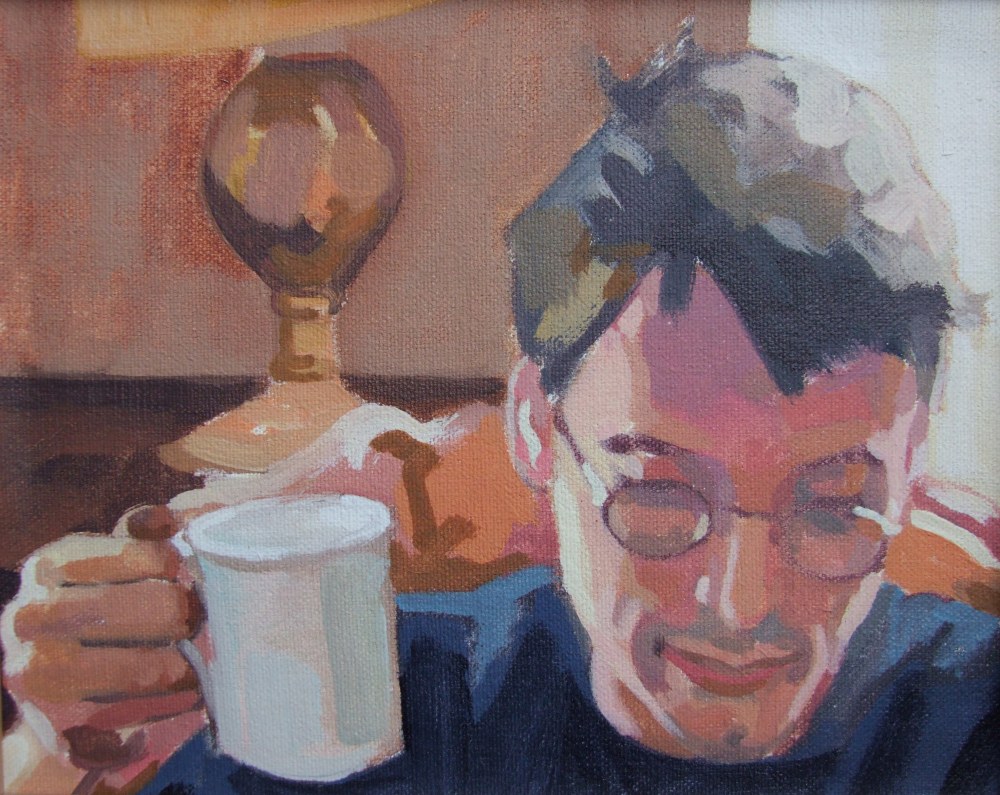 This is a portrait I painted of my brother Tom a few years ago, and I wanted to share it as I love the composition. I don’t know if its obvious but he’s reading, and enjoying a cup of tea at home. I feel the composition of the painting has a compactness to it, whilst having three distinct spatial areas – himself in the foreground, the room behind, and the window and world outside. There’s also the added dimension of the other window on his right, shedding light on his hand and cheek. And you could include the space I sat and painted in. I think I spent an hour or so on it and it was a good likeness, so decided to leave it as it was.
I was quite free with colour at the time and that’s something I want to renew and develop further, as another discipline to complement grisaille painting. I think some of the paintings I made in the years before I learned traditional techniques have a freedom and spontaneity that I don’t want to lose sight of. I’ll share more of these on this blog soon.
I’m hoping to start going a drop-in life class to specifically do some oil sketches and Alla Prima portraits so we’ll see how that goes. As I post this I will be at a portrait class in Topsham, Devon, and I will post again about it. Alla Prima is a technique I’ve had a little instruction in, but I’m feeling the need to go back to Bristol to have a chat with James Scrase about it. I’ve mentioned before but he worked for and trained under Pietro Annigoni, so he knows what he’s talking about! Alla Prima is Italian for ‘first attempt’ and is also called wet-on-wet. You basically try and finish the painting in a sitting, rather than painting layers of oil paint on top of paint that has been allowed to dry. I’d love to do one of Louis Smith’s courses on it as he provides brilliant tuition in all things academic in oil painting and portraiture.
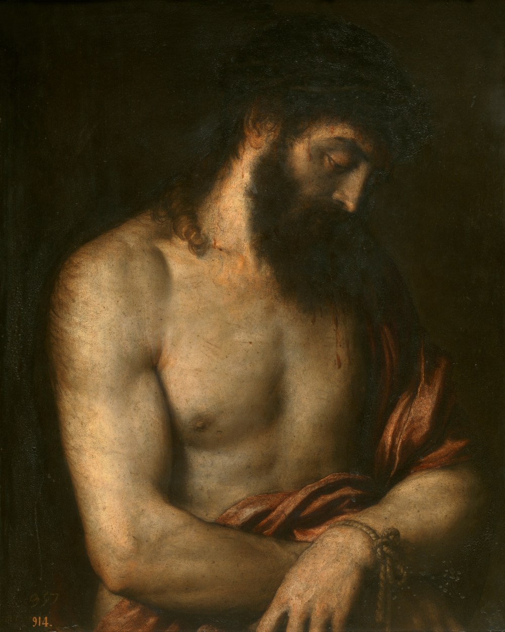
Titian’s Ecce Homo – underpainting and glazing
Posted on August 7, 2017
This beautiful painting by Titian from the Prado Museum is the reason I wanted to try and learn the technique of painting with a grey layer, or underpainting in grisaille, a technique that Titian pioneered.
The flesh appears both taught, as if it was carved out of marble, and fluid at the same time. Titian painted this in Rome, and you can clearly see the influence of Michelangelo in the rendering of the forms and their monumentality. Another interesting fact is that he painted it on Slate. You can see the colour layers as applied over the grisaille and they seem to dance and flicker on the picture plane. It is as if Jesus Christ is illuminated from the inside, and the strokes of glaze glow like flames burning in a furnace. The cloth Christ is wrapped in has an extraordinary quality which maybe I could get to the bottom of by copying.
I don’t paint portraits with this kind of chiaroscuro and extreme passages of light to dark, but maybe I should. Chiaroscuro as seen here feels like it belongs in a different age, but it would be interesting to see if you could do it today, and make it something worth looking at, without pastiche.
These paintings of Christ on his way to the crucifixion were meant as devotional images, painted in such ways to elicit empathy from the viewer. You can feel the depth of Titian’s religious faith in this painting. There is more information on the Museo Del Prado’s website about it.
It feels a bit shallow chatting about it in this way, or that I’ve somehow understood it when I don’t think I have at all. Perhaps the only way to come to terms with it is to try and copy the painting, but the subject is so raw that personally I don’t think I can. I am able to admire this painting, but not as a devotional object and certainly only in a small way appreciate it in the way Titian intended. But as much as being a devotional object it is also celebrated because of the skill and grace he displayed in handling the paint after all. I do believe though that it was his religious faith that gave rise to his superlative technique here.
Jack in Burnt Umber and Titanium White
Posted on July 30, 2017
Jack, oil on canvas. Glazes over a burnt umber underpainting
When I began investigating Old Master techniques I had some brilliant instruction from James Scrase, a portrait painter who was trained by Pietro Annigoni (see his fantastic self portrait). He learned every traditional painting skill from Annigoni, including fresco painting, and he taught me to use Burnt Umber as a wash to draw the portrait first, and then build up layers of slightly opaque ‘half-pastes’ using colour and a little white. Also I was taught to add white with small amounts of blue and then glaze over it with flesh tones. This was one of my first attempts, of my cousin Jack. Of late I have been focussing on a strict grisaille underpainting but looking at this I think I prefer the slightly more fluid quality burnt umber can achieve with thinner washes.
Portrait painting and glazing
Posted on July 24, 2017
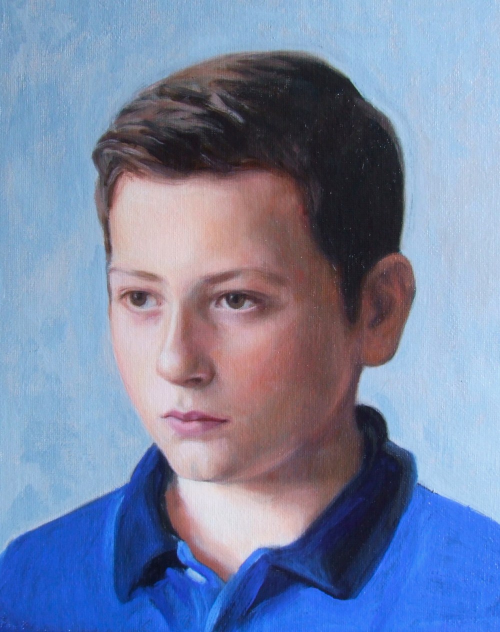
This boy had a head with a great symmetry and the final portrait had an almost hieratic quality. There was a lot of correcting while painting the glazes, but as Philip Guston said, painting should have a moral aspect, and somehow all the effort spent in painting a picture or portrait is stored as a kind of moral worth. The opposite would be something like doing it with a photoshop app and a click of a button.
Here is a recent portrait commission using the grisaille method, where the colour glazes overlap and create an optical effect as the light passes through each layer. This one has around 6-8 layers of oil glaze over the grey underpainting. As I have mentioned before, I use M. Graham’s walnut alkyd medium, which dries quickly enough and doesn’t give me a headache. I was constantly repainting and working into the drawing as I went, and the main problem in the end is the risk of over-working it, so at this stage I decided to call it a day.
The portrait has a rather serious quality that I like. There was a lot of revising and correcting, but the head looks as if it could be carved out of marble. As a sculptor by training I definitely enjoyed painting this head with its beautiful symmetry. It’s one of those things but I would rework it if I could get it back now, but actually I couldn’t because it lives in its own time and I correct it in further paintings. Each painting is part of a long chain of work that link one to the other, and each painting has its own quality, for better or worse. Actually I would have loved to carve a portrait sculpture based on this portrait.
There was a lot of correcting while painting the glazes, because the grisaille was probably not complete at the time of the first glaze. But as Philip Guston said, painting should have a moral aspect, and somehow all the effort spent in painting a picture or portrait is stored as a kind of moral force. The opposite would be something like doing it with a photoshop app and a click of a button. This is absolutely true and you can always sense this in a painting, and in the most subtle way all the effort, all the revisions and alterations, all the agony and effort, and joy, show in the final painting. Philip Guston was a true hero of art.
Revelation with colour glazing
Posted on May 31, 2017
 One of the most important things that has happened to me in all the years I have been portrait painting was going on a course run by Louis Smith in 2014, learning about glazing. Looking at his website I thought this would be about glazing as I understood it where you have a very thin translucent layer of paint and you go over a grey underpainting, or dead layer, like Caravaggio or Ingres. We learned to glaze over an underpainting, but the glazes felt more like ‘half-pastes’ as they were not entirely transparent. Even so it transformed the way I approached colour mixing for portrait paintings, and I learned amazing colour combinations of reds and greens which are now the foundation of my approach to painting a face. I’ll write about them in another blog post. I found out about Louis Smith from Jonathan Jones, the Guardian newspaper art critic.
On the course, which was over a weekend, we used a monochrome print from another portrait and went step by step through the process of building up areas of colour, slowly refining and blending each.
Devon open studios
Posted on February 28, 2017
I’ this portrait for promotional material for Devon open studios in September 2017 #portrait #portraitpainting #contemporaryrealism #art #oilpainting #devonartistnetwork #devonopenstudios (at Kenton, Devon)
Colour glazing – 3rd glaze over the underpainting
Posted on November 10, 2016
The third glaze has been painted with veils of oil paint over the grey or grisaille underpainting. I did some experimenting with the background here, but ended up painting it out in further glazes.
3rd glaze done. Still a few more needed #underpainting #grisaille #portrait #portraitpainting #oiloncanvas #art #painting #fineart #devon #glaze #contemporaryart #contemporaryrealism #oilpainting
