matt harvey art
Portrait paintings, art demonstrations, figurative painting, landscapes
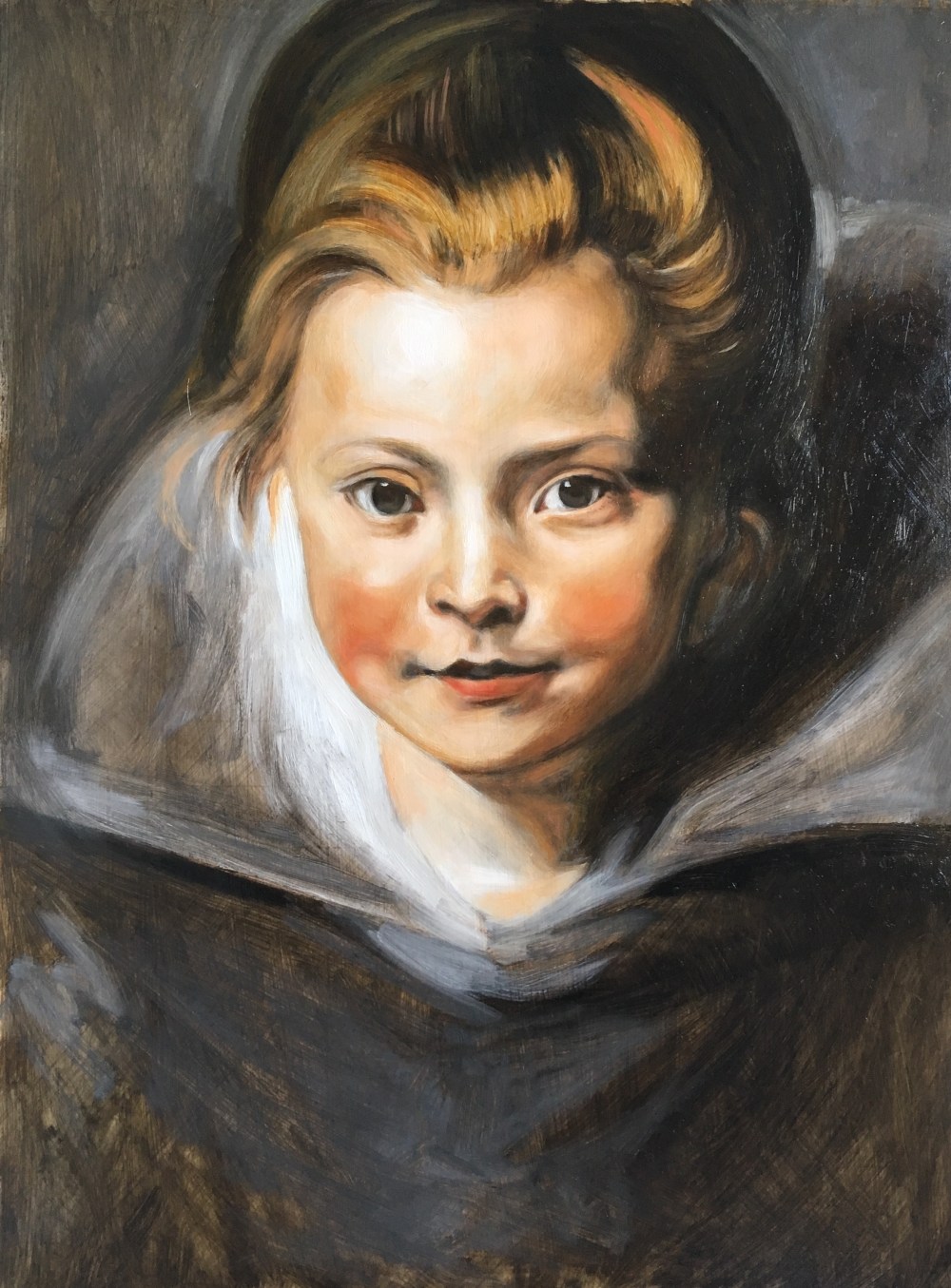
Portrait of a young girl after Rubens, 2nd glaze!
Posted on March 5, 2019
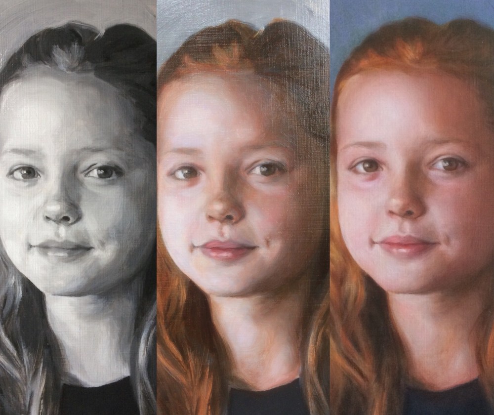
Hi there, I’ve been looking forward to doing this for a while, and now I’ve completed the films of both the glazes. Here is a photo of before and after the 2nd glaze.
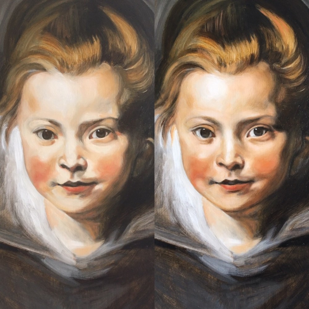
from the 1st to 2nd glaze
So this is the painting again showing the change from the 1st to the 2nd glaze, and then following on from that you can see the 2nd glaze next to the original. The 2nd glaze took about 90 minutes, and you can see it in real time on Patreon, and off camera I spent another 10 minutes painting in the dark lines around her eyelids and some details of eyelashes. I feel this is close to the working method of Rubens, and now I’ve done it I think I can get even closer and work even more efficiently. I’m really looking forward to making some more copies from Rubens, Van Dyck, Velasquez and Caravaggio. Each time is an amazing learning experience and I have gained so much from it. I will still work on this painting a bit more but have to stop for now due to time restrictions. I didn’t really do much to the mouth which is OK, but I would model some of the transitions around there next time. In terms of the film I’ll leave it for now because I think it shows you how to achieve these results. It has been a revelation for me just working in this very limited palette, and I’m looking forward to using it in my own work in the future. If you would like to see how I did it in real time you can see it all on patreon.
about 6 hours work to get to this point. I painted the underpainting in 2 passes in Raw Umber, then 3rd pass using more Ivory black, and then 2 separate colour glazes using Vermillion, Yellow Ochre, Black and White, and some Burnt Umber
Painting portraits with Sap Green
Posted on May 14, 2018
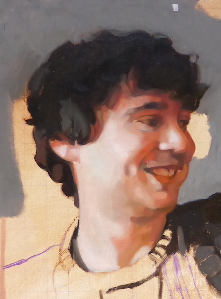
This was the first stage of the portrait, painted in approximately 2 hours. It is difficult to see the Sap Greens but they are all there mixed in with the reds. Without the sap greens the reds would be far too warm.
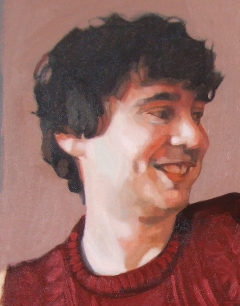
After the second glazes have gone on.
Detail of the final painting
Sap Green is a generic name for a warm, deep green. Perhaps its difficult to tell, but the above detail of a portrait painting was made possible with the invaluable Sap Green and even though impossible to see really its all over it! Sap Green cools reds. Red and green are complementary colours so together they neutralise each other. People generally aren’t that green, but they are greener than you might imagine.. skin in shadow is invariably greenish in hue. Maybe greenish is too strong a word (it might not be a word) but generally when I paint shadows there are always greens silently working their magic.
There a lots of different Sap Greens made by different oil paint manufacturers as each develops their paints in their own way. I love Michael Harding’s oil paints and I love his Sap Green, but it doesn’t have the particular warm quality I am generally after when I reach for it, in the context I want it. It is good for cooler shades and hues but I haven’t yet been bold enough to use it in a portrait. Michael Harding’s website says that it would be ideal for the plein air painter which is true.
The Sap Green I worked with when I studied with Louis Smith was one of the warmest greens I had painted with (Lukas studio oils), and I discovered mixing with Alizarin Crimson is brilliant for cooling down reds in shadow tones. It served this purpose in the portrait painting shown. I painted this shortly after I did a glazing workshop with Louis Smith in Manchester and it was a revelation for me. The sap green I generally use is the Winsor and Newton Winton variety, but I’m sure there are a lot of other ones out there including the Lukas one. I have just been going through what I already have in my paints box. I also have an old tube of water-mixable Duo Aqua sap green which I can use as its also warmish.
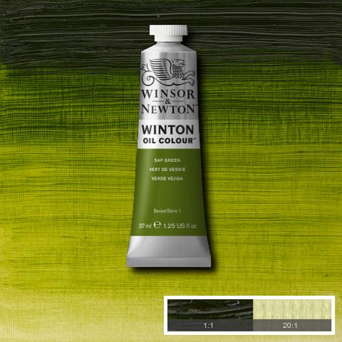
Sap green was originally a lake pigment made from unripe Buckthorn berries. This isn’t the best quality paint but its the right hue for my work. I just have to add a little more when mixing with better quality colours as they have more pigment in them.
The one colour I can’t live without at the moment is sap green. What a discovery that was! All credit to Louis Smith for introducing me to it back when I was starting to seriously paint portraits. For me all skin tones seem to flow from there when this green is mixed with alizarin crimson or cadmium red. In my case I generally add both, or start with a dark mix of crimson and sap green. I have found myself recently mixing a deep colour using these two and working from there on the palette in various directions, adding white here, blue or yellow there and seeing where I end up.
If I mix Sap Green and a red for a shadow and it’s still too warm I mix in a bit of blue. It could be any blue but the blue I have on my pallet is Ultramarine. This again is a warm blue, but its cool enough to dampen the fires of Cadmium Red or Alizarin Crimson. I have to be careful not to add too much blue or it overpowers the other colours.
Honestly I think I would struggle to paint a portrait without it these days. The description on the Winsor and Newton website says Sap Green is a bright mid-range green with a yellow undertone. Originally Sap Green was a lake pigment made from unripe Buckthorn berries. Here is a picture of some Buckthorn, also once used as a ‘purgative’ which sounds nice. Perhaps its a good thing its not used anymore as its very toxic.
My palette is a fairly warm one when seen all laid out, and I’m sure at any time I could dispense with some of the colours. I generally don’t use umbers (browns) in my palette except when I’m doing drawing or underpainting. I have found its convenient to have a bit when I’m painting hair, but I usually mix my browns from various other colours, typically starting with a red and sap green together. Here is a video starting at the moment I have prepared a glaze mix on my palette using these colours, and I use it for the hair:
When mixing colours I’m always back and forth, correcting and adjusting as I go. I never get it right first time but have come to see it as a process of guesswork where I try a colour, see it in context, and then try again. I was never taught any formal method like you might see on an academic painters palette. Sometimes when I have a very warm hue for a highlight, where I have used a lot of red, it can work very well to just add some blue or a sharp green like Viridian. I want to try and get the values to remain the same with the two colours, but the cooler hue bounces off the warmer and creates the subtlest shadows. It still takes a bit of time when painting to get to the point where I can find this balance, and often I do it by accident. That is part of the pleasure of painting though, where we are constantly surprising ourselves.
Portrait painting step by step, glazing over grisaille
Posted on November 28, 2017

I’ve nearly finished this portrait painting. It’s had 5 glazes over the initial underpainting. This picture shows the grisaille, the first glaze (which I filmed and is on youtube please click here to view) and then the 5th glaze which is almost the last one. I still intend to go over the hair and background again, amongst other things. The background was a dark green the glaze before this! It still shows through and gives it a nice depth. The lovely thing about working in this way is that everything can change with just one glaze. This portrait has been through many stages while painting each glaze. Sometimes I misjudged a colour or hue or the values of light and dark weren’t right. In each case I was able to correct the painting in the following glaze, either lightening or darkening.
I love painting highlights in a portrait so I guess I overdid it somewhat and the lightest light ended up too bright by the 4th glaze, but in the latest glaze which you can see here I went over the whole portrait again with a darker glaze just to soften it a little. In areas where it was too dark again I just used a dry brush to pick off the paint and continue blending. I can always keep adjusting a portrait at a late stage if the client commissioning the portrait feels there is something that needs changing.
It is surprising just how close to the original grisaille the painting is, even when its possible to see how much refining and drawing has gone into the portrait over all the glazes. Its strange to see later very finished versions of a portrait where the grisaille is like a ghost, still very present but disguised under veils and glazes of colour. The grisaille functions like an anchor that holds the structure of the portrait in place, and many many changes can occur but the painting is still held firmly together by the initial drawing. Its the main reason I started learning how to paint using the grisaille method.
I always use the same mixes when I paint portraits using the grisaille method. Here is another example video in my Bouguereau copy. All my glazes start with various quantities of the same colours: Alizarin Crimson, Cadmium Red, Raw Umber and Sap Green (a warm Sap Green). All the later glazes are mixed with these colours but with additions, like Ultramarine Blue to cool it down, a bit of Titanium White to make a velatura or semi opaque glaze, some Cadmium Orange.. but always hovering around the same original mix. Of course this depends on the commission and the sitter.
Portrait painting in 3 stages: The grisaille, the 1st glaze, and the 5th glaze. The glazing process is the same each time, and the portrait just gets steadily refined as it progresses
Portrait painting video demonstration
Posted on November 21, 2017
My latest film, another shot while putting on the first glaze over a grisaille underpainting, is now finished and on youtube. Here’s a link to the first installment:
It’s been an interesting experience filming myself working, and quite strange to watch it back as I’ve never seen myself working before. I wanted to make an authentic account of working with this method, and create the film I was looking for when trying to learn how to do it myself. Of course thats a process that never stops!
New video on youtube of the grisaille and glazing process
Posted on October 26, 2017
I wanted to share the magical transformation an oil painting undergoes, glazing oil colour over a monotone underpainting.
I filmed myself painting the glaze and velatura over this portrait for one hour, in 3 short videos – this being the first. Its the first glaze and there will be a few others to finish the portrait, but this video shows the process, and I hope shows why I find it such a rewarding method to work with. It shows the dramatic results you can achieve in a relatively short amount of time.
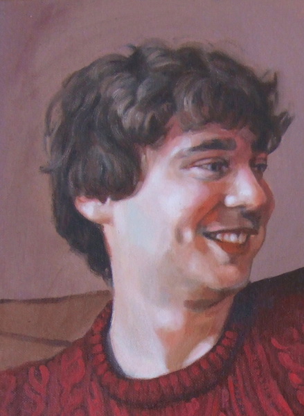
Devon open studios
Posted on February 28, 2017
I’ this portrait for promotional material for Devon open studios in September 2017 #portrait #portraitpainting #contemporaryrealism #art #oilpainting #devonartistnetwork #devonopenstudios (at Kenton, Devon)
Portrait painting in stages
Posted on January 12, 2017
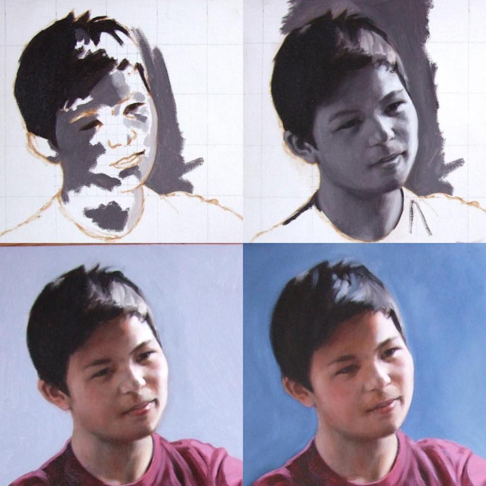
This is an early example and one of my first efforts at glazing over a grisaille underpainting, a portrait I painted of Dai, in stages. You can see the grid system I used to copy the original photograph reference. I don’t have a strict methodology of working from darkest darks to lightest lights that you can sometimes read about on academic portrait painting sites, and work intuitively. The painting doesn’t use so many glazes, maybe 3 or 4, but at the time I felt it had a nice quality and I left it. #contemporaryart #realism #underpainting #art #portrait #grisaille #underpainting #portraitpainting
