matt harvey art
Portrait paintings, art demonstrations, figurative painting, landscapes
Short clip of my latest painting
Posted on May 12, 2024
I love drawing and painting the human figure. I see these paintings as sculptures though really, they are prequels to carvings.
I am wary of interpretation with these paintings. For me, in and of themselves they show the beautiful symmetry of the human form as it reflects the macrocosmic universe.
Portraits in a landscape
Posted on December 12, 2019

Rockpooling, acrylic and oil on canvas
I can’t take too much credit for the composition of this one which was originally photographed on the Cornish coast, one of my favourite places! I like the dribble of seawater coming off the net on the left. Its a good dribble. This was another painting that I began in acrylics and finished in oil paint, and its a method I am going to return to. My dilemma is that there is nothing more pleasurable than pushing oil paint around a painting surface and acrylics lack this quality as they dry so quickly. I learned how to paint using oil paints and still feel acrylics are not the most natural method for me. They are dry before you know it and I have always found this difficult to manage. But then building them up slowly in layers has other advantages. When I was younger I wanted to draw like Giacometti and used biros and gouache paint to build up meshes of lines and daubs, and that is echoed in how I have been glazing acrylic paint when I use it. Because I don’t want to commit too much as the paint won’t let me manipulate it before it dries, I use thin layers of acrylic to slowly render the form.
I have mentioned I find this similar to carving. Inverted carving, as it is adding and not taking away. But each line or glaze of paint serves to refine and tighten the drawing, but unlike carving the mistakes add to the whole effect and in the end strengthen the drawing. When I carve stone every ‘mark’ with the chisel has to count. Every cut moves the sculpture closer to completion.
New Caravaggio technique video – underpainting stage
Posted on February 27, 2019
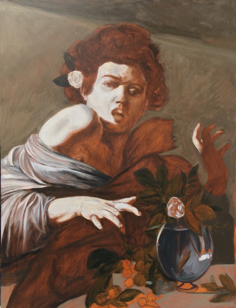
Underpainting stage for Boy Bitten by a Lizard, after Caravaggio
Hi there, I’ve just posted this on youtube. Its going to be one of 2 videos there but 6 in total on patreon where they are also unedited and in real time. This video is cobbled together from 3 real time films, about 3 hours painting in all. I loved copying this painting and learned so much. Looking forward to the next one! I still have to finish the Rubens copy I’m doing as well. And the glazing for this painting. After that Velasquez and Van Dyck.. all the Baroque greats. Thank you for looking!
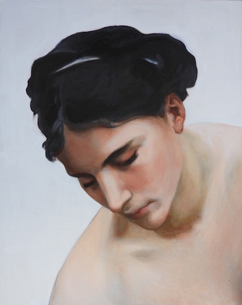
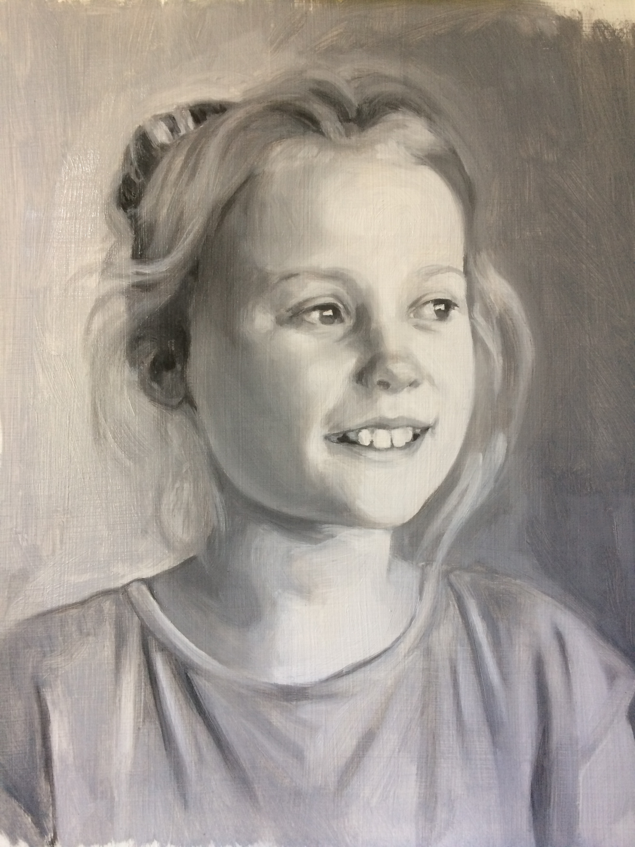
Portrait of a young girl after Rubens, grisaille underpainting
Posted on February 16, 2019

Grisaille of Portrait of a young girl after Rubens
I’ve been finishing the grisaille for this portrait painting copy off camera, which is relaxing! I worked on it for another 2 hours roughly, mainly adding pure black here and there and adjusting the shadows. There were a few areas where I sharpened the drawing, but its a fine balance between trying to work in a way that is possibly similar to Rubens and also precise in the copying. I have used fairly loose brushwork around the painting, particularly on her collar and black dress, because it doesn’t feel right copying a fluid spontaneous brushmark exactly.
Better I feel to approach it with some of the spontaneity of the artist. Even though it might not be an exact copy, its an interpretation of the artists work and at the same time an attempt to understand aspects his process. There are many many factors involved in this though. Things like size of brushes, mediums, painting surface etc., all create the impression of the painting, and here I am perhaps guilty of a lack of rigour. It is still possible just to approach something that may resemble Rubens’ working method even though in this painting my brushes mediums and painting surface are different.
I have honestly loved painting this copy so far, and have gained a much deeper appreciation of Rubens the artist. I have always loved painting with grisaille, and Raw Umber and Titanium White is very beautiful together. Painting the black today has finished this stage, and I can now make it available as a print so that anyone who may want to try and glaze it themselves can have a go.
Prints are available in my etsy shop.
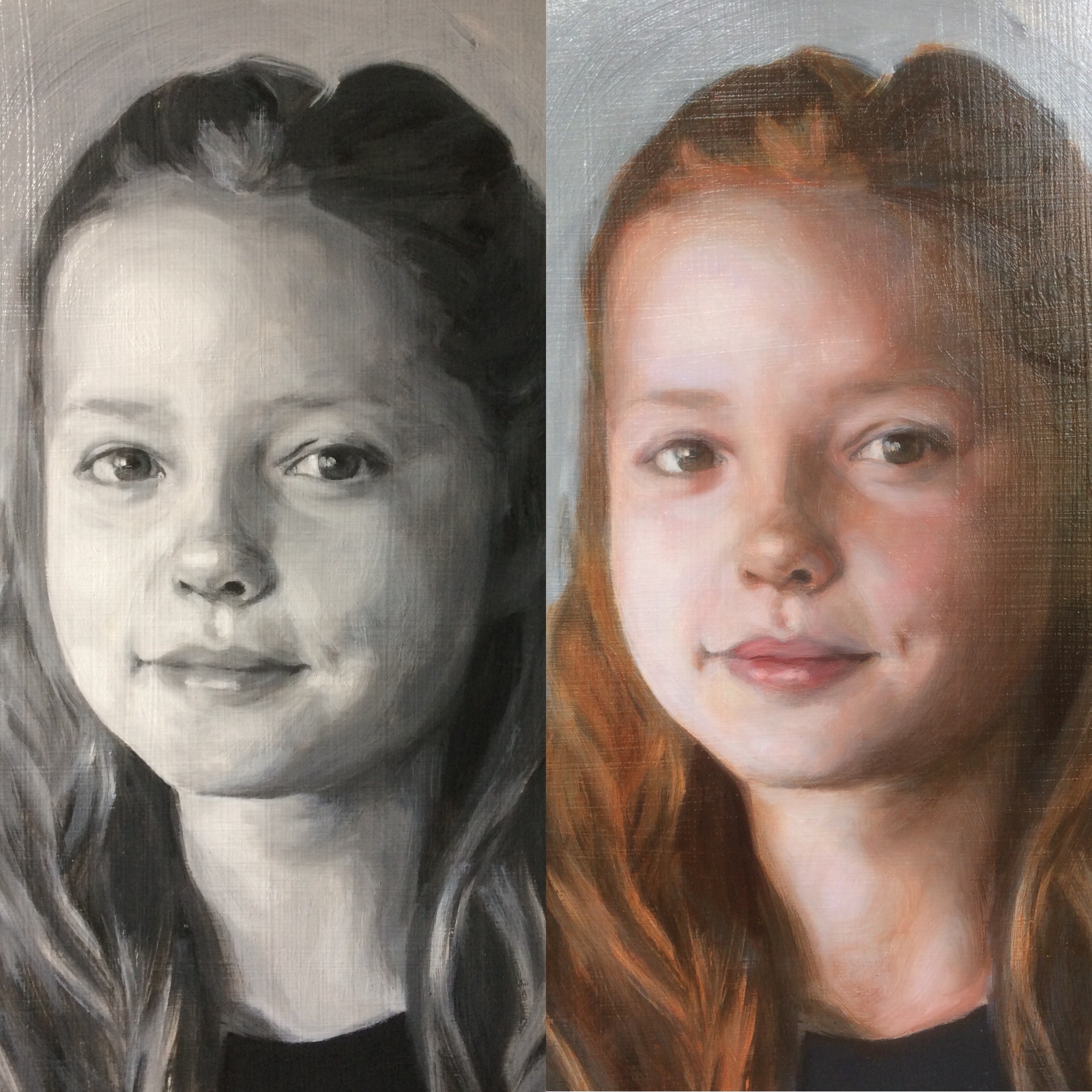
Here is the grisaille next to the reference. Its difficult to pinpoint what isn’t quite working here, but things usually get resolved with the colour glazes. I wanted to put some darker shadows around her mouth because you can see this underpainting showing through in the original. Hopefully then I will be able to create the same effect. Looking at the glazing on the original I think he’s used a mix of Vermilion and probably Yellow Ochre, and you can see the almost patchy way he has applied various combinations of these pigments around her face: her temple, cheeks, forhead etc. He has also used something more like Vermilion and white to create a pink which can also be seen here and there. I hope to be able to show that process or something like it when I film myself painting the glazes soon. I will only really know when I have tried it. You can see all the highs and lows of the glazing in real time on my patreon page, patreon.com/mattharveyart.

Original painting by Peter Paul Rubens and grisaille underpainting copy
Video of 1st glaze on underpainting ‘After Bouguereau’
Posted on June 29, 2018
I have just finished the first glaze in oil paints on my grisaille underpainting. This short video project was all about trying to work out how Bouguereau made his paintings, something I have often wondered about.
His works have a particular translucent quality and it was my mission to try and fathom the processes behind this. I think the only real way one can do that is to use the glazing technique over a grisaille. Of course you may get an idea of how it was done using different painting methods or materials but I wanted to stick as closely as possible to his generally agreed method of glazing.
The only real way to understand another artist’s technique is to try and do it oneself. I have not copied many works in my art practice but this has been an invaluable exercise in understanding glazing generally. That is my real and only goal actually; to find a way to develop my own practice with glazing in my paintings. But in the process I hope to leave a course of videos that might enable anyone to achieve similar results to Bouguereau with a little practice. I feel that actually this technique is deceptively simple, but I am still trying to work out the most efficient way of doing it. If you look at Caravaggio’s paintings you can see that once the underpainting was done it was a small step to add some colour, although being able to do it is another matter entirely.
I still feel that anyone can begin to approach painting in the same way as these artists, it just needs practice.
This piece obviously needs some more work to get close to Bouguereau’s, but its only the first glaze, so I’m really looking forward to doing the second glaze and more. I’m thinking of getting a print of the grisaille and trying all over again, and that way I think I might actually crack it, based on lessons learned so far. It was never about making a perfect copy, only trying to come close to the original so as to learn the process generally.
I’m still getting used to filming myself working. The hardest thing about it is making room for the painting and the palette, where I would normally be much closer to the painted surface. I normally spend the whole time panicking!
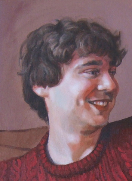
Painting portraits with Sap Green
Posted on May 14, 2018
This was the first stage of the portrait, painted in approximately 2 hours. It is difficult to see the Sap Greens but they are all there mixed in with the reds. Without the sap greens the reds would be far too warm.
After the second glazes have gone on.
Detail of the final painting
Sap Green is a generic name for a warm, deep green. Perhaps its difficult to tell, but the above detail of a portrait painting was made possible with the invaluable Sap Green and even though impossible to see really its all over it! Sap Green cools reds. Red and green are complementary colours so together they neutralise each other. People generally aren’t that green, but they are greener than you might imagine.. skin in shadow is invariably greenish in hue. Maybe greenish is too strong a word (it might not be a word) but generally when I paint shadows there are always greens silently working their magic.
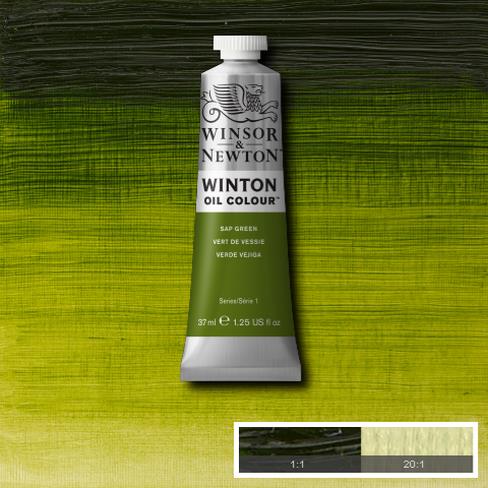
There a lots of different Sap Greens made by different oil paint manufacturers as each develops their paints in their own way. I love Michael Harding’s oil paints and I love his Sap Green, but it doesn’t have the particular warm quality I am generally after when I reach for it, in the context I want it. It is good for cooler shades and hues but I haven’t yet been bold enough to use it in a portrait. Michael Harding’s website says that it would be ideal for the plein air painter which is true.
The Sap Green I worked with when I studied with Louis Smith was one of the warmest greens I had painted with (Lukas studio oils), and I discovered mixing with Alizarin Crimson is brilliant for cooling down reds in shadow tones. It served this purpose in the portrait painting shown. I painted this shortly after I did a glazing workshop with Louis Smith in Manchester and it was a revelation for me. The sap green I generally use is the Winsor and Newton Winton variety, but I’m sure there are a lot of other ones out there including the Lukas one. I have just been going through what I already have in my paints box. I also have an old tube of water-mixable Duo Aqua sap green which I can use as its also warmish.
Sap green was originally a lake pigment made from unripe Buckthorn berries. This isn’t the best quality paint but its the right hue for my work. I just have to add a little more when mixing with better quality colours as they have more pigment in them.
The one colour I can’t live without at the moment is sap green. What a discovery that was! All credit to Louis Smith for introducing me to it back when I was starting to seriously paint portraits. For me all skin tones seem to flow from there when this green is mixed with alizarin crimson or cadmium red. In my case I generally add both, or start with a dark mix of crimson and sap green. I have found myself recently mixing a deep colour using these two and working from there on the palette in various directions, adding white here, blue or yellow there and seeing where I end up.
If I mix Sap Green and a red for a shadow and it’s still too warm I mix in a bit of blue. It could be any blue but the blue I have on my pallet is Ultramarine. This again is a warm blue, but its cool enough to dampen the fires of Cadmium Red or Alizarin Crimson. I have to be careful not to add too much blue or it overpowers the other colours.
Honestly I think I would struggle to paint a portrait without it these days. The description on the Winsor and Newton website says Sap Green is a bright mid-range green with a yellow undertone. Originally Sap Green was a lake pigment made from unripe Buckthorn berries. Here is a picture of some Buckthorn, also once used as a ‘purgative’ which sounds nice. Perhaps its a good thing its not used anymore as its very toxic.
My palette is a fairly warm one when seen all laid out, and I’m sure at any time I could dispense with some of the colours. I generally don’t use umbers (browns) in my palette except when I’m doing drawing or underpainting. I have found its convenient to have a bit when I’m painting hair, but I usually mix my browns from various other colours, typically starting with a red and sap green together. Here is a video starting at the moment I have prepared a glaze mix on my palette using these colours, and I use it for the hair:
When mixing colours I’m always back and forth, correcting and adjusting as I go. I never get it right first time but have come to see it as a process of guesswork where I try a colour, see it in context, and then try again. I was never taught any formal method like you might see on an academic painters palette. Sometimes when I have a very warm hue for a highlight, where I have used a lot of red, it can work very well to just add some blue or a sharp green like Viridian. I want to try and get the values to remain the same with the two colours, but the cooler hue bounces off the warmer and creates the subtlest shadows. It still takes a bit of time when painting to get to the point where I can find this balance, and often I do it by accident. That is part of the pleasure of painting though, where we are constantly surprising ourselves.
Portrait painting step by step, glazing over grisaille
Posted on November 28, 2017

I’ve nearly finished this portrait painting. It’s had 5 glazes over the initial underpainting. This picture shows the grisaille, the first glaze (which I filmed and is on youtube please click here to view) and then the 5th glaze which is almost the last one. I still intend to go over the hair and background again, amongst other things. The background was a dark green the glaze before this! It still shows through and gives it a nice depth. The lovely thing about working in this way is that everything can change with just one glaze. This portrait has been through many stages while painting each glaze. Sometimes I misjudged a colour or hue or the values of light and dark weren’t right. In each case I was able to correct the painting in the following glaze, either lightening or darkening.
I love painting highlights in a portrait so I guess I overdid it somewhat and the lightest light ended up too bright by the 4th glaze, but in the latest glaze which you can see here I went over the whole portrait again with a darker glaze just to soften it a little. In areas where it was too dark again I just used a dry brush to pick off the paint and continue blending. I can always keep adjusting a portrait at a late stage if the client commissioning the portrait feels there is something that needs changing.
It is surprising just how close to the original grisaille the painting is, even when its possible to see how much refining and drawing has gone into the portrait over all the glazes. Its strange to see later very finished versions of a portrait where the grisaille is like a ghost, still very present but disguised under veils and glazes of colour. The grisaille functions like an anchor that holds the structure of the portrait in place, and many many changes can occur but the painting is still held firmly together by the initial drawing. Its the main reason I started learning how to paint using the grisaille method.
I always use the same mixes when I paint portraits using the grisaille method. Here is another example video in my Bouguereau copy. All my glazes start with various quantities of the same colours: Alizarin Crimson, Cadmium Red, Raw Umber and Sap Green (a warm Sap Green). All the later glazes are mixed with these colours but with additions, like Ultramarine Blue to cool it down, a bit of Titanium White to make a velatura or semi opaque glaze, some Cadmium Orange.. but always hovering around the same original mix. Of course this depends on the commission and the sitter.
Portrait painting in 3 stages: The grisaille, the 1st glaze, and the 5th glaze. The glazing process is the same each time, and the portrait just gets steadily refined as it progresses
Portrait painting video demonstration
Posted on November 21, 2017
My latest film, another shot while putting on the first glaze over a grisaille underpainting, is now finished and on youtube. Here’s a link to the first installment:
It’s been an interesting experience filming myself working, and quite strange to watch it back as I’ve never seen myself working before. I wanted to make an authentic account of working with this method, and create the film I was looking for when trying to learn how to do it myself. Of course thats a process that never stops!
Portrait painting commission – grisaille layer waiting for the first glaze
Posted on November 2, 2017
This is the first stage, the grisaille. I will be posting a video of the first glaze in a few days. The sitter is the sister of the earlier portrait posted. I will be able to continue modelling the forms as I glaze. I have talked about this elsewhere but the drawing never stops while glazing is taking place, each glaze revealing new areas to develop in the painting. The grisaille is not perfectly formed but is enough to form an anchor for the rest of the painting. Hue or colour is in itself drawing and form and all the imperfections and flat areas are transformed with the glazes.
There are many different ways to make a grisaille underpainting; with black and white as here, or you can make a ‘verdaccio’ which is monotone green and white, or burnt umber and whites. In the future I would like to do some paintings with very limited palettes, like the Zorn palette which has Yellow Ochre, Black, red and white. Or like the one I used at school, Burnt Sienna, Cobalt Blue and White. Just thinking about it is so nostalgic and I fondly remember swimming in warm and cool tones back then.
Portrait of Ruby, grisaille painted in oils, Titanium White and Ivory Black
Oil painting demonstration: Glazing over grisaille – Portrait of Amy
Posted on October 23, 2017
This is Amy’s portrait, glazed in oil paints. I filmed myself doing this and it will shortly be on my youtube channel. Its still in the early stages, and when this layer is dry I’ll go over it again, up to 3 or 4 times. I don’t know if I’m going to film those other stages – they might be a bit boring as its just a lot of tinkering. In the early stages its quite dramatic how a few glazes of colour changes the grisaille into a very nearly finished portrait. Stay tuned!
Before and after glazing over grisaille. The first oil glaze took roughly an hour to complete. The grisaille underpainting was painted using Titanium White and Ivory Black oil paints, and the glazes are mixed from Alizarin Crimson, Raw Sienna, Cadmium Red, Titanium White, Ultramarine Blue and Sap Green, to name a few
Anna and Simon portrait
Posted on September 21, 2017
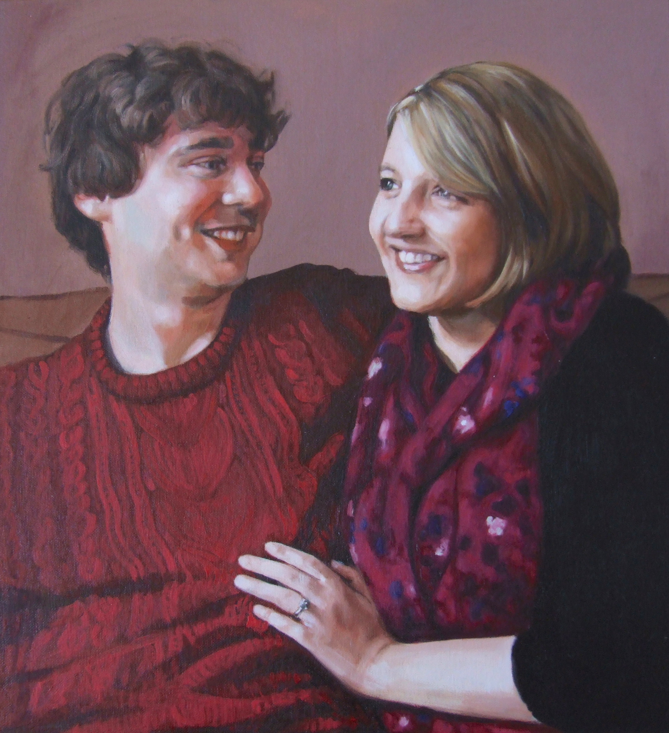
Anna and Simon final version
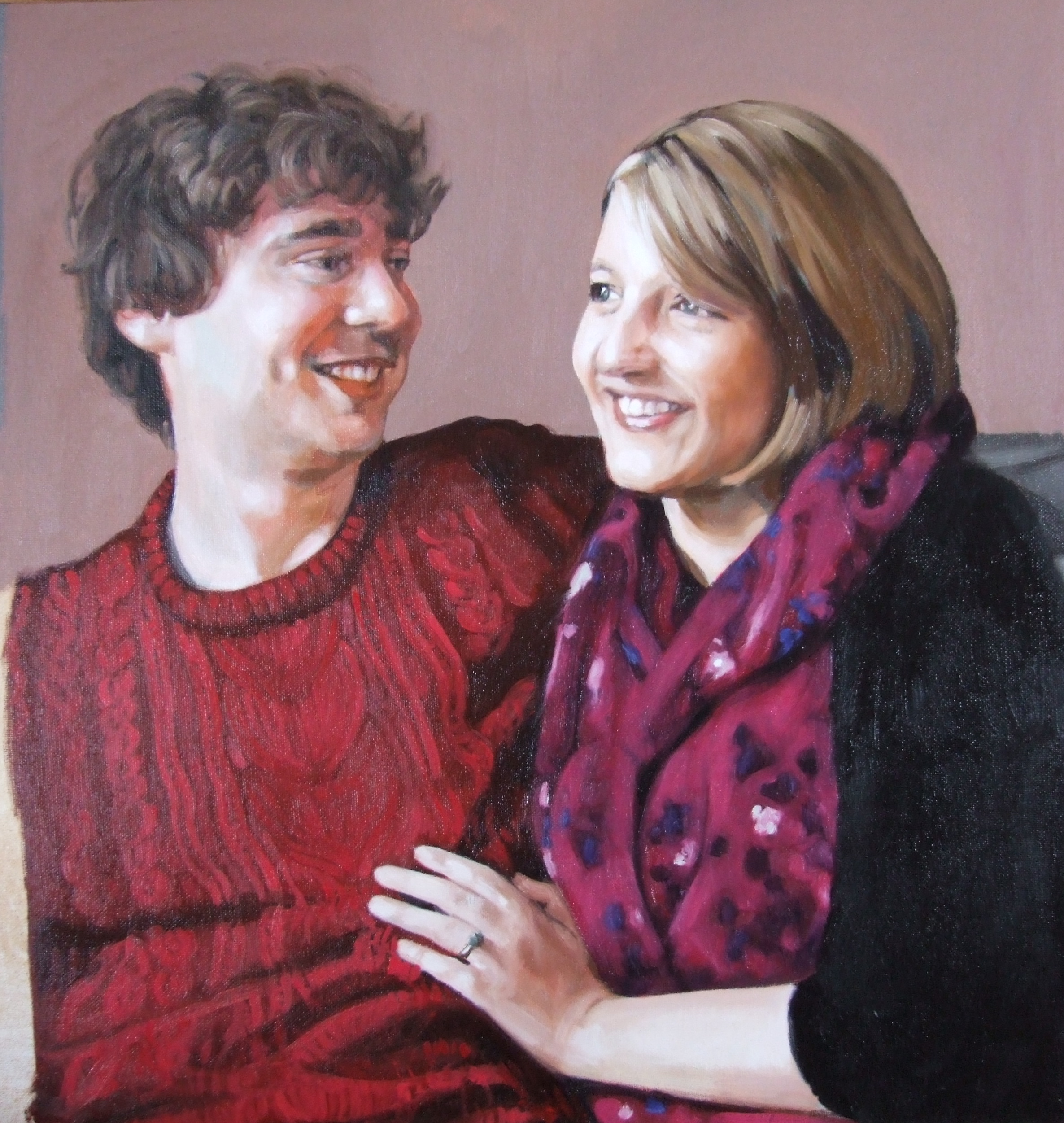
Anna and Simon progress 3 – refining details and adding glazes for depth. I was trying to be economical about the details of Simon’s jumper
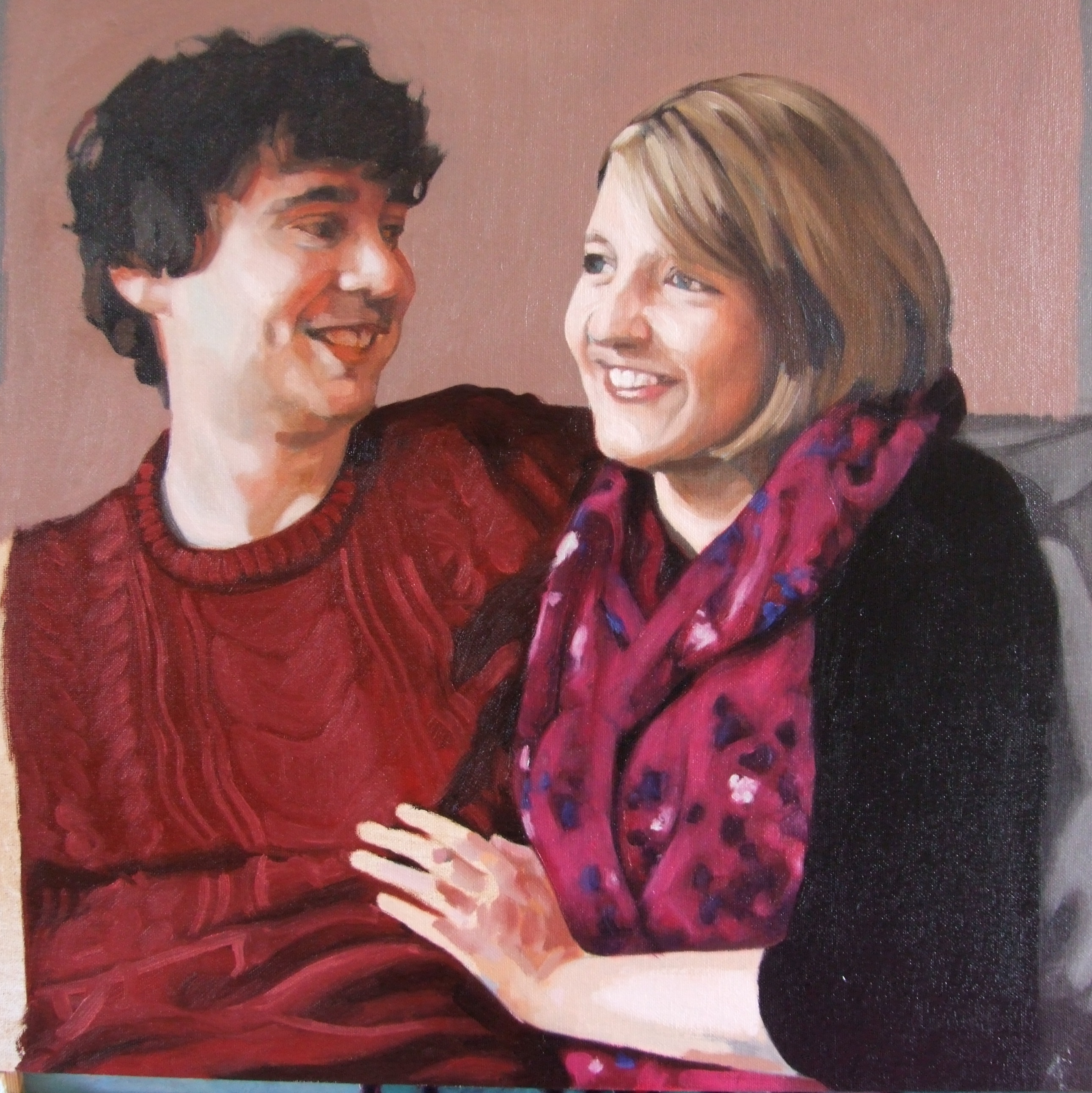
Anna and Simon progress 2 – here I have blocked in all the areas of colour, like a ‘dead layer’
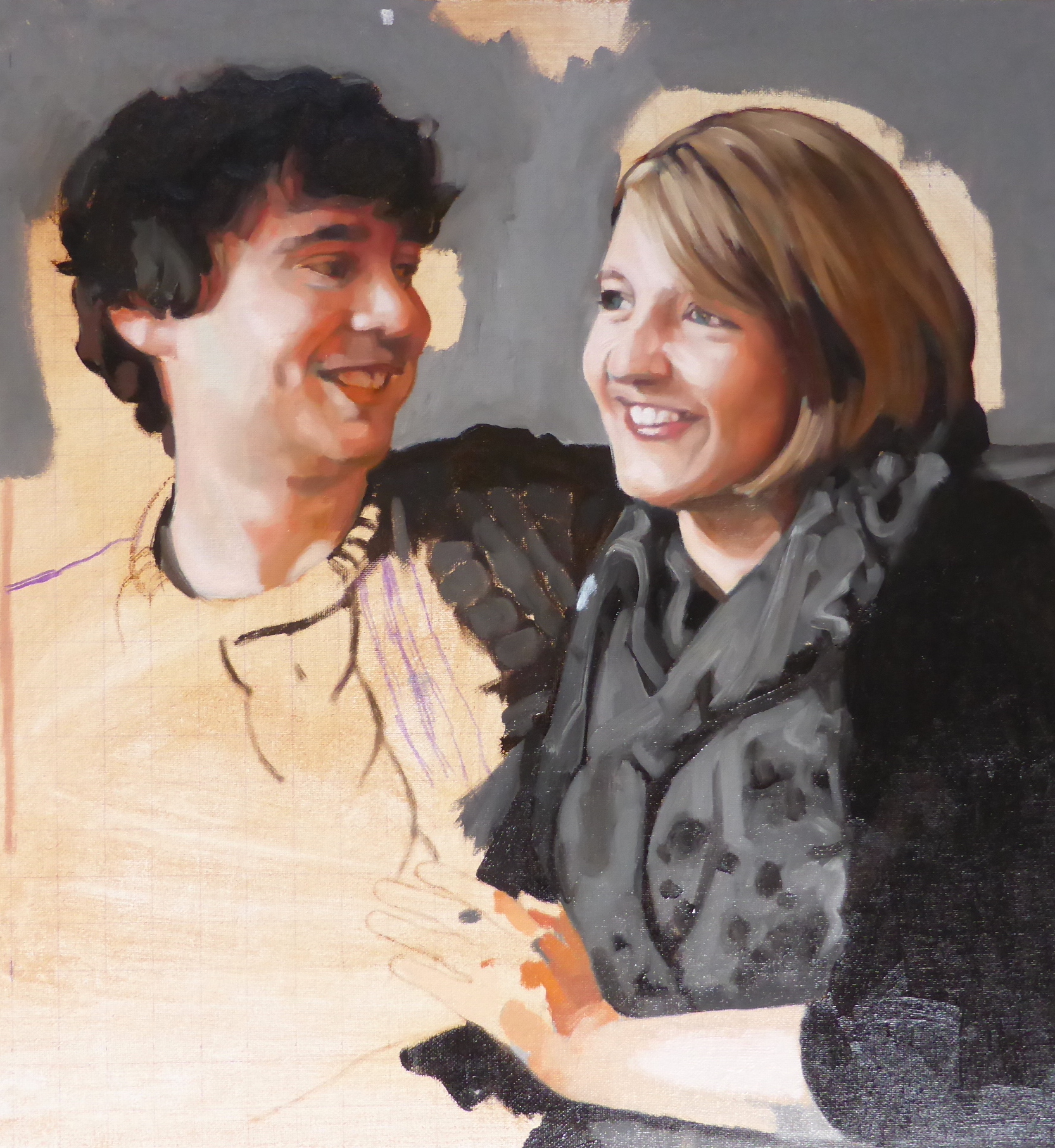
Anna and Simon progress 1- at this stage I abandoned the grisaille and worked colours straight onto the canvas
Here is a double portrait I worked on from a photo, to give an example of the process. I originally painted Anna in a grisaille, and went over the face in colour, having changed tack and wanting concentrate on a single opaque colour layer. It was worked into over a few sessions with additional glazes of colour.
In contrast I painted Simon’s face in colour directly onto primed canvas. I painted a ‘ground’ (or colour stain) on the canvas first, using a couple of coats of acrylic Burnt Umber. You can also see where I drew the grid. I had to leave some of the background unpainted so I could still follow the gridlines! It was one of those rare occasions where I was able to get the drawing right on the first attempt.
When the drawing doesn’t work I can spend many hours going back over the painting, needlessly, because if the drawing was all correct in the first place it wouldn’t have been a problem. Many bad experiences trying to fix paintings like this led me to use the grisaille method, because that is a great way of ensuring the drawing is right before attempting colour.
When I say drawing I’m talking about drawing with the paint. I’ve written about this before, especially here regarding the utmost importance of getting the drawing right first. Drawing is all of painting – figurative painting that is. That’s why even though I trained as a sculptor I could try painting portraits, because I had done a lot of drawing already. Working to commission means I need to make sure there’s no wasted effort.
Portrait of Tom
Posted on September 19, 2017
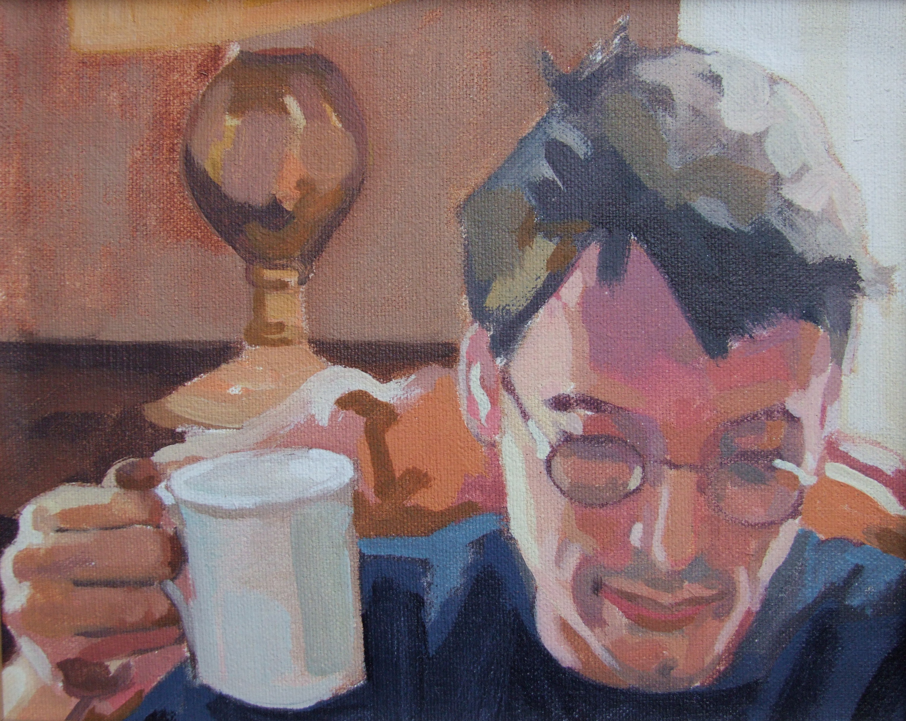 This is a portrait I painted of my brother Tom a few years ago, and I wanted to share it as I love the composition. I don’t know if its obvious but he’s reading, and enjoying a cup of tea at home. I feel the composition of the painting has a compactness to it, whilst having three distinct spatial areas – himself in the foreground, the room behind, and the window and world outside. There’s also the added dimension of the other window on his right, shedding light on his hand and cheek. And you could include the space I sat and painted in. I think I spent an hour or so on it and it was a good likeness, so decided to leave it as it was.
I was quite free with colour at the time and that’s something I want to renew and develop further, as another discipline to complement grisaille painting. I think some of the paintings I made in the years before I learned traditional techniques have a freedom and spontaneity that I don’t want to lose sight of. I’ll share more of these on this blog soon.
I’m hoping to start going a drop-in life class to specifically do some oil sketches and Alla Prima portraits so we’ll see how that goes. As I post this I will be at a portrait class in Topsham, Devon, and I will post again about it. Alla Prima is a technique I’ve had a little instruction in, but I’m feeling the need to go back to Bristol to have a chat with James Scrase about it. I’ve mentioned before but he worked for and trained under Pietro Annigoni, so he knows what he’s talking about! Alla Prima is Italian for ‘first attempt’ and is also called wet-on-wet. You basically try and finish the painting in a sitting, rather than painting layers of oil paint on top of paint that has been allowed to dry. I’d love to do one of Louis Smith’s courses on it as he provides brilliant tuition in all things academic in oil painting and portraiture.
Jack in Burnt Umber and Titanium White
Posted on July 30, 2017
Jack, oil on canvas. Glazes over a burnt umber underpainting
When I began investigating Old Master techniques I had some brilliant instruction from James Scrase, a portrait painter who was trained by Pietro Annigoni (see his fantastic self portrait). He learned every traditional painting skill from Annigoni, including fresco painting, and he taught me to use Burnt Umber as a wash to draw the portrait first, and then build up layers of slightly opaque ‘half-pastes’ using colour and a little white. Also I was taught to add white with small amounts of blue and then glaze over it with flesh tones. This was one of my first attempts, of my cousin Jack. Of late I have been focussing on a strict grisaille underpainting but looking at this I think I prefer the slightly more fluid quality burnt umber can achieve with thinner washes.
Revelation with colour glazing
Posted on May 31, 2017
 One of the most important things that has happened to me in all the years I have been portrait painting was going on a course run by Louis Smith in 2014, learning about glazing. Looking at his website I thought this would be about glazing as I understood it where you have a very thin translucent layer of paint and you go over a grey underpainting, or dead layer, like Caravaggio or Ingres. We learned to glaze over an underpainting, but the glazes felt more like ‘half-pastes’ as they were not entirely transparent. Even so it transformed the way I approached colour mixing for portrait paintings, and I learned amazing colour combinations of reds and greens which are now the foundation of my approach to painting a face. I’ll write about them in another blog post. I found out about Louis Smith from Jonathan Jones, the Guardian newspaper art critic.
On the course, which was over a weekend, we used a monochrome print from another portrait and went step by step through the process of building up areas of colour, slowly refining and blending each.
Devon open studios
Posted on February 28, 2017
I’ this portrait for promotional material for Devon open studios in September 2017 #portrait #portraitpainting #contemporaryrealism #art #oilpainting #devonartistnetwork #devonopenstudios (at Kenton, Devon)
