matt harvey art
Portrait paintings, art demonstrations, figurative painting, landscapes
Painting portraits with Sap Green
Posted on May 14, 2018
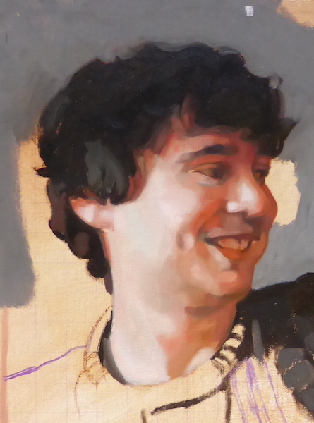
This was the first stage of the portrait, painted in approximately 2 hours. It is difficult to see the Sap Greens but they are all there mixed in with the reds. Without the sap greens the reds would be far too warm.
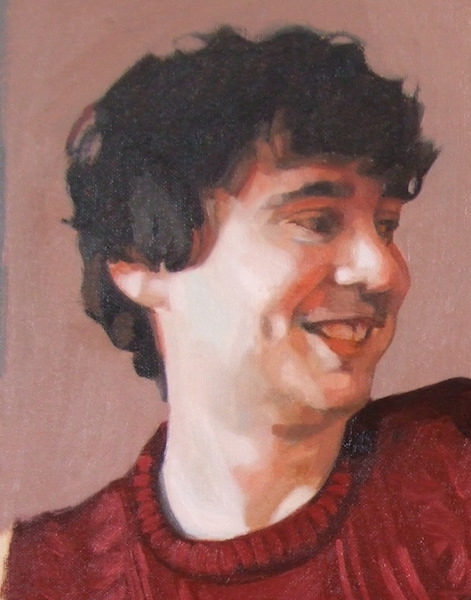
After the second glazes have gone on.
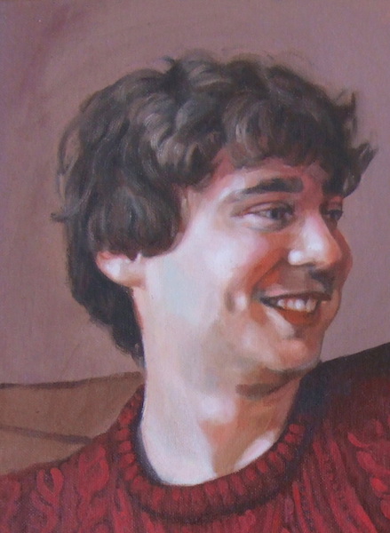
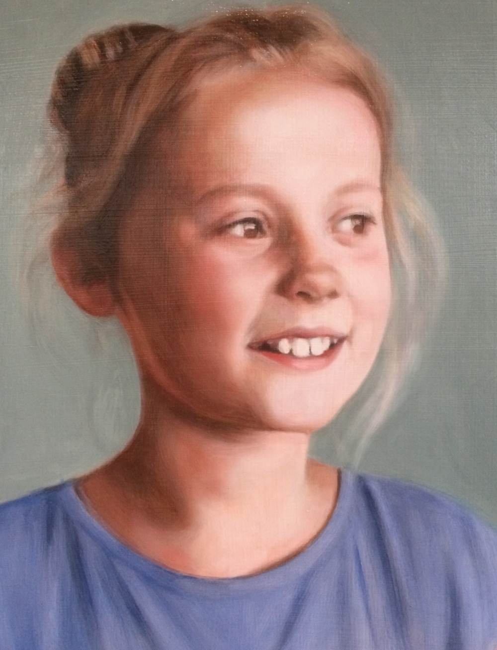
Detail of the final painting
Sap Green is a generic name for a warm, deep green. Perhaps its difficult to tell, but the above detail of a portrait painting was made possible with the invaluable Sap Green and even though impossible to see really its all over it! Sap Green cools reds. Red and green are complementary colours so together they neutralise each other. People generally aren’t that green, but they are greener than you might imagine.. skin in shadow is invariably greenish in hue. Maybe greenish is too strong a word (it might not be a word) but generally when I paint shadows there are always greens silently working their magic.
There a lots of different Sap Greens made by different oil paint manufacturers as each develops their paints in their own way. I love Michael Harding’s oil paints and I love his Sap Green, but it doesn’t have the particular warm quality I am generally after when I reach for it, in the context I want it. It is good for cooler shades and hues but I haven’t yet been bold enough to use it in a portrait. Michael Harding’s website says that it would be ideal for the plein air painter which is true.
The Sap Green I worked with when I studied with Louis Smith was one of the warmest greens I had painted with (Lukas studio oils), and I discovered mixing with Alizarin Crimson is brilliant for cooling down reds in shadow tones. It served this purpose in the portrait painting shown. I painted this shortly after I did a glazing workshop with Louis Smith in Manchester and it was a revelation for me. The sap green I generally use is the Winsor and Newton Winton variety, but I’m sure there are a lot of other ones out there including the Lukas one. I have just been going through what I already have in my paints box. I also have an old tube of water-mixable Duo Aqua sap green which I can use as its also warmish.
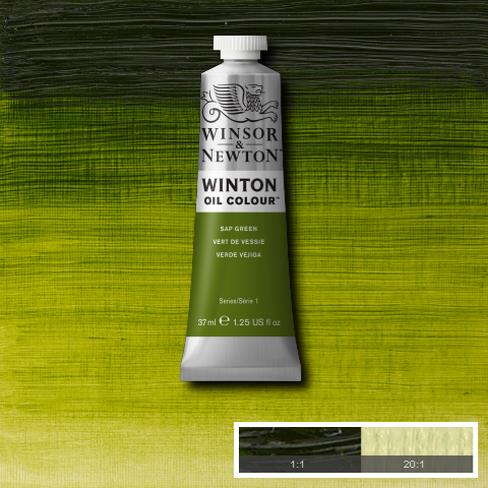
Sap green was originally a lake pigment made from unripe Buckthorn berries. This isn’t the best quality paint but its the right hue for my work. I just have to add a little more when mixing with better quality colours as they have more pigment in them.
The one colour I can’t live without at the moment is sap green. What a discovery that was! All credit to Louis Smith for introducing me to it back when I was starting to seriously paint portraits. For me all skin tones seem to flow from there when this green is mixed with alizarin crimson or cadmium red. In my case I generally add both, or start with a dark mix of crimson and sap green. I have found myself recently mixing a deep colour using these two and working from there on the palette in various directions, adding white here, blue or yellow there and seeing where I end up.
If I mix Sap Green and a red for a shadow and it’s still too warm I mix in a bit of blue. It could be any blue but the blue I have on my pallet is Ultramarine. This again is a warm blue, but its cool enough to dampen the fires of Cadmium Red or Alizarin Crimson. I have to be careful not to add too much blue or it overpowers the other colours.
Honestly I think I would struggle to paint a portrait without it these days. The description on the Winsor and Newton website says Sap Green is a bright mid-range green with a yellow undertone. Originally Sap Green was a lake pigment made from unripe Buckthorn berries. Here is a picture of some Buckthorn, also once used as a ‘purgative’ which sounds nice. Perhaps its a good thing its not used anymore as its very toxic.
My palette is a fairly warm one when seen all laid out, and I’m sure at any time I could dispense with some of the colours. I generally don’t use umbers (browns) in my palette except when I’m doing drawing or underpainting. I have found its convenient to have a bit when I’m painting hair, but I usually mix my browns from various other colours, typically starting with a red and sap green together. Here is a video starting at the moment I have prepared a glaze mix on my palette using these colours, and I use it for the hair:
When mixing colours I’m always back and forth, correcting and adjusting as I go. I never get it right first time but have come to see it as a process of guesswork where I try a colour, see it in context, and then try again. I was never taught any formal method like you might see on an academic painters palette. Sometimes when I have a very warm hue for a highlight, where I have used a lot of red, it can work very well to just add some blue or a sharp green like Viridian. I want to try and get the values to remain the same with the two colours, but the cooler hue bounces off the warmer and creates the subtlest shadows. It still takes a bit of time when painting to get to the point where I can find this balance, and often I do it by accident. That is part of the pleasure of painting though, where we are constantly surprising ourselves.
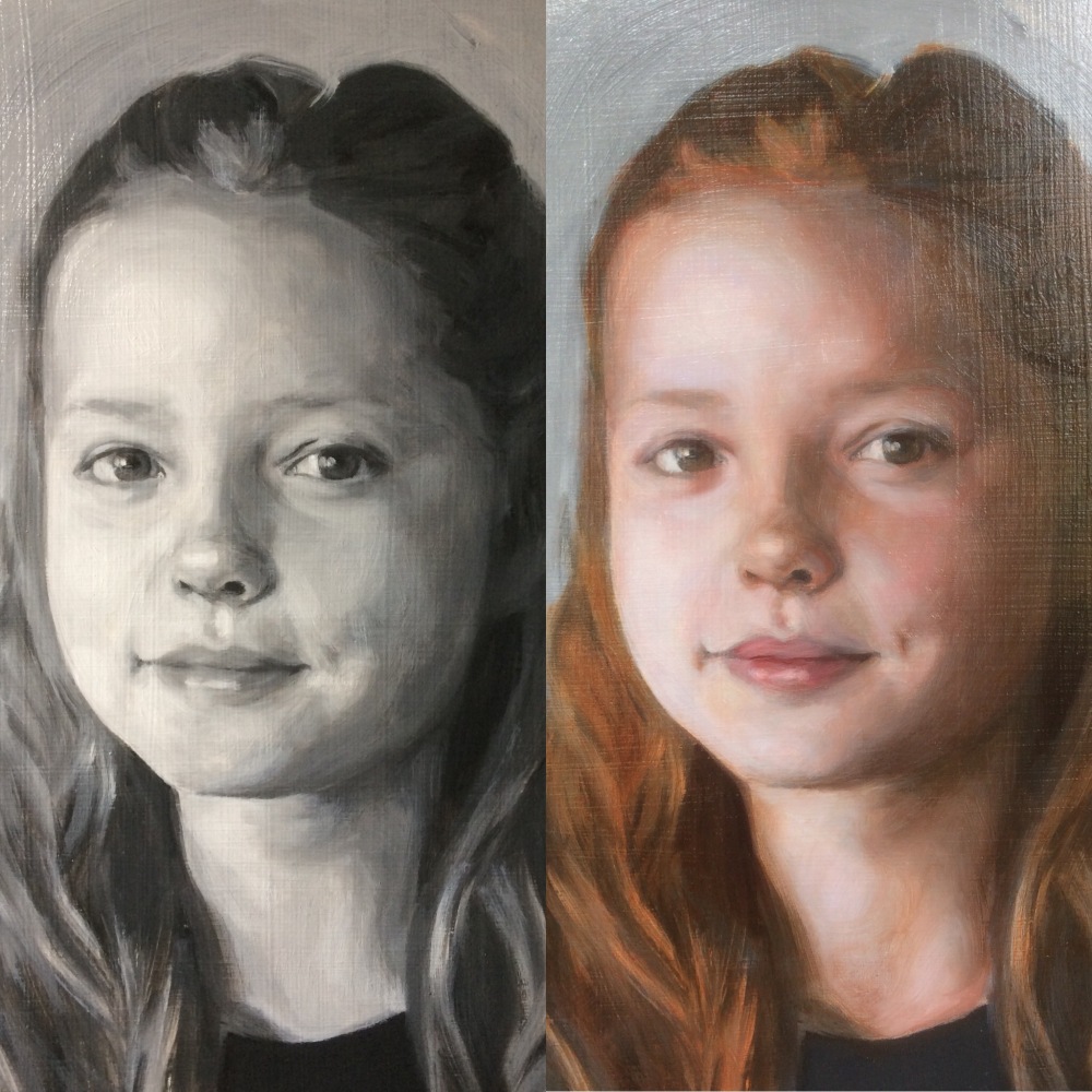
Portrait painting from grisaille underpainting to fourth glaze
Posted on November 23, 2017
Here are a selection of photos showing the completed glazes done over the grisaille underpainting in this portrait commission.
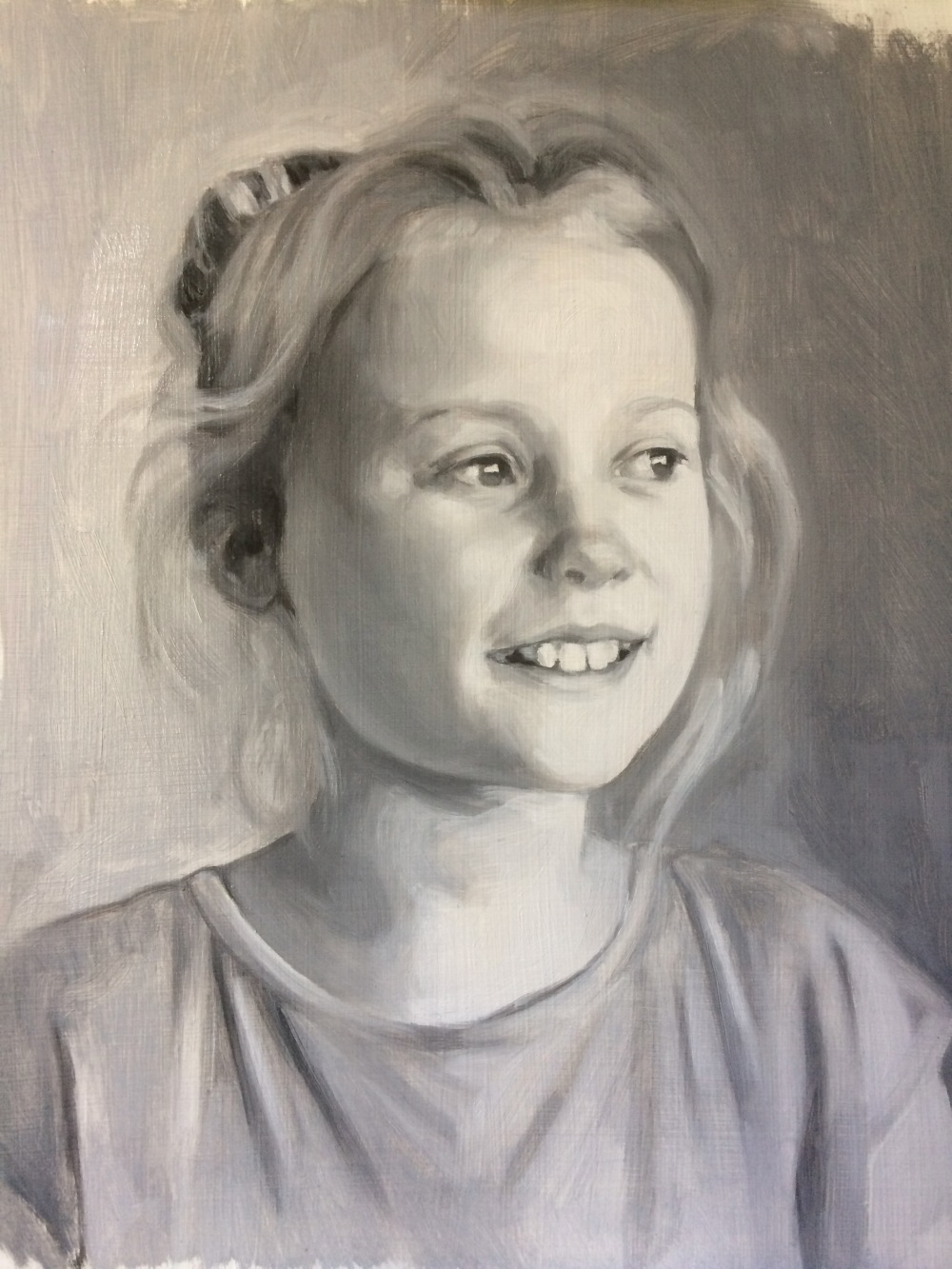
The first layer, called a grisaille as its painted in grey, using Titanium White and Ivory Black
The first glaze which was painted in roughly an hour. This is the subject of a film in 4 parts, showing the 1st glaze being painted in oils
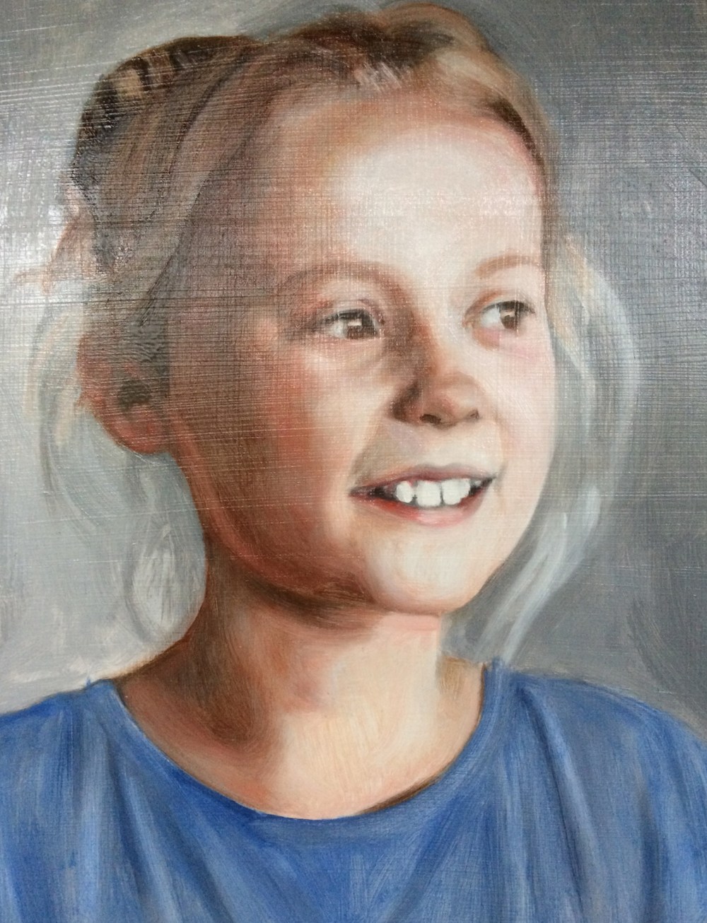
The second glaze, painted after a couple of days when the first glaze had fully dried. I use M. Graham’s Walnut Alkyd medium. The alkyd accelerates the drying, otherwise the oil takes at least a week to be dry enough to paint the next glaze.
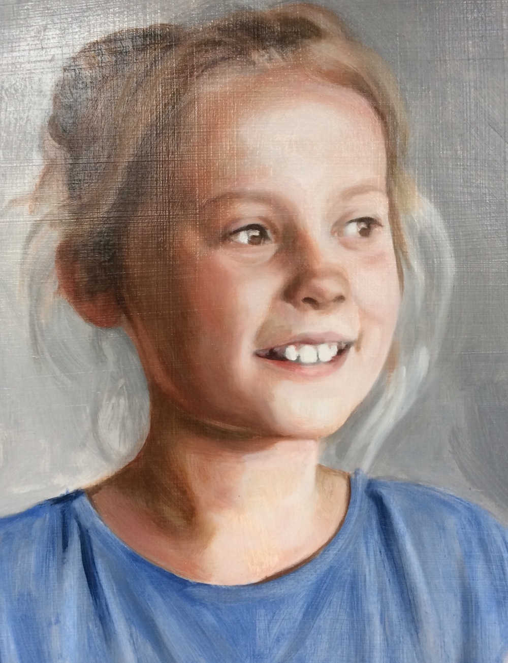
The third oil glaze shows the colours getting richer. I continue to model the forms of the portrait while I paint the glazes.
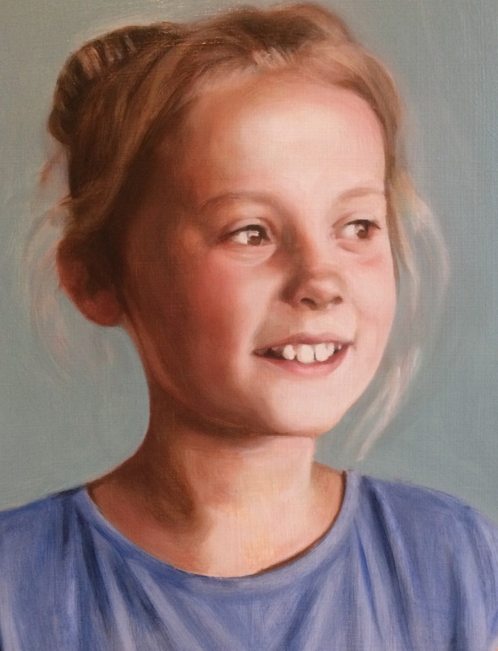
4th glaze
Portrait painting commission – grisaille layer waiting for the first glaze
Posted on November 2, 2017
This is the first stage, the grisaille. I will be posting a video of the first glaze in a few days. The sitter is the sister of the earlier portrait posted. I will be able to continue modelling the forms as I glaze. I have talked about this elsewhere but the drawing never stops while glazing is taking place, each glaze revealing new areas to develop in the painting. The grisaille is not perfectly formed but is enough to form an anchor for the rest of the painting. Hue or colour is in itself drawing and form and all the imperfections and flat areas are transformed with the glazes.
There are many different ways to make a grisaille underpainting; with black and white as here, or you can make a ‘verdaccio’ which is monotone green and white, or burnt umber and whites. In the future I would like to do some paintings with very limited palettes, like the Zorn palette which has Yellow Ochre, Black, red and white. Or like the one I used at school, Burnt Sienna, Cobalt Blue and White. Just thinking about it is so nostalgic and I fondly remember swimming in warm and cool tones back then.

Portrait of Ruby, grisaille painted in oils, Titanium White and Ivory Black
Pencil portrait, spot the difference
Posted on October 24, 2017
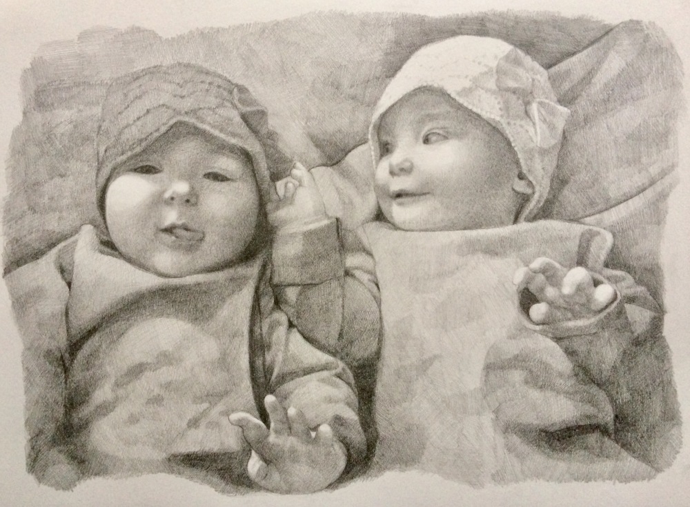
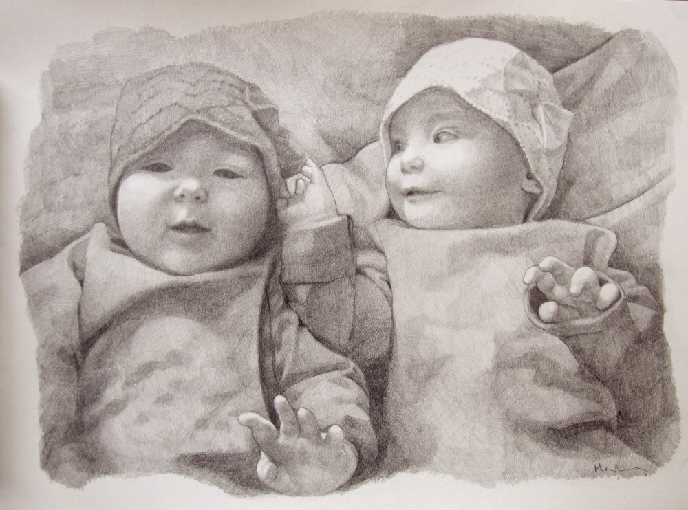
I was recently commissioned to do a drawing of two twins. See if you can spot the difference.
The drawing before
The drawing after adjustments
I worked very closely from the photo provided but the client didn’t like the way the tongue looked in the end, so I had to do a bit of human photoshopping. In hindsight it was never going to work, but I followed the brief and was still happy with the drawing at that stage. Its the first pencil drawing I’ve done for over 20 years and, ahem, nearly 30.. Still working with a crosshatch style. Old habits really do die hard with art. As I wrote in another blog, Learning to love black, it took me years to shake off the idea that black in a tube was a crime against art.
Oil painting demonstration: Glazing over grisaille – Portrait of Amy
Posted on October 23, 2017
This is Amy’s portrait, glazed in oil paints. I filmed myself doing this and it will shortly be on my youtube channel. Its still in the early stages, and when this layer is dry I’ll go over it again, up to 3 or 4 times. I don’t know if I’m going to film those other stages – they might be a bit boring as its just a lot of tinkering. In the early stages its quite dramatic how a few glazes of colour changes the grisaille into a very nearly finished portrait. Stay tuned!
Before and after glazing over grisaille. The first oil glaze took roughly an hour to complete. The grisaille underpainting was painted using Titanium White and Ivory Black oil paints, and the glazes are mixed from Alizarin Crimson, Raw Sienna, Cadmium Red, Titanium White, Ultramarine Blue and Sap Green, to name a few
