Portrait painting in oil – underpainting in grisaille
Posted on May 8, 2018


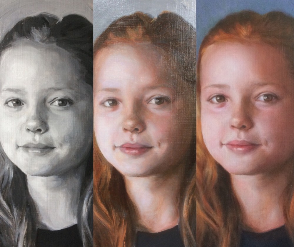
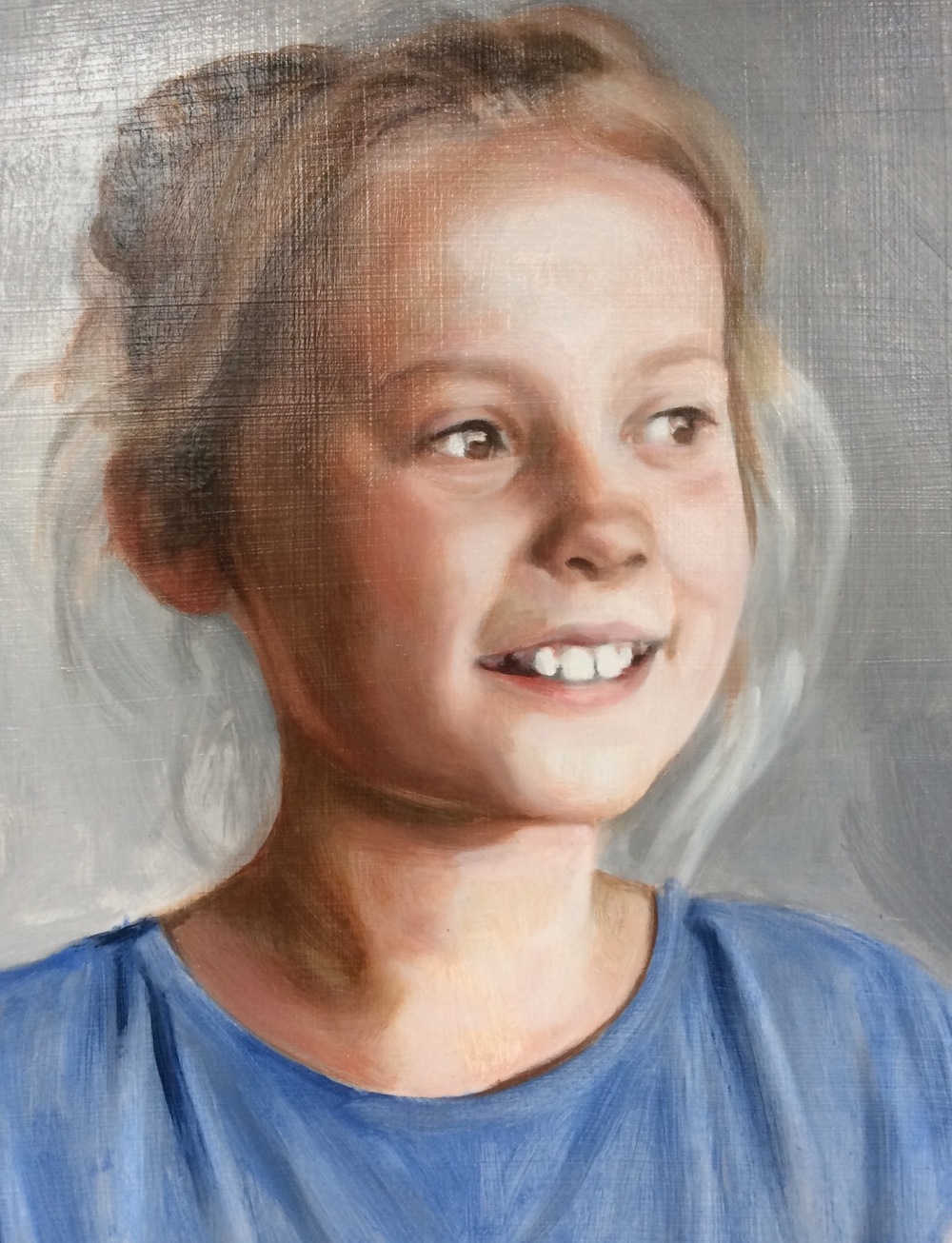
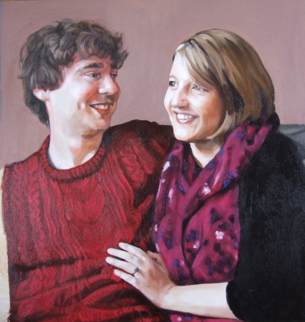
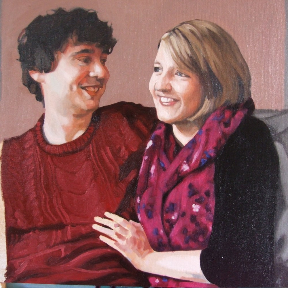
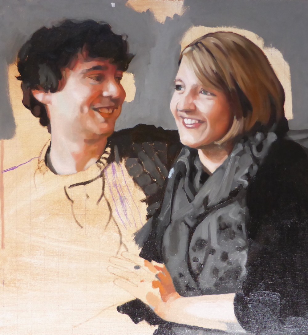
I have been reworking a long standing grisaille portrait painting in oil and experimenting with a more colourful painterly approach. I am still using the glazing technique, but with a more complex palette than some of my other work. The original photo reference was taken in an interior space under a combination of artificial light and daylight. This gave the skin in the reference a rich multi-hued surface, where the face was illuminated artificially and was only slightly in any shadow. Looking at it one can see oranges, greens, blues, yellows, every colour imaginable but with only the slightest variation in value, or light and dark. It has some beautiful cool shadows juxtaposed against warm (very warm) highlights.
I was pleased with the grisaille underpainting, and it worked because I am now more attuned to the very subtle changes in value when painting portraits. In the past I may have mistakenly exaggerated the changes in value, or light to dark, but I have come to see that these changes are only very minor and actually best left to the overpainting and colour glazes. It appears best to take a ‘paint by numbers’ approach and work in larger areas of grey values, what they call ‘blocking in’, and to use colour to build the shape of the face. Unless a sitter is very brightly illuminated with a strong chiaroscuro effect, then even the differences between shadow and highlights in a portrait can be quite subtle. Working in colour as opposed to modelling light to dark is something Cezanne called ‘modulation’ – where colour alone creates the sense of the form. He said ‘When colour is richest, form is most complete’.
I have painted a few grisaille portraits where the grisaille is too dark, and this was the problem here. Unfortunately I can’t show a photo of the first glaze which didn’t work, but the colour glazes I used over the initial grisaille made it all too dark. This has happened in some other portraits I have painted. Oil colours themselves can have different values depending on how much paint you put on, so when I tried to colour his cheek using a little alizarin crimson with sap green this was too much and ended looking unsightly. When I squint my eyes at the reference it looks the same as the grisaille in terms of the values, so in order to make room for the colours on top I needed to lighten it first. I don’t actually like painting too methodically in this way, as it seems to suck all the joy and spontaneity out of it so I need to develop it so it still feels natural. By natural I mean the relationship between me and subject is one of looking and responding in the most unaffected way, without calculation. Here is a portrait from 15 years ago, painted before I got stuck into the grisaille technique and trying to find the best formula to paint with. I still love the freshness and simplicity in the drawing and colour rendering. My goal would be to combine this with a more rigorous technique if that is at all possible.

Portrait of Tom – painted in a sitting without any knowledge baggage! I hope to return to this way of working, without losing everything I now know about colour, value etc.
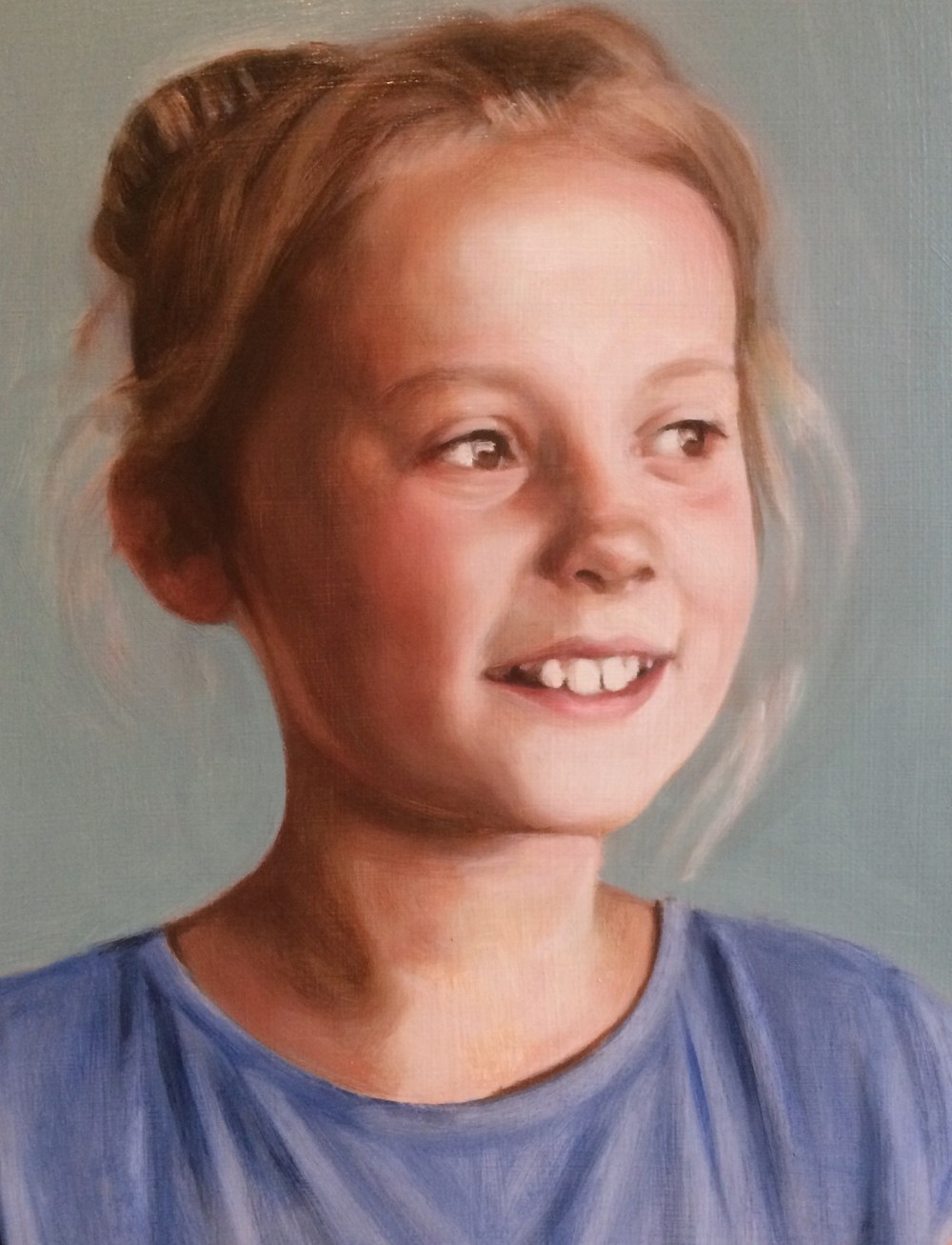
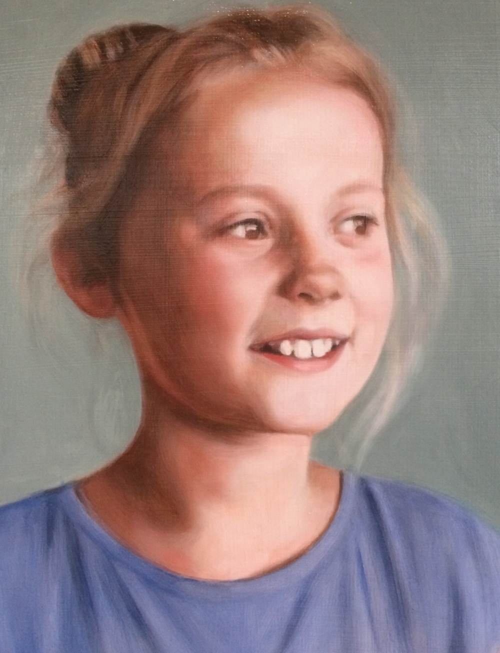
When I attempted to glaze it I found I couldn’t do it, the hues were just too subtle. This was in the early stages of my learning the glazing technique and was beyond me at the time. So the glazed version was shelved for a good while. I have a bad habit of giving up on paintings when actually nearly all paintings are redeemable. As Camille Pissarro said though, you have to keep working until you get it right. When this happens paintings just end up marked ‘fail’ on the fail shelf, and they gnaw away at me. This is a weakness I am trying to overcome, and in that spirit I went back to this portrait and reworked it, specifically after looking at Bonnard. He is such a gorgeous painter who has a rare magical ability with colour, always surprising and new.
Looking at Bonnard fuelled the desire to just let go a bit and love colour, love painting again. Sometimes working on the grisaille technique has made me work in a narrow way and I felt I lost my earlier naive jollity. That’s not what I was taught though by Louis Smith amongst others, who all used many different colour hues when glazing. I just got to a point where I found a way that was working and stuck with it. Having said all that, I was happy with the grisaille paintings that I glazed, I just felt I wanted to let go a bit. It wasn’t working in this particular painting anyway, so I needed something different. I can’t just ape Bonnard in his beautiful loose technique, which you can see was always his sensibility when you look at his early work. I love colour but also love ‘polishing’ the drawing, which is something I get from my love of stone carving.
Here is a Bonnard self portrait to give an idea of what I mean.

Group portrait painting
Posted on April 11, 2018
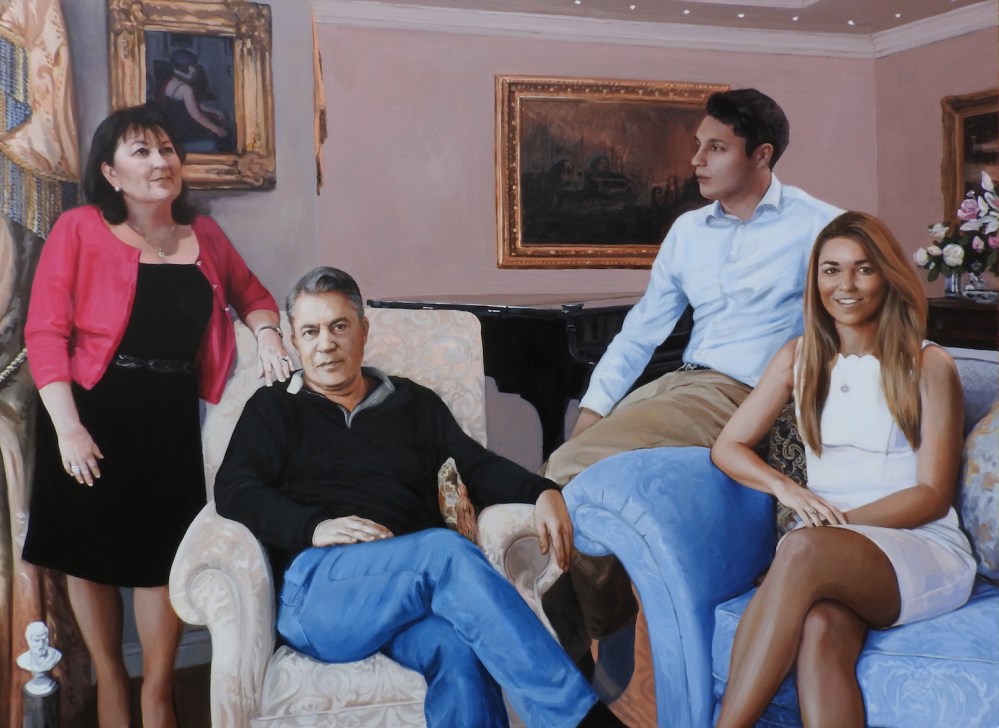
Portrait of a family, oil and acrylic on board, 150 x 110 cm
This is a recent portrait commission, which I really enjoyed painting! Particularly, organising the group composition was a great challenge. I started with a photoshoot, taking a lot of photos of everyone relaxing together and interacting as a family. Obviously we could spend days doing this, going through many combinations and settings, making sketches etc. But this can also be achieved in a relatively short time over a morning or afternoon. At the time the sitters and artist selected some of the best photos to use as references to and later in the studio I organised the painting, working out the composition by sketching various configurations. Usually the photos chosen initially concern how the image captures the likeness and character of the individual sitters. Using these as a starting point I then found ways to combine those images with others where the poses of the figures worked in terms of an overall whole. My aim was to lead the eye of the viewer around the canvas and so hopefully the composition flows naturally through various echos and parallels in the sitters poses.
Working out the composition of a group portrait is a collaboration between the client and artist, where the client can see the photos, offer criticism and request certain photos to use. They may make suggestions based on each person’s character, or that a particular setting or viewpoint is desirable. Who is the portrait commission for? Is it a gift, and if the recipient will be in the portrait painting how do they want to be situated? Do they have a favourite chair or room where the painting will be set? The artist then takes these decisions as a starting point, and then attempts to bring all these diverse elements together. Here I wanted to create a harmonious unified composition, one that brings out all of the sitters characters without being overly formal or rigid. Working with the images already provided, and these images are primarily decided based on how they are felt to give a good likeness and sense of the sitter, the artist might then use other references with different poses, ones that will help the overall composition. The finished painting is a combination of all these many different elements, the space, the furniture, each individual and their relationship to each other. Sometimes the image references can be many for even an individual sitter; the image for their face was initially decided, but then their pose may be from a different reference, their hands another, another for their chair and how they then relate to the space around them and the other sitters..
From my original training as a sculptor, and one who was interested in abstract sculpture and carving, I can’t help see a painting in terms of its abstract qualities. How the forms create a sense of space and movement around them, how the eye is led around the picture surface, and how the colour palette is balanced across the painted surface. A portrait is a painting first and foremost, not a copy of reality. Its an invention. This moment in time did not actually happen, but the painting is a combination of many small moments, interactions, pauses, light reflecting and shadows passing. All of these moments are compressed and gathered by the artist, and then united into a single pictorial ‘conceit’. It is not a photograph, although for convenience photos were used for a reference. This painting is oil mixed with pigment and brushed onto wood board. But it is also a true reflection of the lives of the sitters, achieved through likeness painted by the artist’s brush.
Glazing over acrylic underpainting video
Posted on February 19, 2018
Here is a new video of me working on a first colour glaze in oils, over an acrylic grisaille underpainting, which is a new medium for me. I’m trying to speed up the process a little bit. It took a while to get the hang of acrylic, something I’m still progressing with. The grisaille is done using raw umber and titanium white, but hopefully the video is self-explanatory.
Drawing with willow charcoal
Posted on January 23, 2018

Dancer, willow charcoal on paper 40x50cm
I reworked this drawing a bit today and realised again how much I love working with willow charcoal! I’m hoping to start a new series of work inspired by dance using this medium. I have always loved life drawing and working from the figure and its nice to have something to work on between painting portraits.
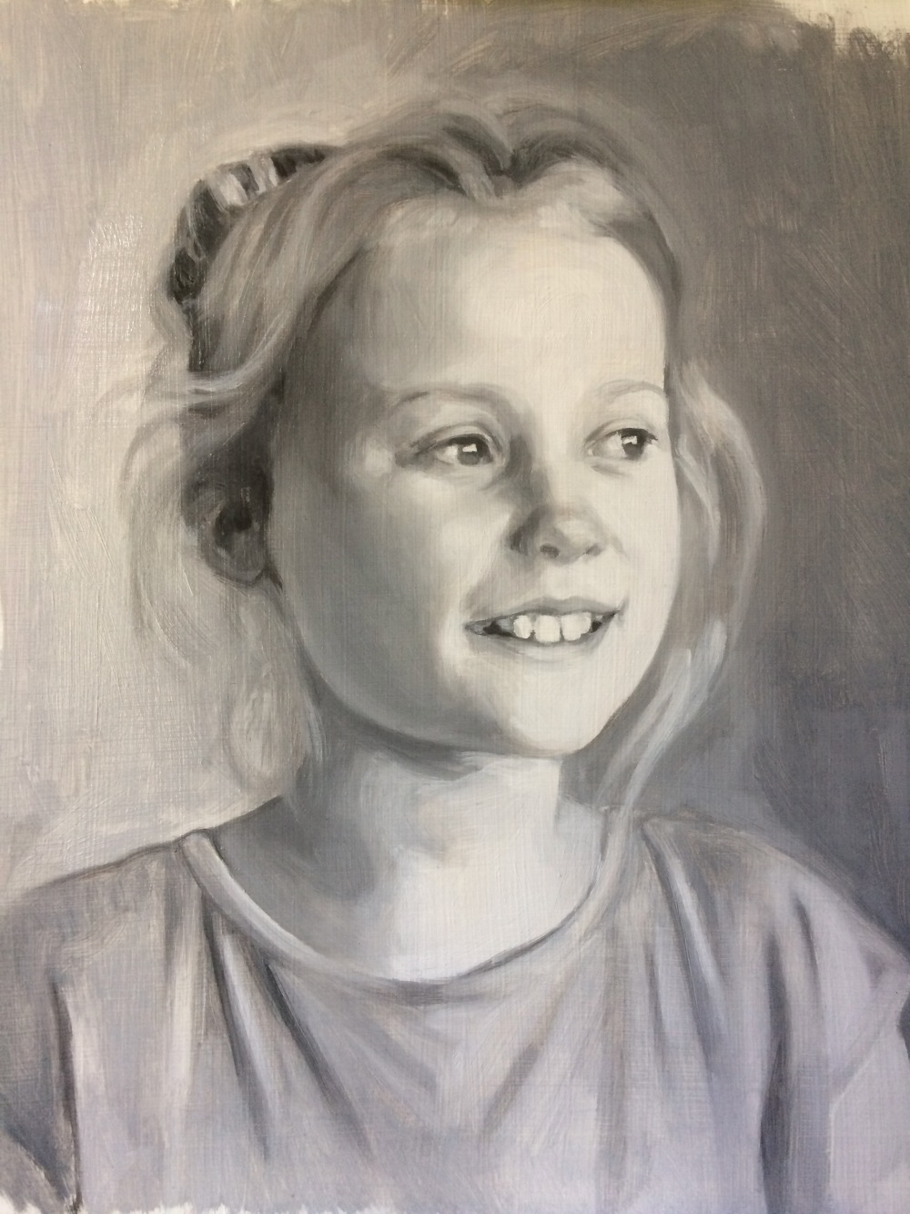
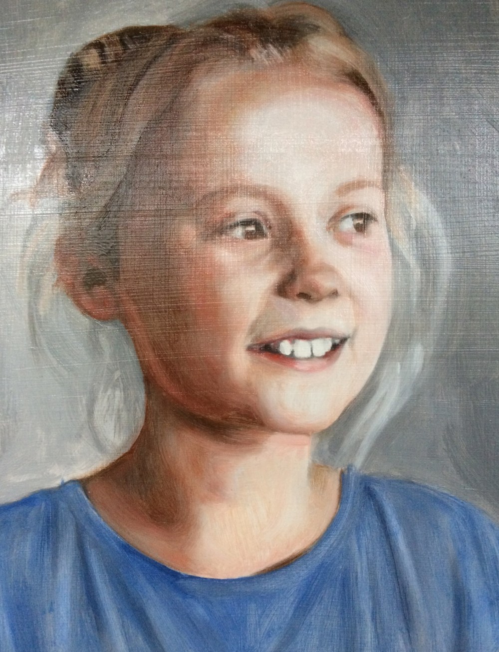
Portrait painting step by step, glazing over grisaille
Posted on November 28, 2017
I’ve nearly finished this portrait painting. Its had 5 glazes over the initial underpainting. This picture shows the grisaille, the first glaze (which I filmed and is on youtube please click here to view) and then the 5th glaze which is almost the last one. I still intend to go over the hair and background again amongst other things. The background was a dark green the glaze before this! It still shows through and gives it a nice depth. The lovely thing about working in this way is that everything can change with just one glaze. This portrait has been through many stages while painting each glaze. Sometimes I misjudged a colour or hue or the values of light and dark weren’t right. In each case I was able to correct the painting in the following glaze, either lightening or darkening.
I love painting highlights in a portrait so I guess I overdid it somewhat and the lightest light ended up too bright by the 4th glaze, but in the latest glaze which you can see here I went over the whole portrait again with a darker glaze just to soften it a little. In areas where it was too dark again I just used a dry brush to pick off the paint and continue blending. I can always keep adjusting a portrait at a late stage if the client commissioning the portrait feels there is something that needs changing.
It is surprising just how close to the original grisaille the painting is, even when its possible to see how much refining and drawing has gone into the portrait over all the glazes. Its strange to see later very finished versions of a portrait where the grisaille is like a ghost, still very present but disguised under veils and glazes of colour. The grisaille functions like an anchor that holds the structure of the portrait in place, and many many changes can occur but the painting is still held firmly together by the initial drawing. Its the main reason I started learning how to paint using the grisaille method.
I always use the same mixes when I paint portraits using the grisaille method. Here is another example video in my Bouguereau copy. All my glazes start with various quantities of the same colours: Alizarin Crimson, Cadmium Red, Raw Umber and Sap Green (a warm Sap Green). All the later glazes are mixed with these colours but with other additions, like Ultramarine Blue to cool it down, a bit of Titanium White to make a velatura or semi opaque glaze, some Cadmium Orange.. but always hovering around the same original mix. Of course this depends on the commission and the sitter having their portrait painted.
Portrait painting in 3 stages: The grisaille, the 1st glaze, and the 5th glaze. The glazing process is the same each time, and the portrait just gets steadily refined as it progresses
Portrait painting from grisaille underpainting to fourth glaze
Posted on November 23, 2017
Here are a selection of photos showing the completed glazes done over the grisaille underpainting in this portrait commission.
The first layer, called a grisaille as its painted in grey, using Titanium White and Ivory Black
The first glaze which was painted in roughly an hour. This is the subject of a film in 4 parts, showing the 1st glaze being painted in oils
The second glaze, painted after a couple of days when the first glaze had fully dried. I use M. Graham’s Walnut Alkyd medium. The alkyd accelerates the drying, otherwise the oil takes at least a week to be dry enough to paint the next glaze.
The third oil glaze shows the colours getting richer. I continue to model the forms of the portrait while I paint the glazes.
4th glaze
Portrait painting video demonstration
Posted on November 21, 2017
My latest film, another shot while putting on the first glaze over a grisaille underpainting, is now finished and on youtube. Here’s a link to the first installment:
It’s been an interesting experience filming myself working, and quite strange to watch it back as I’ve never seen myself working before. I wanted to make an authentic account of working with this method, and create the film I was looking for when trying to learn how to do it myself. Of course thats a process that never stops!
Oil painting as alchemy – Dry brush blending in portraiture
Posted on November 9, 2017
Portrait of Violet detail, oil on canvas
I was able to practise my dry brush blending with this portrait of a beautiful girl called Violet. This portrait commission was a staging post for me in developing my understanding of the grisaille technique. I’m now much more comfortable marrying techniques of glazing with my earlier familiar method of building up solid planes of colour. I took a lot of care over the blending and modelling of the glazed areas, and I hope that they also have a painterly quality. My goal isn’t to create a facsimile or exact copy of the photographic reference, but using that reference as a starting point I am first and foremost concerned with creating a painting using oil paint. Oil paint has its own qualities and follows its own transformation as the painting progresses. The delight of an oil painting is how this empty picture plane can somehow come to harbour all these rich layers of paint and medium, which swim around on this surface, again somehow crystallising into a likeness of a person.
Dry brushing an oil painting gives more of a ‘soft focus’ effect, but personally I don’t want to overdo the blending as (in my work) the paint gets a sort of sickly quality, especially if done in areas with more painterly underpainting. Its like more of a stain than a glaze and glazing needs a little backbone, some substance! This painting was done a while ago when I was still in the early stages of portrait painting but looking at it again I feel that I was able to create the kind of effect I am now trying to capture and that I lost somewhere along my journey into oil painting. Parts of it I would now rework but sometimes less seemingly accomplished work has a more desirable quality. I am still trying to find the space between the finished, polished oil painting and the accidental – I read somewhere about the ‘completeness of ‘incompleteness’, sounds good but I don’t know what it means. It might mean something though.
I’m still trying to find a way of using brushwork. I love the sensation of pushing paint around with a hog brush and literally feeling the paint slip around on the picture plane. More than that, paint shudders when you turn the brush this way and that, it ripples and folds and dances on the surface. The wet brush flips and turns as it goes, collecting the paint, hoarding it, spreading and stretching it, round and round, a beautiful moment during each glaze where just wet enough, the surface has a thin layer of oil paint I push and pull around, feeling it fold and eddy under the brush like butter.
I think generally very fine blending is done with sable brushes but I only use these for extremely fine details, like the line of an eyelid, as somehow when I do it the paint loses its painterly qualities. It would work if all of my brush mark-making was done in the same way but a lot of what I do leaves a painterly effect. I need to be shown how to do this by someone who knows. But I don’t want to be too fussy about the blending, again probably because my instinct is to let the paint ‘blend’ in the eye of the viewer. I’m not after a perfect finish. There’s more of a sense of the alchemy of painting and the transformative qualities of paint when it’s a bit rougher and more painterly.
The art historian Richard Elkins wrote a brilliant book titled Painting is Alchemy and he writes about how painting isn’t an exact science, but more akin to alchemy. The specific qualities that individual artists look for in paint can never be written down and aren’t formulaic. It’s transformative
Portrait painting commission – grisaille layer waiting for the first glaze
Posted on November 2, 2017
This is the first stage, the grisaille. I will be posting a video of the first glaze in a few days. The sitter is the sister of the earlier portrait posted. I will be able to continue modelling the forms as I glaze. I have talked about this elsewhere but the drawing never stops while glazing is taking place, each glaze revealing new areas to develop in the painting. The grisaille is not perfectly formed but is enough to form an anchor for the rest of the painting. Hue or colour is in itself drawing and form and all the imperfections and flat areas are transformed with the glazes.
There are many different ways to make a grisaille underpainting; with black and white as here, or you can make a ‘verdaccio’ which is monotone green and white, or burnt umber and whites. In the future I would like to do some paintings with very limited palettes, like the Zorn palette which has Yellow Ochre, Black, red and white. Or like the one I used at school, Burnt Sienna, Cobalt Blue and White. Just thinking about it is so nostalgic and I fondly remember swimming in warm and cool tones back then.

Portrait of Ruby, grisaille painted in oils, Titanium White and Ivory Black
New video on youtube of the grisaille and glazing process
Posted on October 26, 2017
I wanted to share the magical transformation an oil painting undergoes, glazing oil colour over a monotone underpainting.
I filmed myself painting the glaze and velatura over this portrait for one hour, in 3 short videos – this being the first. Its the first glaze and there will be a few others to finish the portrait, but this video shows the process, and I hope shows why I find it such a rewarding method to work with. It shows the dramatic results you can achieve in a relatively short amount of time.
Pencil portrait, spot the difference
Posted on October 24, 2017
I was recently commissioned to do a drawing of two twins. See if you can spot the difference.
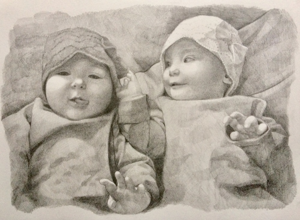
The drawing before
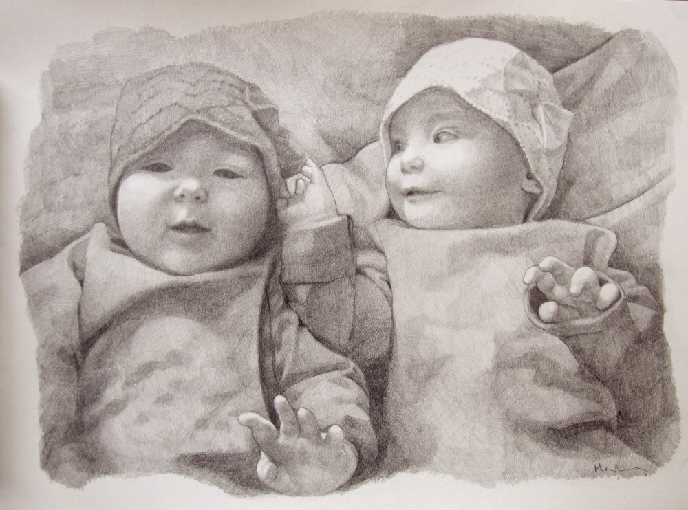
The drawing after adjustments
I worked very closely from the photo provided but the client didn’t like the way the tongue looked in the end, so I had to do a bit of human photoshopping. In hindsight it was never going to work, but I followed the brief and was still happy with the drawing at that stage. Its the first pencil drawing I’ve done for over 20 years and, ahem, nearly 30.. Still working with a crosshatch style. Old habits really do die hard with art. As I wrote in another blog, Learning to love black, it took me years to shake off the idea that black in a tube was a crime against art.
Oil painting demonstration: Glazing over grisaille – Portrait of Amy
Posted on October 23, 2017
This is Amy’s portrait, glazed in oil paints. I filmed myself doing this and it will shortly be on my youtube channel. Its still in the early stages, and when this layer is dry I’ll go over it again, up to 3 or 4 times. I don’t know if I’m going to film those other stages – they might be a bit boring as its just a lot of tinkering. In the early stages its quite dramatic how a few glazes of colour changes the grisaille into a very nearly finished portrait. Stay tuned!
Before and after glazing over grisaille. The first oil glaze took roughly an hour to complete. The grisaille underpainting was painted using Titanium White and Ivory Black oil paints, and the glazes are mixed from Alizarin Crimson, Raw Sienna, Cadmium Red, Titanium White, Ultramarine Blue and Sap Green, to name a few
Anna and Simon portrait
Posted on September 21, 2017
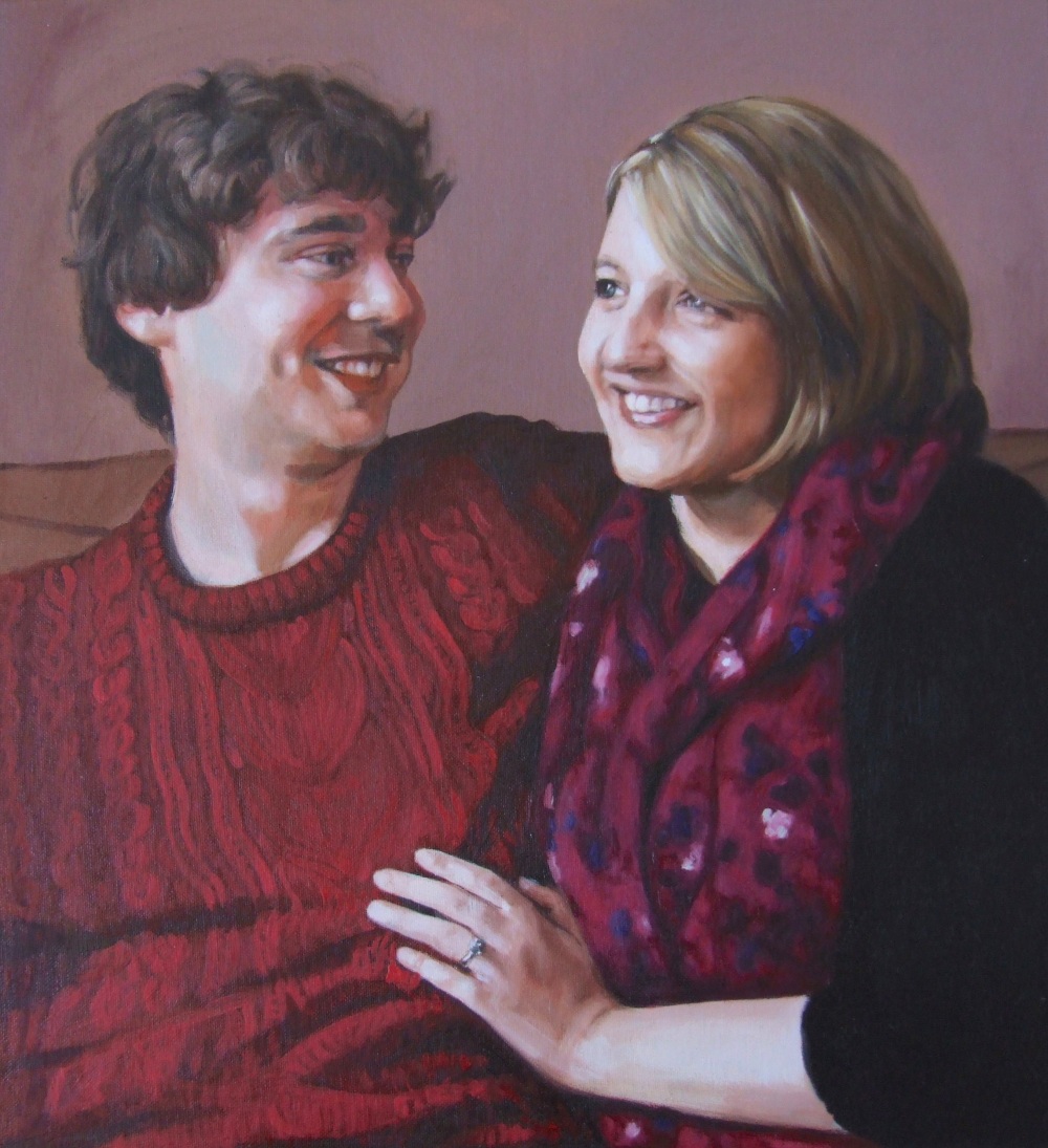
Anna and Simon final version
Anna and Simon progress 3 – refining details and adding glazes for depth. I was trying to be economical about the details of Simon’s jumper
Anna and Simon progress 2 – here I have blocked in all the areas of colour, like a ‘dead layer’
Anna and Simon progress 1- at this stage I abandoned the grisaille and worked colours straight onto the canvas
Here is a double portrait I worked on from a photo, to give an example of the process. I originally painted Anna in a grisaille, and went over the face in colour, having changed tack and wanting concentrate on a single opaque colour layer. It was worked into over a few sessions with additional glazes of colour.
In contrast I painted Simon’s face in colour directly onto primed canvas. I painted a ‘ground’ (or colour stain) on the canvas first, using a couple of coats of acrylic Burnt Umber. You can also see where I drew the grid. I had to leave some of the background unpainted so I could still follow the gridlines! It was one of those rare occasions where I was able to get the drawing right on the first attempt.
When the drawing doesn’t work I can spend many hours going back over the painting, needlessly, because if the drawing was all correct in the first place it wouldn’t have been a problem. Many bad experiences trying to fix paintings like this led me to use the grisaille method, because that is a great way of ensuring the drawing is right before attempting colour.
When I say drawing I’m talking about drawing with the paint. I’ve written about this before, especially here regarding the utmost importance of getting the drawing right first. Drawing is all of painting – figurative painting that is. That’s why even though I trained as a sculptor I could try painting portraits, because I had done a lot of drawing already. Working to commission means I need to make sure there’s no wasted effort.
Portrait of Tom
Posted on September 19, 2017
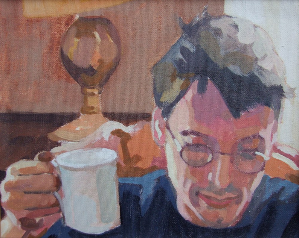 This is a portrait I painted of my brother Tom a few years ago, and I wanted to share it as I love the composition. I don’t know if its obvious but he’s reading, and enjoying a cup of tea at home. I feel the composition of the painting has a compactness to it, whilst having three distinct spatial areas – himself in the foreground, the room behind, and the window and world outside. There’s also the added dimension of the other window on his right, shedding light on his hand and cheek. And you could include the space I sat and painted in. I think I spent an hour or so on it and it was a good likeness, so decided to leave it as it was.
I was quite free with colour at the time and that’s something I want to renew and develop further, as another discipline to complement grisaille painting. I think some of the paintings I made in the years before I learned traditional techniques have a freedom and spontaneity that I don’t want to lose sight of. I’ll share more of these on this blog soon.
I’m hoping to start going a drop-in life class to specifically do some oil sketches and Alla Prima portraits so we’ll see how that goes. As I post this I will be at a portrait class in Topsham, Devon, and I will post again about it. Alla Prima is a technique I’ve had a little instruction in, but I’m feeling the need to go back to Bristol to have a chat with James Scrase about it. I’ve mentioned before but he worked for and trained under Pietro Annigoni, so he knows what he’s talking about! Alla Prima is Italian for ‘first attempt’ and is also called wet-on-wet. You basically try and finish the painting in a sitting, rather than painting layers of oil paint on top of paint that has been allowed to dry. I’d love to do one of Louis Smith’s courses on it as he provides brilliant tuition in all things academic in oil painting and portraiture.
Learning to love black
Posted on August 9, 2017
At school in art class I was taught that black paint is evil, (my teacher was a hardcore impressionist) and that to make a black you need to mix it from other colours, and the required colours were Burnt Sienna and Cobalt blue. It’s taken a LONG time to get this out of my system and in my paintings I still like to mix optical blacks, usually now with Alizarin Crimson and Viridian Green, and Burnt Umber with Ultramarine or Pthalo Blues.
Matisse said ‘black is a force’ and he painted some amazing paintings using blacks. You can see what he’s getting at looking at his paintings, but it was his rare skill not to overuse them and just use them to anchor his compositions. I learnt from Louis Smith that for very dark shadow skin tones Alizarin Crimson and Sap Green work really well together. I have mixed black with other colours to darken them and am getting better at using it, although sparingly.. I also learnt to mix Alizarin Crimson with black as this gives it more depth – just another kind of optical black really.
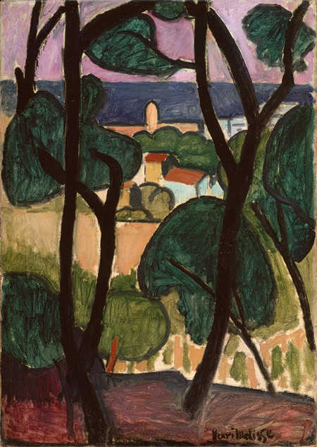
Here’s one of my favourite Matisse paintings and one of my all time greatest paintings; View of Collioure and the sea, 1907 – from the Met Museum, as I remember about 60 x 90cm. Its a lateish Fauvist work known, according to the Met Museum, as “Le Vitrail” (“The Stained Glass”) by Matisse’s family as the black lines of the trees and the colours resemble a stained glass window. Its painted with such economy of means – the photo doesn’t do it justice of course. Fabulous snaking tree trunks and green blobs for foliage, through to the view of the sea beyond. I saw it in Tate Modern a few years ago in some show or other, such a beautiful painting. I still remember clearly how it took my breath away.
