Ballet dancer painting ‘Croise derriere en l’air’
Posted on November 19, 2018
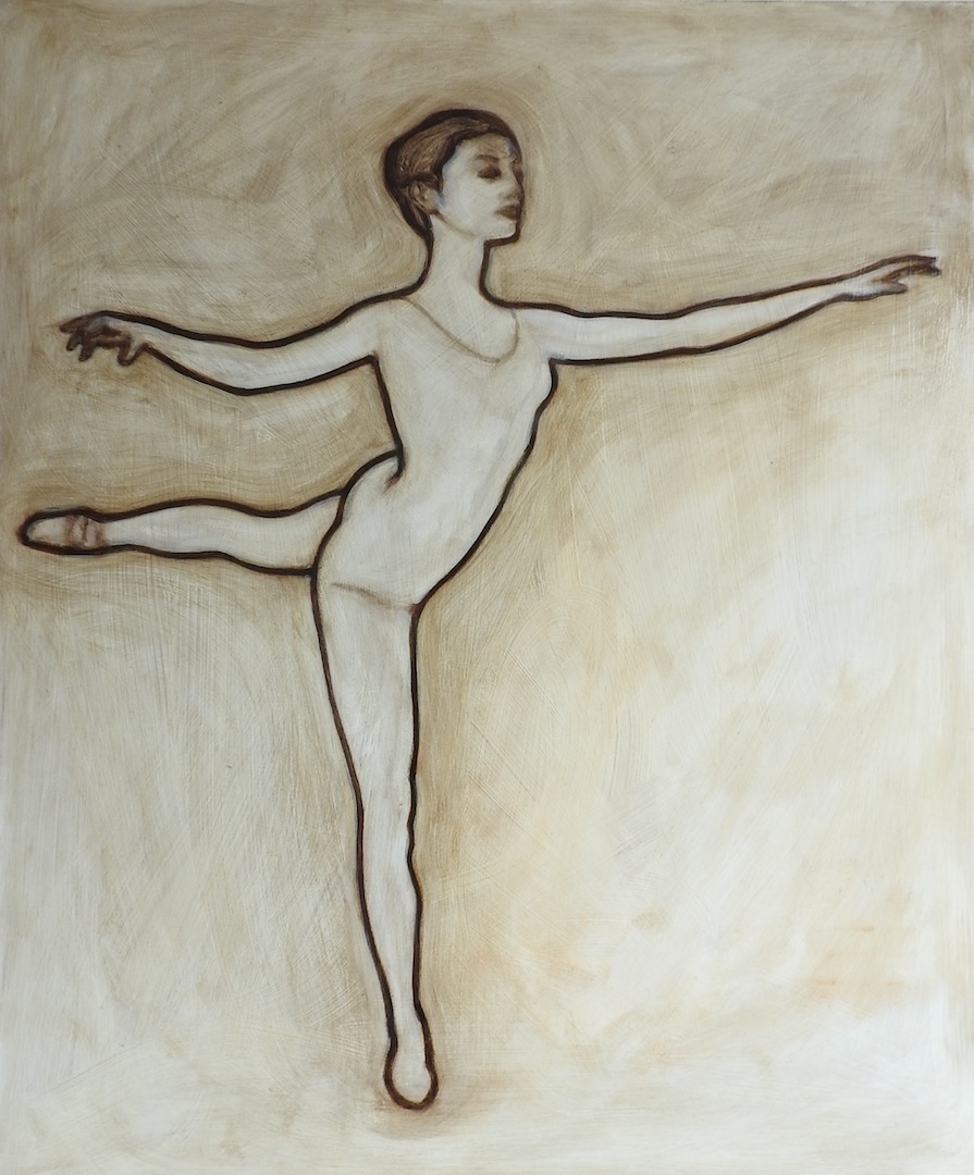
Painted in Raw Umber and white. Raw Umber bistre to start with, and then worked into with some white. I am trying to paint like a drawing, and sculpt a painting! I would like to make something reminiscent of sculpture on the painted surface. When I paint the line I am carving it, modelling the paint and then refining by taking it away. This is also how I initially do the underpainting for portraits, or any painting. As a sculptor who likes to carve stone, in my mind I am always ‘carving’, whatever I am working on.
Painting with Raw Umber and White
Posted on September 25, 2018
I wanted to paint some more using Raw Umber and Titanium White to paint the underpainting for portraits. Looking back over some earlier work from a couple of years ago inspired me to start using them together again. This is a detail from a recent portrait before the glazing. I wanted to approach it with a more fluid, perhaps bolder (for me) style. The underpainting took a couple of hours and when painting it I wanted to allow the brushwork to show a bit more as you get more of a sense of the process of painting it. I also started the painting on a ‘ground’ which was a middle tone of the 2 colours. You can see I left it in the space on the left side of the painting by the chair. Soon I hope to do a video on my youtube channel exploring how Caravaggio used grounds in his oil paintings.
I will also post a video of me doing the glazing for this portrait in the near future.
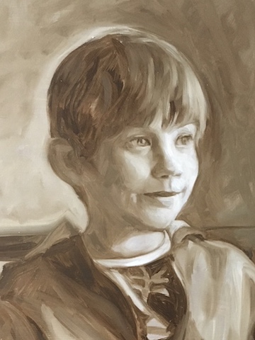
Portrait of Jacob, grisaille in Raw Umber and Titanium White, detail
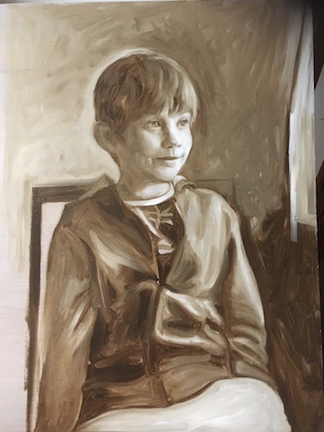
Portrait of Jacob, grisaille in Raw Umber and Titanium White
My hope is to paint freely, without really worrying too much about it, without being a slave to technique or overthinking it. I’m presently attempting to return to a simpler process, where the focus is on the drawing, the underpainting. Working in the grisaille holds and extends the moment when I feel I am most deeply connected to pure painting, whatever that is. It helps in sustaining the emotion I feel when pushing paint around, drawing with paint and attempting to conjure a likeness. It removes any other distractions to painting, like choosing the right colour! At the moment I enjoy breaking this process into the two stages, drawing and colour, hence grisaille and glazing. As a sculptor my first love was always drawing, and grisaille fuses the two, becoming like a bridge between drawing and painting.
When starting to paint portraits seriously a few years ago I looked hard for a way of working that suits my disposition and the need to paint as efficiently as possible so as to make it a viable career. I wanted to work with technique, without becoming its slave. To be able to work efficiently so as not to waste time, but to paint with feeling. There’s a certain emotion I get from a painting when it is going well, and I have felt that emotion disappearing by degree the more I have focussed on technique. I think this is something I can correct easily but I need to work through it a bit to maintain the pure pleasure of painting portraits. Its a fine line because I still believe technique is important. If there is a way to do it I want to somehow get lost in the emotion of painting. I see this after finishing a successful portrait, but then the ‘how’ disappears and I can’t recall what happened exactly to make the painting work.
I was happy with this Umber grisaille, but when I tried to recreate the same quality it has in the next painting, I couldn’t do it. There are a thousand, an infinite number of variables and I think I am narrowing in on what I want to do. Hopefully work will reveal it slowly and I can record that on this blog and youtube.
Incidentally, speaking of emotion or feeling in a work, a famous quote from Van Gogh goes: “I want to touch people with my art. I want them to say ‘he feels deeply, he feels tenderly’.”
I landed on the technique, or method, of painting with grisaille as I thought it covered all bases. The magic of painting a portrait is found in the way brush marks can transform inert paint into something that can conjure a likeness, even a character or personality on a canvas. I don’t want to fixate on recreating reality, or paint in a photorealist style. I love paint, making a mess with paint, and to leave a painting as a record of this experience.
Glazing a portrait from grisaille to colour
Posted on September 20, 2018
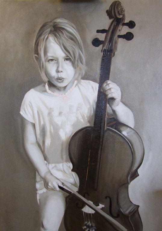
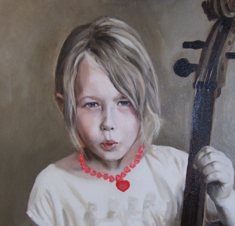
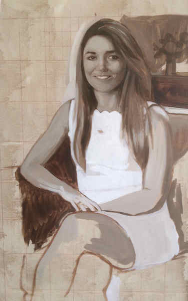
Portrait of a young cellist. Grisaille painted in Raw Umber and Titanium White, oil on board
This was a commissioned portrait of a young girl and here are before and after images to show how I developed the underpainting. Grisaille underpainting was completed first and then I added some layers of colour glazes. With this method, rather than mixing the colours on the palette the colours are ‘mixed’ optically through progressive glazes – very thin layers – of oil paint with a little medium.
Someone asked me the other day how much medium I use when painting in oils. Firstly I should explain that I always ‘oil out’ the painting surface before each painting session. Some people call it ‘oiling in’ by the way, but essentially it just means taking a little of the medium you are using and applying it to the painting surface. You can apply it any way you want, but I prefer to brush it on (any brush will do but I use a short wide sable brush) and when the surface I am working on is covered I rub the medium off very gently so there should be a very thin layer of medium left. I use M. Graham’s Walnut Alkyd Medium because it has an alkyd resin in it so it will dry in 48 hours. You could use plain linseed oil, it just takes longer to dry. There are quick drying oil paints out there and also siccatives but they are usually made using mineral spirits which I don’t like.
You can see me demonstrate this on one of the videos I put on youtube:
Oiling out is something you just get the hang of with practice. Sometimes I have left too much medium on and sometimes it feels like there isn’t enough. I do it between every glaze, so when a glaze is dry to the touch and I am starting the next I just repeat the process. Once all this is done the paint flows on the surface more easily, but I still add some medium to the glaze as I mix it on the pallet, being careful not to add too much otherwise it gets sloppy and ugly. Having said that I can always pull it off an area of the canvas by using a dry brush. It really depends on what kind of result you are after as a painter, everyone is different and is seeking a different quality in the paint they use.
In the portrait of the girl with a cello I used Raw Umber and Titanium white to do the underpainting, which has a nice warmth to it. Looking at this painting again has inspired me to rethink how I produce portrait paintings. I have found myself pulling against the overly finished and polished style of some of my work, so I want to revisit this way of working with a Raw Umber grisaille. I’m looking for something cruder, looser and freer from the constrains of technique. Sometimes too much knowledge and technique can get in the way of painting. My goal is to be able to paint with more naivety, as well as with good technique.
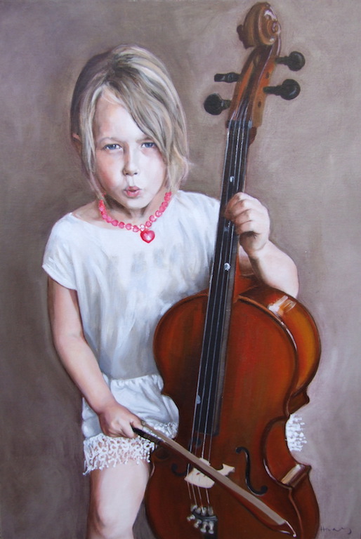
Portrait of a young cellist,70x50cm. The palette was fairly limited after painting the grisaille. Painting the cello was surprisingly done in just a 2 glazes, I guess because glazing is very similar to the polishing or lacquered finish a stringed instrument has.
I was interested in this painting again because I have been struggling with how to complete backgrounds, and finding myself overworking them. I like the simplicity of this background, completed at the underpainting stage. Raw Umber and white has a warm neutrality which works well. I painted this without really worrying too much about it, without technique or overthinking it. I’m presently trying to return to this simpler process, where the focus is on the drawing, the underpainting.
Romily portrait
Posted on September 14, 2018
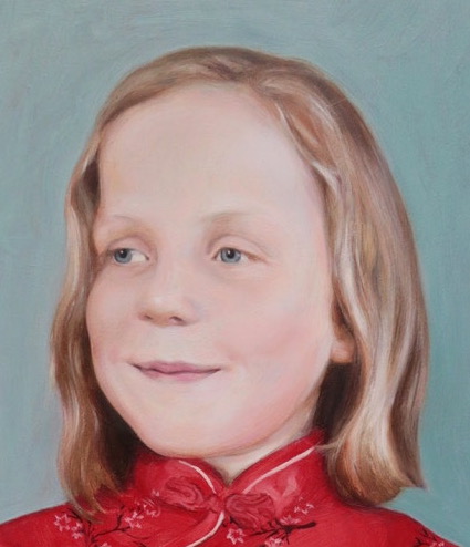
Portrait of Romily detail, oil on board
Heres a detail of a recent portrait. I painted this using the usual process of working over a grisaille. Her skin tones were very subtle and perhaps the rendering is not so easy to see in a photo. I painted about 5 or 6 glazes over the grisaille, and it was a challenge to capture the translucency of the skin. This is exactly what glazing does so well though and in the way it allows light to shine through it functions in a similar way to skin, which is essentially translucent itself. I’m not after the most polished look and like to have a painterly surface where brush marks are still visible, as I think this adds to the magical illusion of painting.
One thing I love when glazing an oil painting is painting hands, and here is another detail:
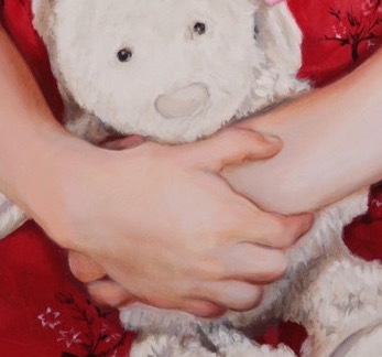
Portrait of Romily, detail showing the hands, oil on board
Up close they are rendered in a fairly loose way, and with about 3 or 4 glazes as I remember.
Here is the finished painting:
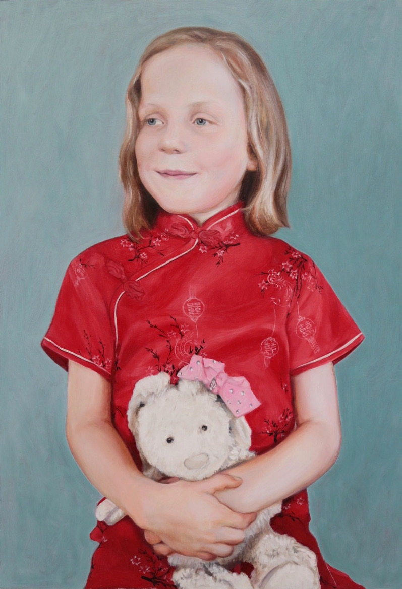
Portrait of Romily, oil on board, 40x60cm
I loved painting the Chinese dress and glazed it a few times with a mixture of Cadmium Red and Rose Madder, then added the details as a final touch to the painting. I decided not to paint the chair she was sitting on, wanting to simplify the format. I like the vertical tautness this gives the composition – perhaps it has echoes of a Chinese portrait. I like to ‘declutter’ the background that appears in my reference photos, most of the time. It depends on the relevancy to the portrait of an individual as a whole. I felt here that there were enough references to the sitter here without any additional details, and these weren’t discussed during the photo session.
Artists have always provided visual clues about the character of a sitter in their paintings – for this painting the client asked that a favourite teddy was involved, and the child chose her favourite dress. Clues that represent the social life of the sitter are included by the artist to show the sitter’s ‘relational self’, the self that is seen by others and relates to others in a social context. To give an extreme example, royalty are often portrayed with all the trappings of their position, personifications of the ruling power, before they are portrayed as individuals (Brilliant, Portraiture P. 104). Despite having the odd reference here and there, I am always focussed on the sitter as an individual, before any externals. I want to focus on the sitter’s uniqueness and their shining humanity. I believe that if the artist looks long enough and hard enough, that humanity is visible in a person’s face and can be captured in paint on canvas.
Portrait of a young England fan
Posted on August 24, 2018
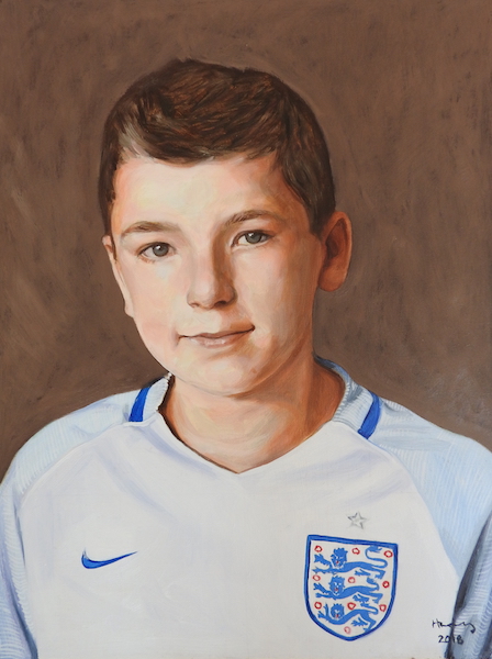
Portrait of Ben, oil on board 35x45cm
The client initially made enquiries about commissioning a portrait because they had a portrait painted of themselves as a 13 year old, and wanted to commission a portrait of their son at the same age. It was agreed the portrait would be in oil on board, and I went to the family home and worked on the painting from life for a day before taking the painting back to the studio to continue working.
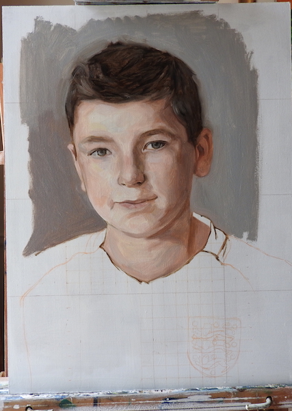
Portrait of Ben, 1st sitting from life. oil on board
Because of time restraints I used a grid method which can work very well for portraits of fidgety younger people! After having a chat and getting to know the sitter I took a photo and after copying the outline onto the grid I completed the drawing. Then I could paint the sitter with a degree of confidence, and have the opportunity to observe the skin tones in real life. I used a fairly limited palette but didn’t paint with a grisaille so I could get a feel for the skin colours while I had the opportunity to do so.
I got to this stage after 4 hours and took it back to the studio to wait for it to dry and continue working. After another 3 or 4 glazes the portrait was finished.
It is also possible to use a sitting like this to make sketches and colour studies, so that I can then work from a photo and use a grisaille later in the studio.
2nd glaze on my Bouguereau copy
Posted on July 17, 2018
I finished the 2nd glaze last week and have added a voiceover to my video, so it is all up on youtube now.
This is the last video in this short series, using a copy of a Bouguereau painting to learn about the glazing technique. I chose to make it the last video because my main aim is to demonstrate the technique – I don’t know how interesting it would be to show all of the potential glazes for this painting on video.
But if I do a 3rd and 4th glaze then I’ll post it on here.
Showing the 2nd glaze unedited (well very slightly edited) and in real time, I hope it will be valuable to anyone interested in this technique. I hope it shows that this is quite a straightforward method of working with oil paint that has beautiful results.
It is a method that can also be used with any approach to oil painting, i.e. it can be used to further enrich and deepen any oil painting that has been started in colour. You don’t have to do an underpainting in grisaille or brown to achieve these effects and can work up a painting however you like.
Grisaille underpainting and underpainting generally is my preferred method because I like painting in monotones, I guess because I was originally trained as a sculptor.
I feel glazing over grisaille or grey shows with great clarity the wonderful transformative qualities of glazing very clearly, so it lends itself to this kind of demonstration.
Portrait sculpture in marble – direct carving
Posted on July 4, 2018
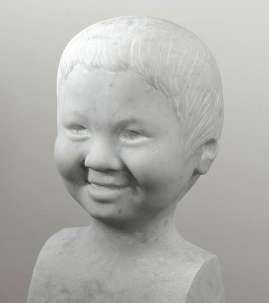
Jamie, Portrait sculpture, direct carving in Carrara Marble
This is one of my favourite portraits, carved in beautiful Carrara marble from Italy. Looking at it here I feel its got a nice sense of the person as well as a simplicity and wholeness. This was a bit of a fluke but I’m hoping to use it as a benchmark for future portrait sculptures. Its a challenge trying to capture eyes in monotone like this, and too much detail doesn’t usually work making the portrait appear ghoulish. Here though I was pleased with the result, and its something to explore in further work.
At first I had made a clay portrait of the sitter which I worked up from photos, but I abandoned the clay portrait and it lay in my studio for a good few months. Then I suddenly had the desire to carve the portrait, so using the clay model as a reference I carved directly into a block of marble I had lying around in the yard. I don’t use a pointing machine or anything when I carve, but I do use callipers to measure distances between say eyes to bottom of nose, width of mouth etc. There is an image below of some preliminary drawings I did for another sculpture in marble with various measurements of distances across the face. I’ve got no other ‘work in progress’ photos of Jamie’s portrait sculpture unfortunately.
The only problem I had with it was that I had bought the marble from a reclamation yard in Oxfordshire so it had already been out of the ground for over 100 years. This meant it had hardened to the extreme and was very difficult to work, or at least a lot harder than recently quarried marble. I’m not sure of the physical processes marble undergoes when it comes out of the ground, but freshly quarried stone has what masons call ‘sap’ in it. This is water embedded in the stone, and it makes stone softer to carve. Once it is dug out of the ground stone gradually loses this quality and hardens further, and with marble this gives it a very hard brittleness. Good marble has an almost buttery quality to it, and is very consistent, making it a joy to carve. Marble is definitely one of the harder limestones, but once you’ve got going its lovely hammering away and feeling the chisel cut into it! My neighbours didn’t like it too much after a while but all is forgiven now.
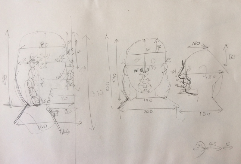
I hew off large areas first, for example from the side of the block the area between the head down to the shoulders can all come off at right angles, then the distance between the projection of the nose and the rest of the face, then down to the cheeks. You can see an example of this in the photo below of another portrait sculpture where the tip of the nose is still square. I carved down to the cheeks first and then began to round them.
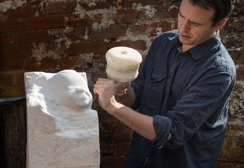
Should have been wearing goggles. Working from photos
This is a method I picked up when working as a stone mason in the Wells Cathedral yard, where I worked while taking a year out of art school. It’s a typically pragmatic way of working for a mason, and it helps a lot when working only from photos. Further on you should discard it and focus on the roundness and wholeness of things, so that a sculpture doesn’t get too mechanical. For a portrait you need to have a sense of precision and exactness to get a likeness so its a good method to use for that. I’ve been painting a lot recently and am looking forward to carving a portrait in the near future!
Video of 1st glaze on underpainting ‘After Bouguereau’
Posted on June 29, 2018
I have just finished the first glaze in oil paints on my grisaille underpainting. This short video project was all about trying to work out how Bouguereau made his paintings, something I have often wondered about.
His works have a particular translucent quality and it was my mission to try and fathom the processes behind this. I think the only real way one can do that is to use the glazing technique over a grisaille. Of course you may get an idea of how it was done using different painting methods or materials but I wanted to stick as closely as possible to his generally agreed method of glazing.
The only real way to understand another artist’s technique is to try and do it oneself. I have not copied many works in my art practice but this has been an invaluable exercise in understanding glazing generally. That is my real and only goal actually; to find a way to develop my own practice with glazing in my paintings. But in the process I hope to leave a course of videos that might enable anyone to achieve similar results to Bouguereau with a little practice. I feel that actually this technique is deceptively simple, but I am still trying to work out the most efficient way of doing it. If you look at Caravaggio’s paintings you can see that once the underpainting was done it was a small step to add some colour, although being able to do it is another matter entirely.
I still feel that anyone can begin to approach painting in the same way as these artists, it just needs practice.
This piece obviously needs some more work to get close to Bouguereau’s, but its only the first glaze, so I’m really looking forward to doing the second glaze and more. I’m thinking of getting a print of the grisaille and trying all over again, and that way I think I might actually crack it, based on lessons learned so far. It was never about making a perfect copy, only trying to come close to the original so as to learn the process generally.
I’m still getting used to filming myself working. The hardest thing about it is making room for the painting and the palette, where I would normally be much closer to the painted surface. I normally spend the whole time panicking!
After Bouguereau grisaille underpainting
Posted on June 21, 2018
After Bouguereau – grisaille underpainting 30x40cm
After drawing in this Bouguereau I painted the grisaille. I’m not normally used to modelling the forms so thoroughly but I found that to be a very valuable experience, because I don’t think I have ever done it! I have found in the past that as long as the drawing is correct in the grisaille then the glazes and half-pastes (with white) will continue to refine the modelling.
I was also conscious of not painting the grisaille too dark to begin with as the later glazes will darken it further. Also it is difficult to tell wether it is purely a glaze that creates the shadow tone here or if there are thinner glazes over the grisaille. I can’t actually tell if the shadow area on her neck below her chin is a thicker rich glaze or the result of the shadow painted in grisaille, showing through the glaze. It doesn’t actually look like there is any grisaille showing through. I recognise the glaze as a mixture of green and red (which ones I’m not so sure). My hunch though is that it is created from Sap Green and Cadmium Red or Vermillion. I left it as a compromise with a little shading in the underpainting. The sharper transitions can all be softened with glazes and I will show this in my next video.
The whole point of the grisaille is that you don’t lose touch with the drawing and it is visible through the glazes. Its a chicken and egg scenario trying to work out which came first. Only time will tell, and when I do the glazing I should have a much clearer idea of how Bouguereau did it.


In the grisaille I have deliberately left some of the transitions between light and shade a little sharp, and some of the lighter areas quite flat. This I hoped would enable me to concentrate on modelling the forms with the colour glazes which is what I think Bouguereau did.
All the modelling around her shoulders could have been created with glazes only over a fairly flat underpainting. Also I have not really darkened the area on her left cheek as I’m sure this has been created with a red glaze. I once saw a photo of one of his paintings where the glaze was flaking off but unfortunately I can’t find it again. This proved though that so much of the modelling was done with glazes alone, and that these glazes gave the work that translucent quality.
Learning the glazing technique from Bouguereau, new series of videos
Posted on June 12, 2018
I’m embarking on another short series of videos on my youtube channel showing the process of copying this part of a Bouguereau painting from start to finish. I hope to use this as a way to learn about his process and to improve my own glazing technique. Bouguereau primarily used grisaille and glazing as a method of painting and his glazing has a beautiful translucent quality. This first video focusses on how I prepare a canvas or board and using a grid to transfer a photo or drawing to the surface.
Après le bain, oil on canvas 178 x 88.5 cm W-BOUGUEREAU – 1875
Here is a link to the first video in the series:
Commissioned portrait painting
Posted on June 5, 2018
Portrait of a girl. Oil on board. 30x40cm


These images (the 1st 2 are film stills) show the first 3 glazes as they went on, alongside the initial underpainting. This portrait was a challenge in the sense that I underestimated how light the reference was and how light the final painting would be, so the grisaille was too dark to begin with and the glazes darkened it further. It is still a challenge to find this balance in the grisaille and resist the temptation to paint it too darkly.
When the values are a bit dark in the grisaille it can take a while to lighten them, although this can be a blessing because repeated glazing has an unrivalled quality compared to only a few glazes.
Philip Guston described himself as a moral painter, and said the effort a painter puts into their art is still there in the final painting. Sometimes where the path of least resistance has been taken, paintings can have a shallow quality sometimes. But all the effort and struggle, corrections, reworking, repeated revising etc. carry a moral charge that one can intuitively feel and perceive in the final painting.
The video I made of the first glaze going on the underpainting is here on my videos page.
In the end I felt that it worked better to declutter the background, but I kept the colour suggestion of the chair, a warm light green.
Portrait painting showing grisaille underpainting
Posted on May 29, 2018
Detail of a portrait in oil on canvas, showing the grisaille underpainting before and after
This is a detail of a painting that I have shown before of the effect of glazing over a grisaille underpainting in a short time. You can see the first glaze which took around an hour to paint, and the effects are dramatic. It is something I wish I had filmed at the time along with the other short film I made of glazing the arm, my first video!
It also shows a detail of some decorative motifs I was experimenting with which in the end I discarded. Just the sleeve of his pyjamas had some tiny star decorations on, and I enlarged these stars to create a free floating design that ran across the painting. Its certainly good to have a record of this, even though it was scrapped. I’m still interested in the idea of playing games with the picture plane. Of course the realism of the portrait is an illusion, and it felt like a good idea to juxtapose that with something that flaunted the illusion.
The portrait is of my son and it was my wife who decided she didn’t like this design! Its something else I would like to investigate more in the future though.
The palette I used here for the glaze was fairly limited: Titanium White, Indian Yellow, Vermillion, Alizarin Crimson, and Sap Green.
It shows what can be achieved with glazing just a few colours over the Black and White underpainting, but strictly speaking Ivory Black is on the palette too, it was just painted beforehand and already dried as the grisaille. You don’t need umbers or ochres for the hair necessarily, and just a mix of reds and the Sap Green will do, as it did for the shadow tones. Like in a Zorn palette the Ivory Black mixed with white gives a cool bluish hue to the skin tones where it shows through.
I used a hogs hair brush to start and then blended colours using both that and then a sable brush to finish. There was an additional glaze to this but in the main I was happy with this first glaze, and it demonstrates the efficiency of the grisaille technique. Get the drawing right first, and the correct value tones, and then the glazing can achieve very quick results. Even though its quick to paint, every glaze is painted very slowly, very carefully, never committing too much paint.
Here is the final painting which is still not completely resolved. I think I preferred the earlier version and its just been left which is sometimes the only way I finish paintings. I may go back to it one day, but can’t now though because its being exhibited. Paintings though pass into one another in a linked chain of learning where all past failures and successes are handed down and carried through to future works. The point is to keep moving forward!
Portrait of Hideo, oil on canvas
Drawing is the foundation of portrait painting – Ballet lesson
Posted on May 26, 2018
Ballet lesson, oil on board
Here is a portrait of my daughter at ballet class that I painted before attending Louis Smith’s glazing workshop. To begin I painted the whole thing in a ‘dead layer’ or monochrome using Burnt Umber, Ivory Black and Titanium White. Then I did some very thin coloured oil glazes and some ‘half-pastes’ where you’ve got a bit of white mixed with the glazes, which are more opaque and not completely transparent. See my videos page for examples of this. Working in glazes is very methodical, and is sometimes called ‘indirect painting’. Initially I found working in this way too removed from earlier observational painting I had done in the past and at first I found I couldn’t get my early schooling out of my head.
The most crucial point in painting anything is the drawing, and drawing is paramount to painting a portrait. Without correct drawing, drawing that conjures a likeness of the sitter, the painting can fail as a portrait. It might still be a good painting though, but here we are concerned with painting a portrait. And if it has been commissioned the person who commissions the portrait expects a likeness above all. Surely a good likeness is the sine qua non of a portrait painting. The reason I developed an interest in indirect painting and working first in the grisaille is so that I could finish the drawing. Everything follows from there.
Generally in the past I would prefer trying to paint all the colours directly, drawing as I went, but occasionally this method is a bit hit and miss. If I got the drawing wrong initially there was always so much back tracking, and in this painting I saved myself a lot of messing about by getting the drawing right first. Rushing ahead without completely resolving the drawing is like building a house with a wobbly foundation.
In the long run there is no wasted effort in art, as we are always growing and developing as artists, and we grow through work and effort. But my project has also been an attempt not to waste any effort! Hence a focus on drawing first and foremost.
As well as painting is a grisaille, there is also a lot to be said for diving straight in and drawing with colour directly onto the canvas, which is what I did here:
This was the first stage of the portrait, painted in approximately 2 hours. It is difficult to see the sap greens but they are all there mixed in with the reds. Without the sap greens the reds would be far too warm.
Looking back at the above portrait, it is one of the occasions I got both the drawing and the colour right at the same time. There were a few further glazes to refine the drawing but its all finalised in this first glaze. Its a case of taking the time to get it right and not rushing or guessing in any way. Its like sudoku. You can never guess what number should go in a particular square, and when you do you are doomed to failure. Drawing a portrait requires an extremely high degree of concentration which I am better at maintaining now. In the past I might have just let myself slip, guessed the line or the proportion, and continued in a shallow self-satisfied way. You can never assume you’ve got it right until you’ve checked and checked again. Of course you can go back over it but why not get it right first time? Its much harder to go back over it, and for some reason if I’ve committed to having an eye in a particular place for example, its hard to admit to myself its wrong and change it. This is something I did here when I realised I had been happily going along with eyes which were wrongly spaced:


On the left the eyes were too far apart so I had to take a deep breath and repaint her left eye, moving it over by about 1cm. It was the ‘full stop’ on this painting. It wasn’t a nice thought having to repaint it but it only took around 30 minutes in all. This is what I mean by not settling for a shallow version of the painting, and oneself, complacently self satisfied or just plain avoiding the discipline required. I think the problem arose because much of the drawing was incorrect in the first sitting and everything had to be adjusted. In the end I was happy though and could draw a line under it as finished.
My palette, limited palettes and extreme limited palettes
Posted on May 21, 2018
Detail of a group portrait showing the grisaille underpainting painted in acrylic
I like to use disposable palettes. I like to start with them looking nice and clean, a clean slate. I can’t leave the colours on the palette to dry and then work on top. I find its just good to start afresh with each session, so I’m always miserly about how much I squeeze from the tube, although there is always some waste.
At the moment my palette consists of: Titanium white, indian yellow, lemon yellow, brilliant yellow, raw sienna, cadmium orange, vermillion, cadmium red, red lake, alizarin crimson, rose madder, ultramarine blue, viridian green, sap green, raw umber, ivory black. 16 in all, but a few of them I could live without, and generally don’t use too much. It all depends on the portrait I am painting at the time. I find rose madder is invaluable for painting lips! But only that. I have used it in the past for a brightly coloured shirt or dress. I can happily paint with only one of the yellows too, but it helps to have a few others rarely used that I can turn to.
I’m still trying to find the most efficient palette to use, and am more and more tempted by very limited palettes. Something yellow, a red, a blue and a green. And white of course. My very first training in oil painting at school was using palettes of cobalt blue, burn sienna and a white, and this created some beautiful colours together. I’ll have to experiment and will show the results here. Possibly also: Ultramarine Blue, Burnt Umber, White, Cadmium red, and a yellow. If using a blue you would still be able to create beautiful optical blacks mixed with the Umber. For me my palette doesn’t extend much beyond 15 or 16 colours, depending on what I’m painting. There don’t have to be more than this in my own experience. Sometimes though I have ‘guest’ colours that come in for one night only if a painting requires it, like the Rose Madder.
I read that Cezanne used brilliant yellow and red lake so I bought some Old Holland Brilliant Yellow and Red Ochre. I love the fact the names are in Dutch which alone seems to channel the spirit of Rembrandt!


Speaking of limited palettes, the ‘Zorn’ palette, named after Anders Zorn, is a very restricted, you could say austere, colour palette. Consisting of white, Ivory Black, Yellow Ochre, and Cadmium Red or Vermillion. I didn’t know about Zorn until I started investigating whether to mix optical blacks or if I should stick to Ivory Black from the tube when underpainting or painting in a grisaille. I still haven’t settled on any specific formula for this, but the most pragmatic method is to stick with the black on its own. Mixing a little Alizarin Crimson into the black from the tube gives it more depth, and sometimes I do this, although not all the time.
If using black for grisailles, straight from the tube is the most paired down, straightforward method. It is the most limited palette there is after all, assuming you ought to have at least 2 colours on your palette. That’s pretty severe. The kind of palette Samuel Beckett would use, but then maybe he would only use black. There were some conceptual painters in the 70’s who only painted in blacks or greys, and then only painted stripes, and then only horizontal or vertical stripes.. But they wanted to reduce painting to a historical fact alone. Something was painted at a certain time and place, and in a certain context, and that was that. No answers ‘nor consolation nor certainty nor enlightenment are offered’, and ‘the viewer is forced to confront the fundamental truth of the questioning process itself.’ (Buren- quoted from Conceptual Art by Tony Godfrey). Thats not what we are trying to do here though.
Anders Zorn. A life of chromatic austerity, but no stripes.
For Zorn, Black and white could create a blue which was blue enough, seen relative to other colours on the canvas, and Black and Yellow Ochre creates greens – some people use only these two colours for greens when painting landscapes. I like Zorn’s paintings, and love the way he uses his pallette, but some of the nudes have a naughty postcard feel and lack a formal rigour.
Mr Jeremy Baines, my ultra-impressionist teacher at school, wouldn’t countenance the use of black in any painting. It was viewed a kind of heresy, and it literally took me decades to get this thought out of my system. I don’t think it will ever leave me. Although I might think I’m free of these taboos against the colour black, it doesn’t mean I’ve flipped the other way. Instinctively I would always use a broader palette than black and yellow ochre if I was painting a landscape or anything else. If I used black, I would love to use black like Matisse, the true master of black in painting. He said ‘black is a force’, and I don’t know what that means but you get a sense of it when you look at his paintings. Renoir said to Matisse he was jealous of how he could use black in his work.
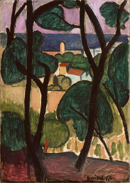
Matisse, view of Collioure by the sea. Tate Modern. Go to see it if you can.
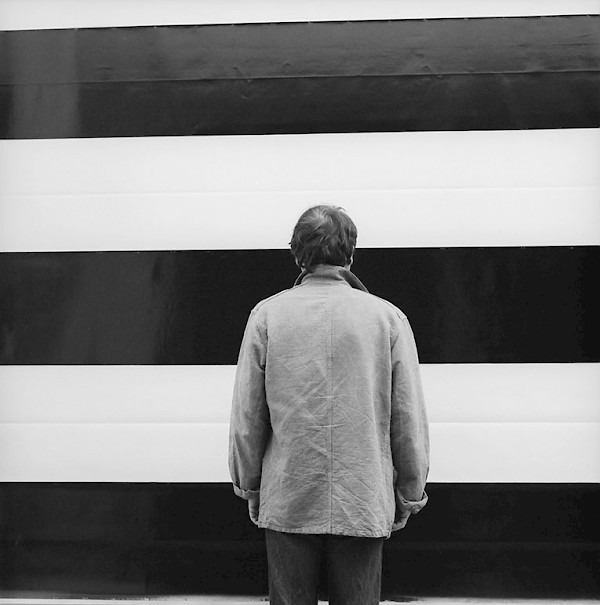
A historical fact. Buren, Mosset, Parmentier and Toroni worked together around 1970 each painting their own signature style paintings. Parmentier’s, above, was horizontal stripes. They said ‘To paint is to give aesthetic value to flowers, women, eroticism, the daily environment, art, dadaism, psychoanalysis and the war in Vietnam, we are not painters‘. Definitely not fans of grisaille underpainting. Buren said that ‘now we can say for the first time, that “it is painting”, as we say, “it is raining”. When it snows we are in the presence of a natural phenomena, so when “it paints” we are in the presence of an historical fact.'(Buren- Conceptual Art by Tony Godfrey)
I’ve always loved that. To be able to say ‘Its painting today’..
Painting portraits with Sap Green
Posted on May 14, 2018
This was the first stage of the portrait, painted in approximately 2 hours. It is difficult to see the Sap Greens but they are all there mixed in with the reds. Without the sap greens the reds would be far too warm.
After the second glazes have gone on.
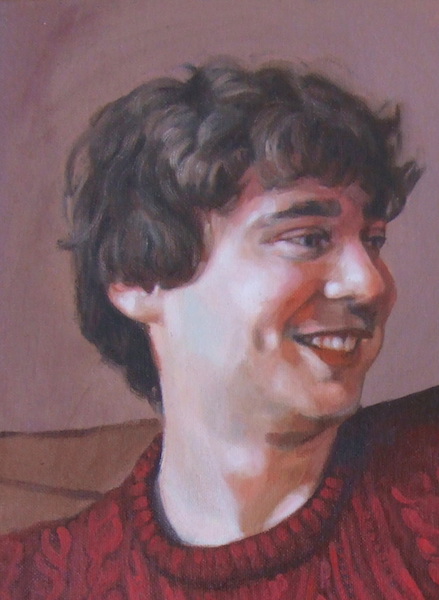
Detail of the final painting
Sap Green is a generic name for a warm, deep green. Perhaps its difficult to tell, but the above detail of a portrait painting was made possible with the invaluable Sap Green and even though impossible to see really its all over it! Sap Green cools reds. Red and green are complementary colours so together they neutralise each other. People generally aren’t that green, but they are greener than you might imagine.. skin in shadow is invariably greenish in hue. Maybe greenish is too strong a word (it might not be a word) but generally when I paint shadows there are always greens silently working their magic.
There a lots of different Sap Greens made by different oil paint manufacturers as each develops their paints in their own way. I love Michael Harding’s oil paints and I love his Sap Green, but it doesn’t have the particular warm quality I am generally after when I reach for it, in the context I want it. It is good for cooler shades and hues but I haven’t yet been bold enough to use it in a portrait. Michael Harding’s website says that it would be ideal for the plein air painter which is true.
The Sap Green I worked with when I studied with Louis Smith was one of the warmest greens I had painted with (Lukas studio oils), and I discovered mixing with Alizarin Crimson is brilliant for cooling down reds in shadow tones. It served this purpose in the portrait painting shown. I painted this shortly after I did a glazing workshop with Louis Smith in Manchester and it was a revelation for me. The sap green I generally use is the Winsor and Newton Winton variety, but I’m sure there are a lot of other ones out there including the Lukas one. I have just been going through what I already have in my paints box. I also have an old tube of water-mixable Duo Aqua sap green which I can use as its also warmish.
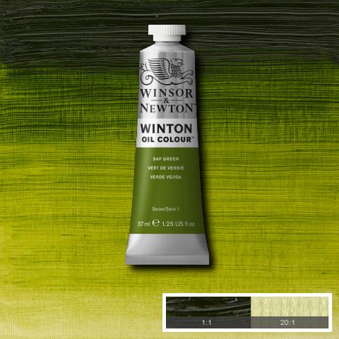
Sap green was originally a lake pigment made from unripe Buckthorn berries. This isn’t the best quality paint but its the right hue for my work. I just have to add a little more when mixing with better quality colours as they have more pigment in them.
The one colour I can’t live without at the moment is sap green. What a discovery that was! All credit to Louis Smith for introducing me to it back when I was starting to seriously paint portraits. For me all skin tones seem to flow from there when this green is mixed with alizarin crimson or cadmium red. In my case I generally add both, or start with a dark mix of crimson and sap green. I have found myself recently mixing a deep colour using these two and working from there on the palette in various directions, adding white here, blue or yellow there and seeing where I end up.
If I mix Sap Green and a red for a shadow and it’s still too warm I mix in a bit of blue. It could be any blue but the blue I have on my pallet is Ultramarine. This again is a warm blue, but its cool enough to dampen the fires of Cadmium Red or Alizarin Crimson. I have to be careful not to add too much blue or it overpowers the other colours.
Honestly I think I would struggle to paint a portrait without it these days. The description on the Winsor and Newton website says Sap Green is a bright mid-range green with a yellow undertone. Originally Sap Green was a lake pigment made from unripe Buckthorn berries. Here is a picture of some Buckthorn, also once used as a ‘purgative’ which sounds nice. Perhaps its a good thing its not used anymore as its very toxic.
My palette is a fairly warm one when seen all laid out, and I’m sure at any time I could dispense with some of the colours. I generally don’t use umbers (browns) in my palette except when I’m doing drawing or underpainting. I have found its convenient to have a bit when I’m painting hair, but I usually mix my browns from various other colours, typically starting with a red and sap green together. Here is a video starting at the moment I have prepared a glaze mix on my palette using these colours, and I use it for the hair:
When mixing colours I’m always back and forth, correcting and adjusting as I go. I never get it right first time but have come to see it as a process of guesswork where I try a colour, see it in context, and then try again. I was never taught any formal method like you might see on an academic painters palette. Sometimes when I have a very warm hue for a highlight, where I have used a lot of red, it can work very well to just add some blue or a sharp green like Viridian. I want to try and get the values to remain the same with the two colours, but the cooler hue bounces off the warmer and creates the subtlest shadows. It still takes a bit of time when painting to get to the point where I can find this balance, and often I do it by accident. That is part of the pleasure of painting though, where we are constantly surprising ourselves.
