matt harvey art
Portrait paintings, art demonstrations, figurative painting, landscapes
My palette, limited palettes and extreme limited palettes
Posted on May 21, 2018

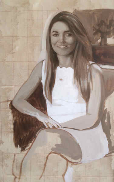
Detail of a group portrait showing the grisaille underpainting painted in acrylic
I like to use disposable palettes. I like to start with them looking nice and clean, a clean slate. I can’t leave the colours on the palette to dry and then work on top. I find its just good to start afresh with each session, so I’m always miserly about how much I squeeze from the tube, although there is always some waste.
At the moment my palette consists of: Titanium white, indian yellow, lemon yellow, brilliant yellow, raw sienna, cadmium orange, vermillion, cadmium red, red lake, alizarin crimson, rose madder, ultramarine blue, viridian green, sap green, raw umber, ivory black. 16 in all, but a few of them I could live without, and generally don’t use too much. It all depends on the portrait I am painting at the time. I find rose madder is invaluable for painting lips! But only that. I have used it in the past for a brightly coloured shirt or dress. I can happily paint with only one of the yellows too, but it helps to have a few others rarely used that I can turn to.
I’m still trying to find the most efficient palette to use, and am more and more tempted by very limited palettes. Something yellow, a red, a blue and a green. And white of course. My very first training in oil painting at school was using palettes of cobalt blue, burn sienna and a white, and this created some beautiful colours together. I’ll have to experiment and will show the results here. Possibly also: Ultramarine Blue, Burnt Umber, White, Cadmium red, and a yellow. If using a blue you would still be able to create beautiful optical blacks mixed with the Umber. For me my palette doesn’t extend much beyond 15 or 16 colours, depending on what I’m painting. There don’t have to be more than this in my own experience. Sometimes though I have ‘guest’ colours that come in for one night only if a painting requires it, like the Rose Madder.
I read that Cezanne used brilliant yellow and red lake so I bought some Old Holland Brilliant Yellow and Red Ochre. I love the fact the names are in Dutch which alone seems to channel the spirit of Rembrandt!
Speaking of limited palettes, the ‘Zorn’ palette, named after Anders Zorn, is a very restricted, you could say austere, colour palette. Consisting of white, Ivory Black, Yellow Ochre, and Cadmium Red or Vermillion. I didn’t know about Zorn until I started investigating whether to mix optical blacks or if I should stick to Ivory Black from the tube when underpainting or painting in a grisaille. I still haven’t settled on any specific formula for this, but the most pragmatic method is to stick with the black on its own. Mixing a little Alizarin Crimson into the black from the tube gives it more depth, and sometimes I do this, although not all the time.
If using black for grisailles, straight from the tube is the most paired down, straightforward method. It is the most limited palette there is after all, assuming you ought to have at least 2 colours on your palette. That’s pretty severe. The kind of palette Samuel Beckett would use, but then maybe he would only use black. There were some conceptual painters in the 70’s who only painted in blacks or greys, and then only painted stripes, and then only horizontal or vertical stripes.. But they wanted to reduce painting to a historical fact alone. Something was painted at a certain time and place, and in a certain context, and that was that. No answers ‘nor consolation nor certainty nor enlightenment are offered’, and ‘the viewer is forced to confront the fundamental truth of the questioning process itself.’ (Buren- quoted from Conceptual Art by Tony Godfrey). Thats not what we are trying to do here though.

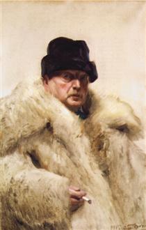
Anders Zorn. A life of chromatic austerity, but no stripes.
For Zorn, Black and white could create a blue which was blue enough, seen relative to other colours on the canvas, and Black and Yellow Ochre creates greens – some people use only these two colours for greens when painting landscapes. I like Zorn’s paintings, and love the way he uses his pallette, but some of the nudes have a naughty postcard feel and lack a formal rigour.
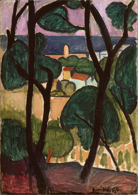
Mr Jeremy Baines, my ultra-impressionist teacher at school, wouldn’t countenance the use of black in any painting. It was viewed a kind of heresy, and it literally took me decades to get this thought out of my system. I don’t think it will ever leave me. Although I might think I’m free of these taboos against the colour black, it doesn’t mean I’ve flipped the other way. Instinctively I would always use a broader palette than black and yellow ochre if I was painting a landscape or anything else. If I used black, I would love to use black like Matisse, the true master of black in painting. He said ‘black is a force’, and I don’t know what that means but you get a sense of it when you look at his paintings. Renoir said to Matisse he was jealous of how he could use black in his work.

Matisse, view of Collioure by the sea. Tate Modern. Go to see it if you can.

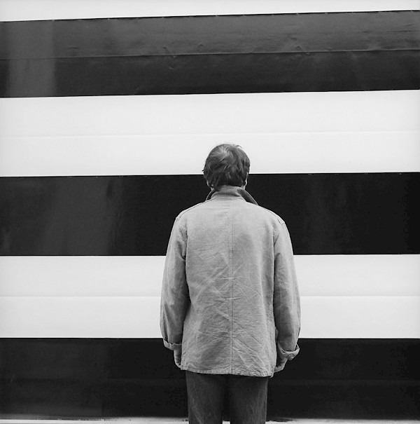
A historical fact. Buren, Mosset, Parmentier and Toroni worked together around 1970 each painting their own signature style paintings. Parmentier’s, above, was horizontal stripes. They said ‘To paint is to give aesthetic value to flowers, women, eroticism, the daily environment, art, dadaism, psychoanalysis and the war in Vietnam, we are not painters‘. Definitely not fans of grisaille underpainting. Buren said that ‘now we can say for the first time, that “it is painting”, as we say, “it is raining”. When it snows we are in the presence of a natural phenomena, so when “it paints” we are in the presence of an historical fact.'(Buren- Conceptual Art by Tony Godfrey)
I’ve always loved that. To be able to say ‘Its painting today’..

